DC4 - Jan 19, 2024
Encouraging Clicks Without Shady Tricks
By Paul Boag

A. Introduction
1. Measuring success and defining metrics
- Defining success through key performance indicators
- Make a measure metrics as good as possible, but except they're never gonna be perfect is better than measures something that measure nothing.
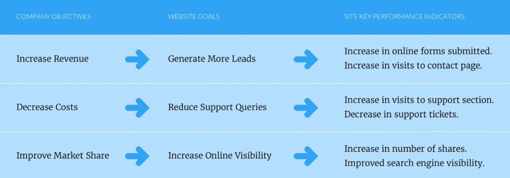
- Striking a balance in your key performance indicators
- Usability metrics (eg. task success, percentage of users capable of completing critica task, time to complete task...)
- Engagement metrics (eg. how long the user is paying attention to content such a video, first impressions, how often does the user like, comment, or share content, how likely a user would recommend the site to others, how many times does the user click...)
- Conversion metrics (eg. leads, orders)
- It's still better to track something, even it's not 100% accurate, than track nothing.
2. Driving quality traffic
- Measure quality
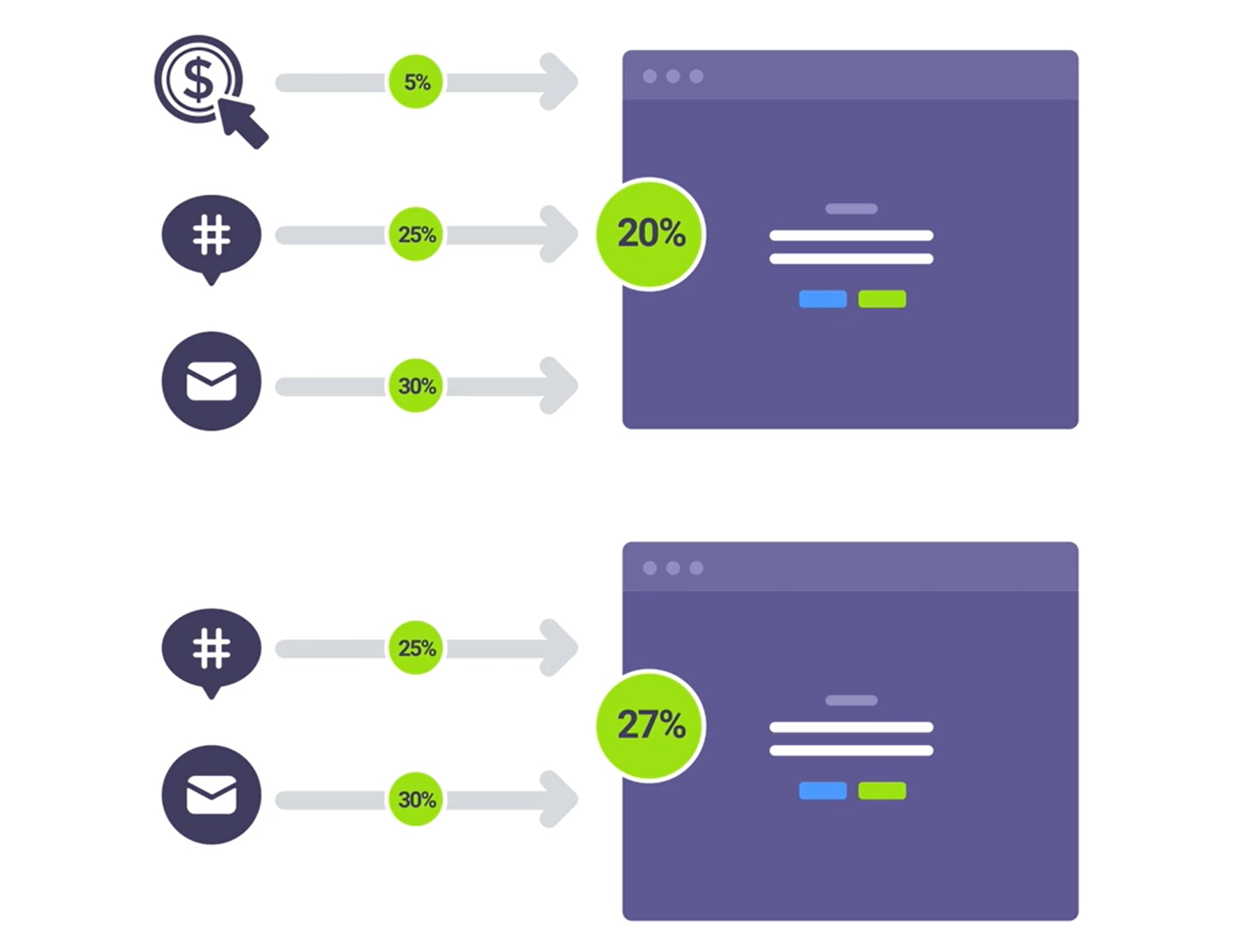
- Drop channels or campaigns that are dragging your overall conversion right down.
- eg. if you drop PayPerClick, the sites overall conversion rate would increase to 27% (from 20% only with 5% rate from PPC)
- or, optimize PPC's landing page to help that channel perform better
- Identifying the right kind of people
- It is important to present 1/4 action to users at the right time.
- If you drive people to your website the wrong time in their purchasing journey, they're not going to act.
- It is essential to understand the overall customers journey.
B. Decision making
1. Redesign (Unfamiliarity)
- When we do redesign, we need to ensure that there's a sense of familiarity with what went before and with other related websites.
If your site behaved a certain way at one point, it should be everywhere. It's a bit disconcerting to the brain when there's a shift in layout or changes in navigational labeling.
2. Help people to decide
- By simplifying the question emphasizing the positive benefits
- eg, let's say you sell sports equipment. If you ask people to sign up to their newsletter, then the have to wei h the pros and cons of that decision. But if you say sign up to get fitter, one can easily answer the question; would I like to get fitter?I
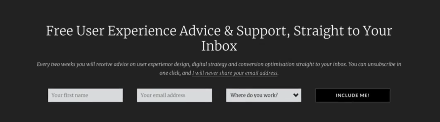
- If we can't control how the question gets simplified, at least address that simplification or any objections. For example, after contraction to sign up to a newsletter, make it very clear that we won't be spamming people and how often they can expect to hear from us.
- By using shapes and perception
- eg, a university that encourages overseas student recruitment. In interviews, many students are discouraged from attending some institutions because they didn't see photographs of people like them from their ethnic background on the website. They therefore concluded that this wasn't a place for people like them.
- Another example, in experiments, supermarkets found that when they play French music in the store, they increase the likelihood of French wine being sold and reduced sells of wine from other countries.
- By using shapes and perception
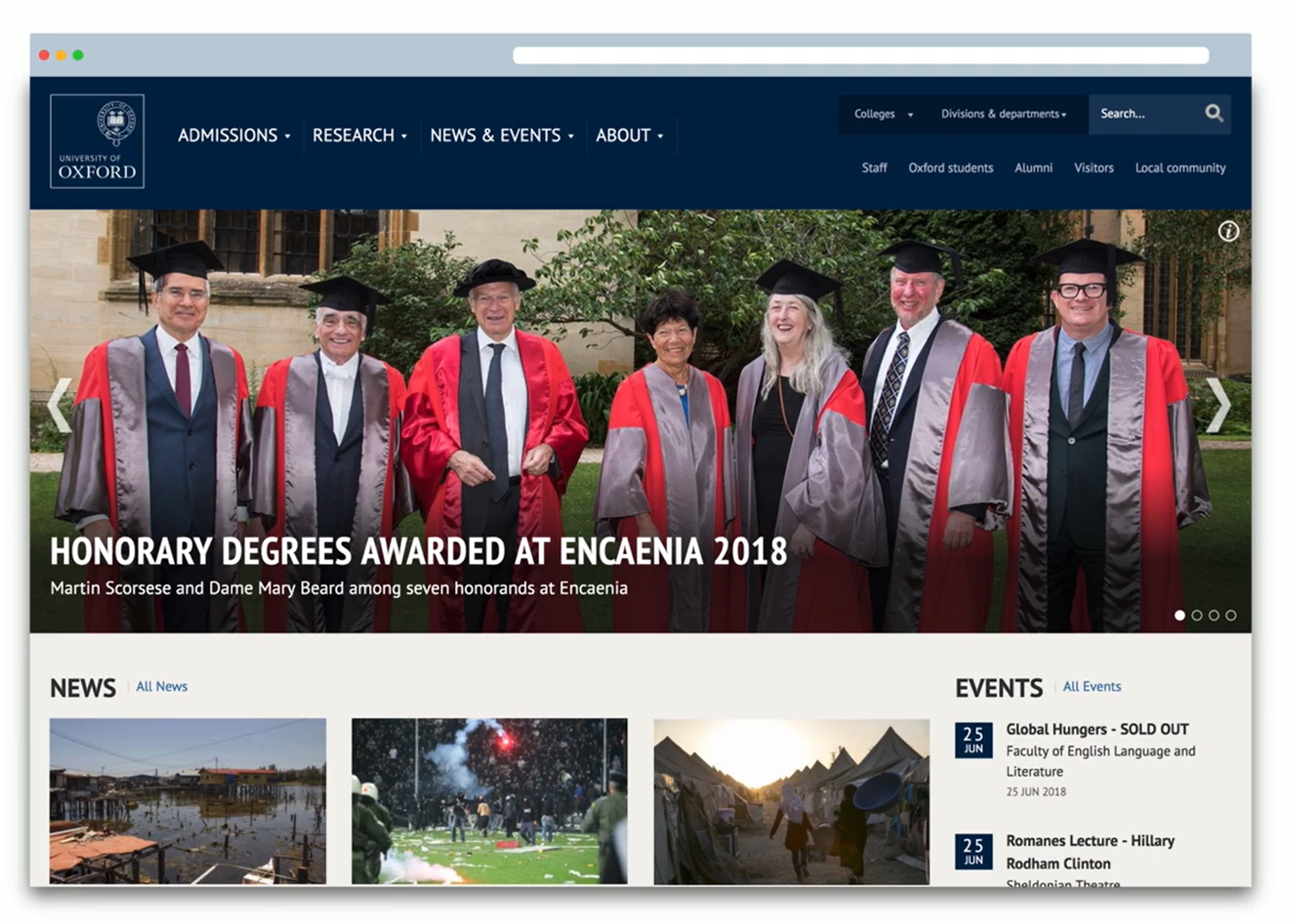
- eg, a university that encourages overseas student recruitment. In interviews, many students are discouraged from attending some institutions because they didn't see photographs of people like them from their ethnic background on the website. They therefore concluded that this wasn't a place for people like them.
- Another example, in experiments, supermarkets found that when they play French music in the store, they increase the likelihood of French wine being sold and reduced sells of wine from other countries.
- By using social proof to influence
- Other people has a massive impact in one's decision making and we can use that to give people confidence in the decision they're making.
We want people to make a fast decision, not because we want to rush them into buying, but because the longer they take to make a decision, the less confidence they will have in it, and the lack of confidence will either lead them to believe they're making the wrong choice or that increases the likelihood of them being unhappy with the result of their decision.
3. Know your audience
- Consolidate what you know (get info from marketing, support, sales team)
- Delve in the data (google clicks, most checked pages)
- Search social media (check company's following/ers)
After this, you'll be aware that, first, some of the information you have is out of date and needs to be checked to see if it's still relevant. Second, your'll notice gaps in what you know about users.
4. Focusing on a problem to solve
5. Turning information into insights
C. how to reduce cognitive load and why that matters
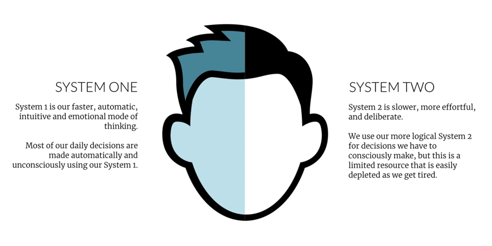
Cognitive load = if you're overwhelmed with the task involving a lot of concentration, you'll gonna miss other things.
1. The impact of cognitive load
- Every item that we add to an interface increases cognitive load and reduces the chance that users are going to see and process more essential elements.
- Also, websites that require us to think feel like hard work, and that makes us view the site negatively.
2. Familiarity reduces cognitive load
- That's why people love using sites like Amazon Facebook. It's not that they're interfaces are particularly well designed but it's just that they're familiar that using those services have become automatic. If they did do a big redesign, they would break the users mental model of how the site works and that would substantially increase their cognitive load.
- Influence of familiarity
- Avoid site redesigns when possible. If we do a redesign, do so with care
- Seek to ensure consistency and predictability
- Use common reoccurring user interface patterns (experiments are great but we need to recognize that this kind of design increases cognitive load and so isn't always appropriate)
3. Introducing simplicity to your site
- Reduce the clutter
- Hide secondary content
- Shrink supporting elements
- Create an obvious hierarchy
- Organize related content
D. Learn how to persuade people without alienating them
1. Create a sense of urgency the right way
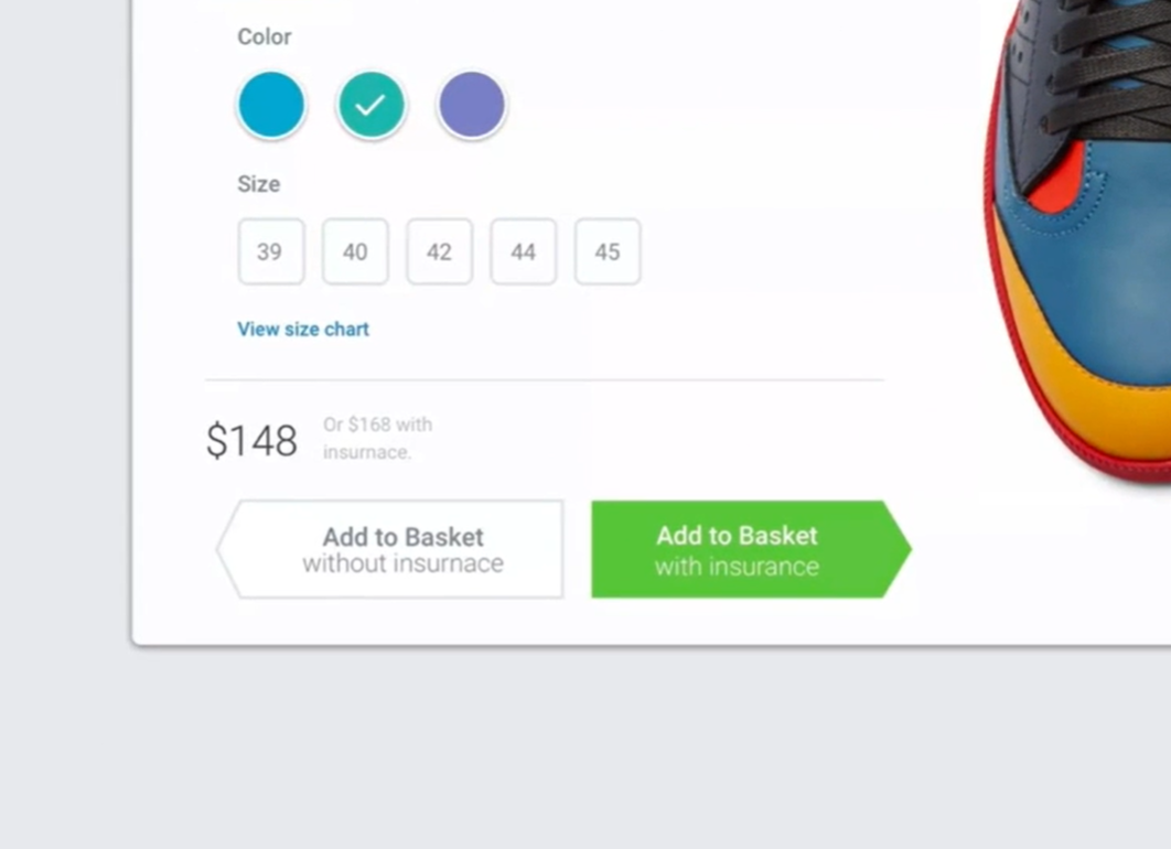
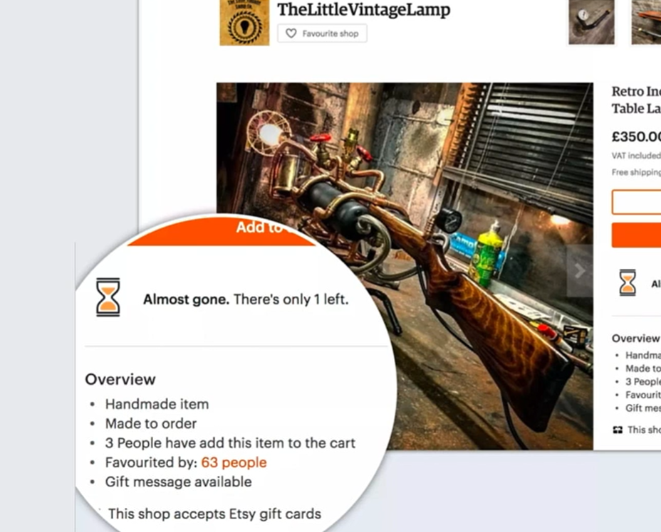
The main reason for avoiding manipulative techniques beyond the obvious ethical considerations is that it leads the buyer's remorse. However, manipulation isn't the only reason that people suffer from buyer's remorse. The longer somebody takes to make a decision, the higher the chances that they will experience buyer's remorse after they decide. They over think the decision and that leads to anxiety and often regret..
- Be honest and consistent with users
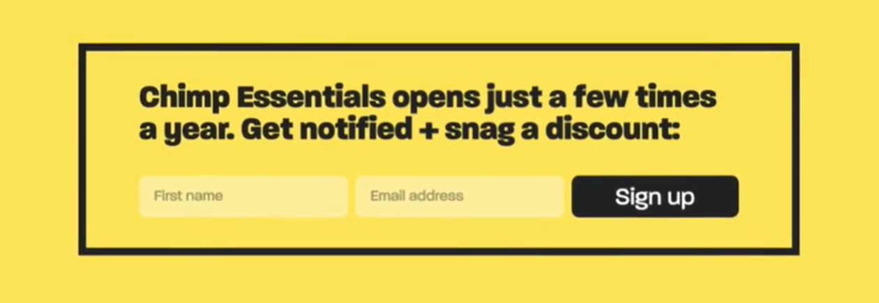
- Give users the option to change their minds
- Make the decision obvious
- The clearer the choice, the less pressure that we feel from a site
2. Positioning your offering in a positive Light
- Consider ordering carefully
- Watch what anchors you set
- Frame your offering positively
3. The under appreciated role of appreciation
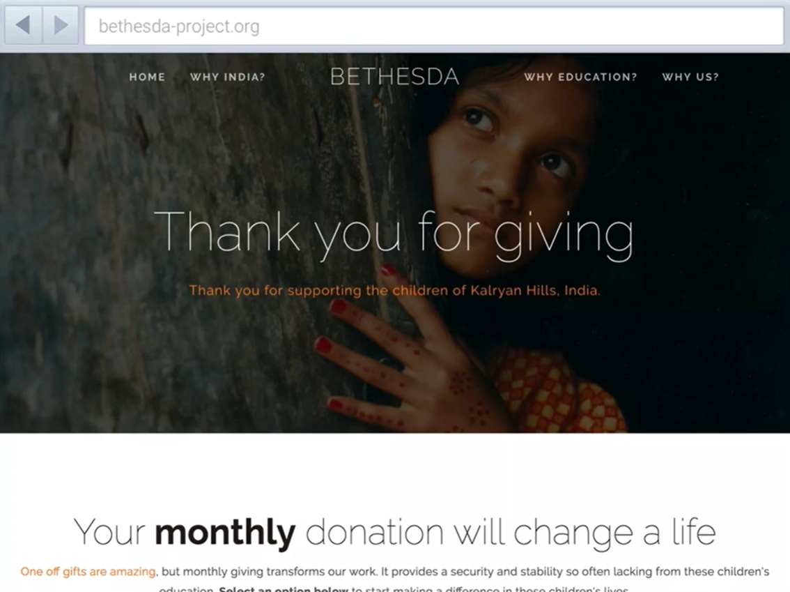
- Thank people
- A funny thing happens when you do acknowledge people, they feel obliged to complete the process because they want to be seen to do something that they said they will do.
- Listen and respond to people
- The Web enabled people to express their lights and frustrations by social media and review sites. Everyday, they're telling us exactly what they want and what they need.
- If we want to show users that we appreciate them, we also need to respond. If we don't answer when a consumer expresses a concern or a question that you learned, everybody else will presume that you just don't care.
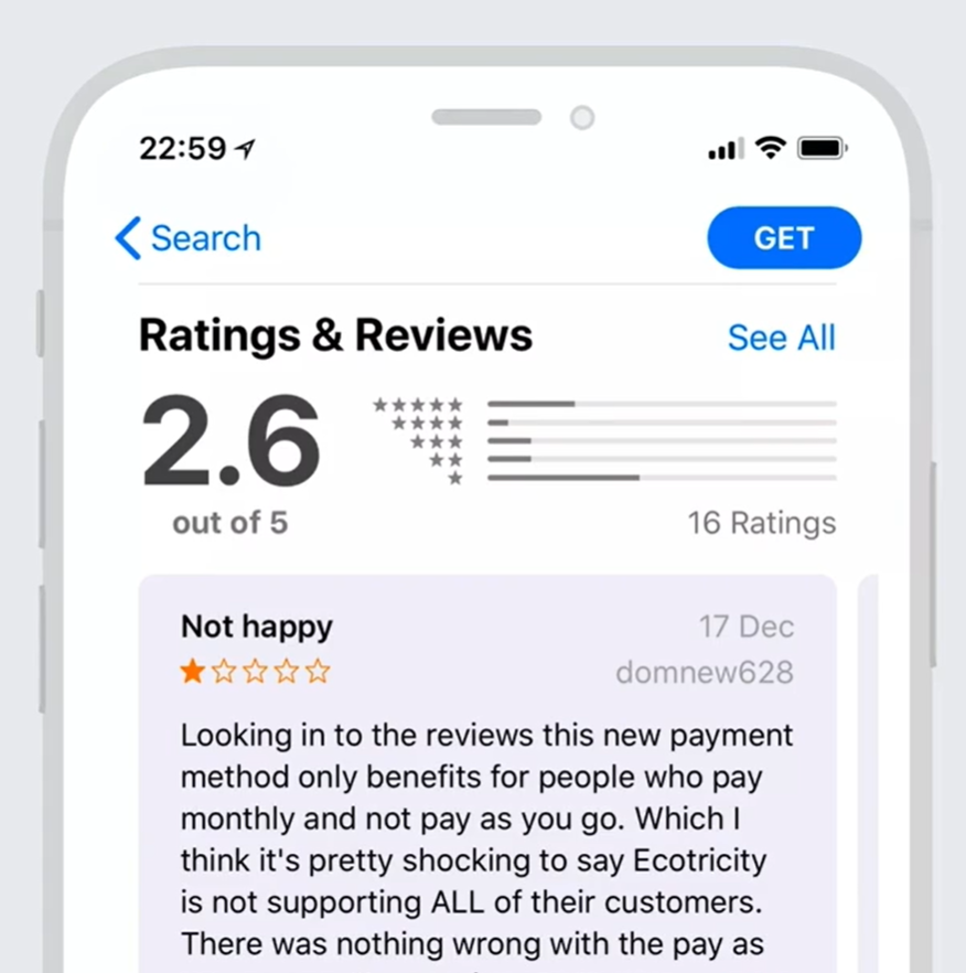
- Failing to appreciate existing customers is bad for future conversions.
- Appreciating existing customers
- From experience, receiving personalized token of appreciation from a business and immediately posting in social media helps with conversion and future prospect customers.
- By appreciating existing customers, you will turn them in to advocates who help increase conversion among new customers.

4. Why you should seek to reduce risk
- Understand common concerns
- Privacy. It's not enough just to adhere to the letter of the law if you want to alleviate people's concerns. In fact, some compliance rules do nothing but worry people, such as those intimidating terms and conditions that nobody's got the time to read.
- Concerns over security
- Irritations about spam
- On the alert for hidden costs
- What-if I want to change my mind?
5. The power of social proof
- Why it works
- For example, in a new or unfamiliar situation, we assume rightly or wrongly that the behavior of others is probably correct.
- We learn by comparing our behavior with the actions of others. We don't just presume that the choices of others of the correct one, we also conclude that they're socially the right thing to do.
- Or if somebody in authority tells us to take a particular action, were more likely to do so.
- How to use
- Ratings and reviews
- Testimonials - having somebody to actively endorse products for you
- Certifications - creates credibility and trust
- Overcoming cynicism
- Including comments that's less complimentary refinforces authenticity
- Linking testinomials to source
- Using video testimonial of real customers
6. The dangers of persuasion
Why people adopt dark patterns? Becaue they actually work, but sometimes the approach overlooks ethic.
- We do not see the cost of dark patterns leading to downfall of conversions in the long run.
- Why you should steer away from these?
- Consumers are cynical, savvy and spoilt for choice
- One disgruntled customer can undermine a brand
- Buyer's remorse costs a business big time
Dark patterns aren't even the most effective approach.
7. Why and how to gain the trust of users
- Be professional
- They will presume that because you have demonstrated a lack of attention in one area, then you're likely that this is being reflected across the whole of the organization, and that's going to impact the conversion.
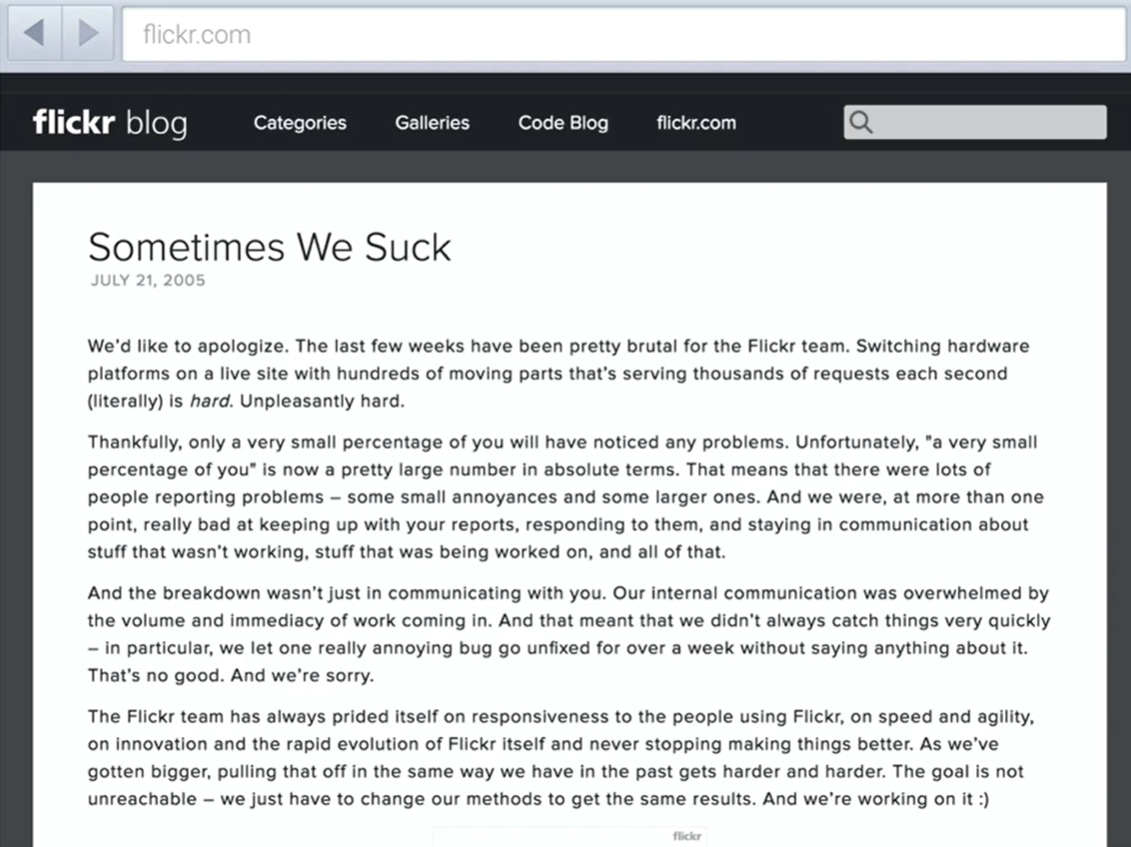
- Improve your communication
- By keeping customers up today about the state of their order, we reassure them that everything is under control, and that builds trust.
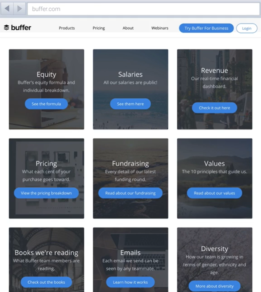
- Prioritise transparency
- Remember to be human
- If you want people to trust you, don't be afraid to inject some personality into your writing. At the very least, you should be writing in a way that actively engages and has a more conversational tone.
E. Improve your conversion rate into the future
1. The Case for Continual Optimisation
- Make sure clients get significant conversion
- Why you need to avoid periodic redesign
- redesign cycle is damaging
- wasteful and expensive
- Solution: Incremental improvement based on data
- saves money
- having data to inform decision speed up the data as well
- promoting more engagement
- Although some redesigns are necessary as it suit organization's business model
2. Building an Evolutionary Process
- You dont have to redesign often - the difference is the scale of changes
- Digital discovery phase are significantly shorter
- Assess what actually is success for clients
- Proof of concept
- use of prototypes - essential during conversion
- then you could refine prototype by adding fidelity
3. Integrating Testing Into Projects
- Testing design aesthetics
- whether client like it or not is not the only thing thst you should test
- you have to be specific like: what does the client want about the color green?
- It will give you powerful insight about the client's measure of success
- Try semantic differential survey
- is your design formal or casual;
- scale should be even number; forces you to lean into one or the other
- put the design alongside a competition and let them choose
- Usability testing
- do the testing early and often
- 2 valuable test:
- snap text (show the prototypes quickly) | if they struggle to recall
- first click test
- testing after a website goes live
- We persevere longer since people are watching
4. Running Usability Testing
- When you start testing, you will see its value
- How to conduct usability testing:
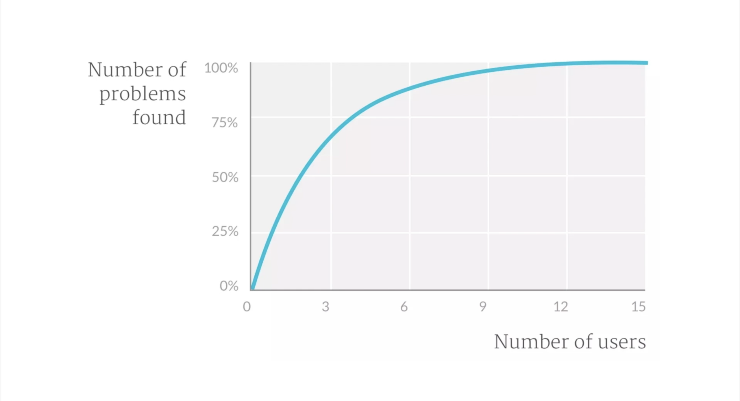
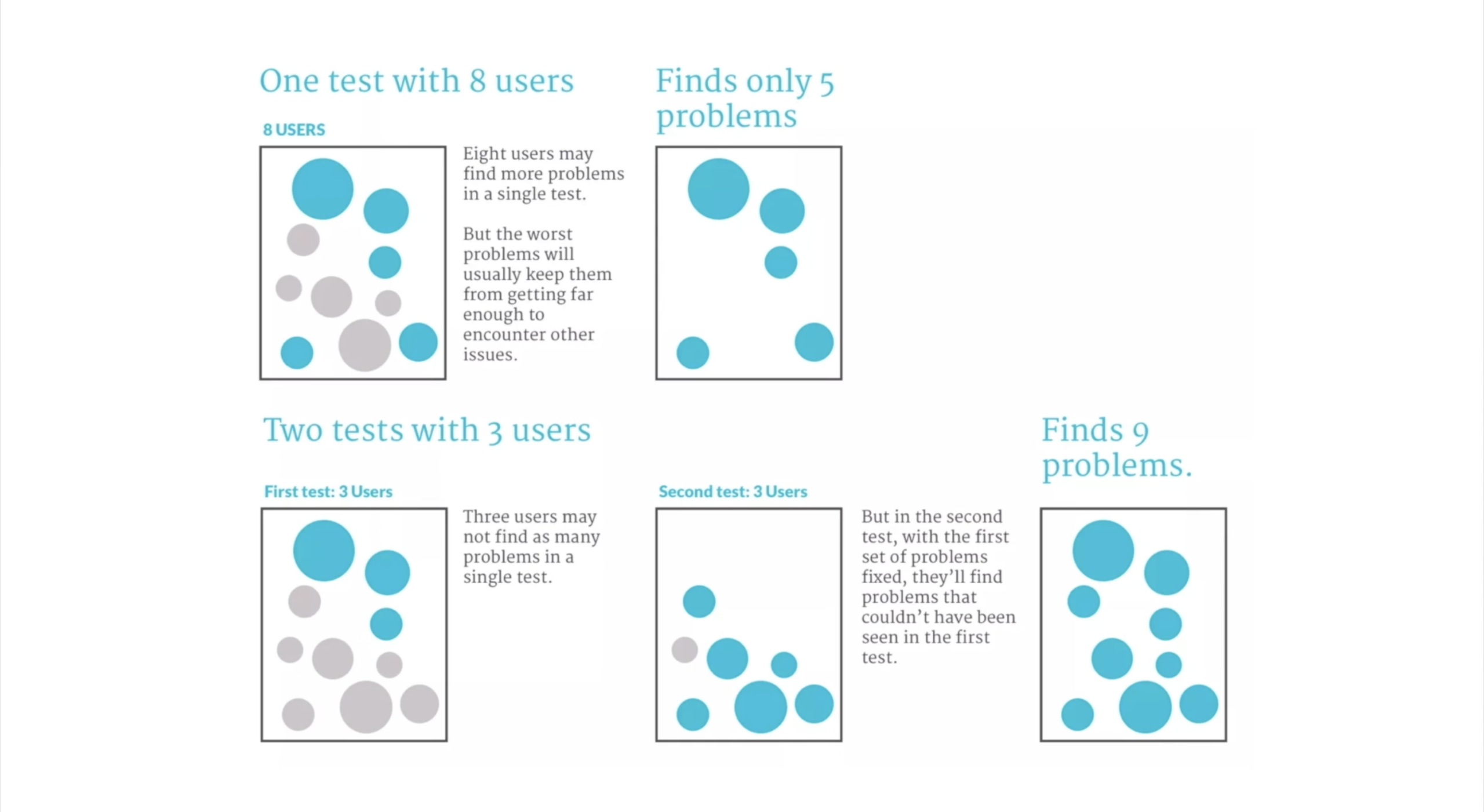
- you dont have to test a lot of people in usability testing
- the key is: rounds of testing
- dont be too prescriptive
- shorten the testing process
- compensate people for participating
5. An Introduction to A_B and Multivariate Testing
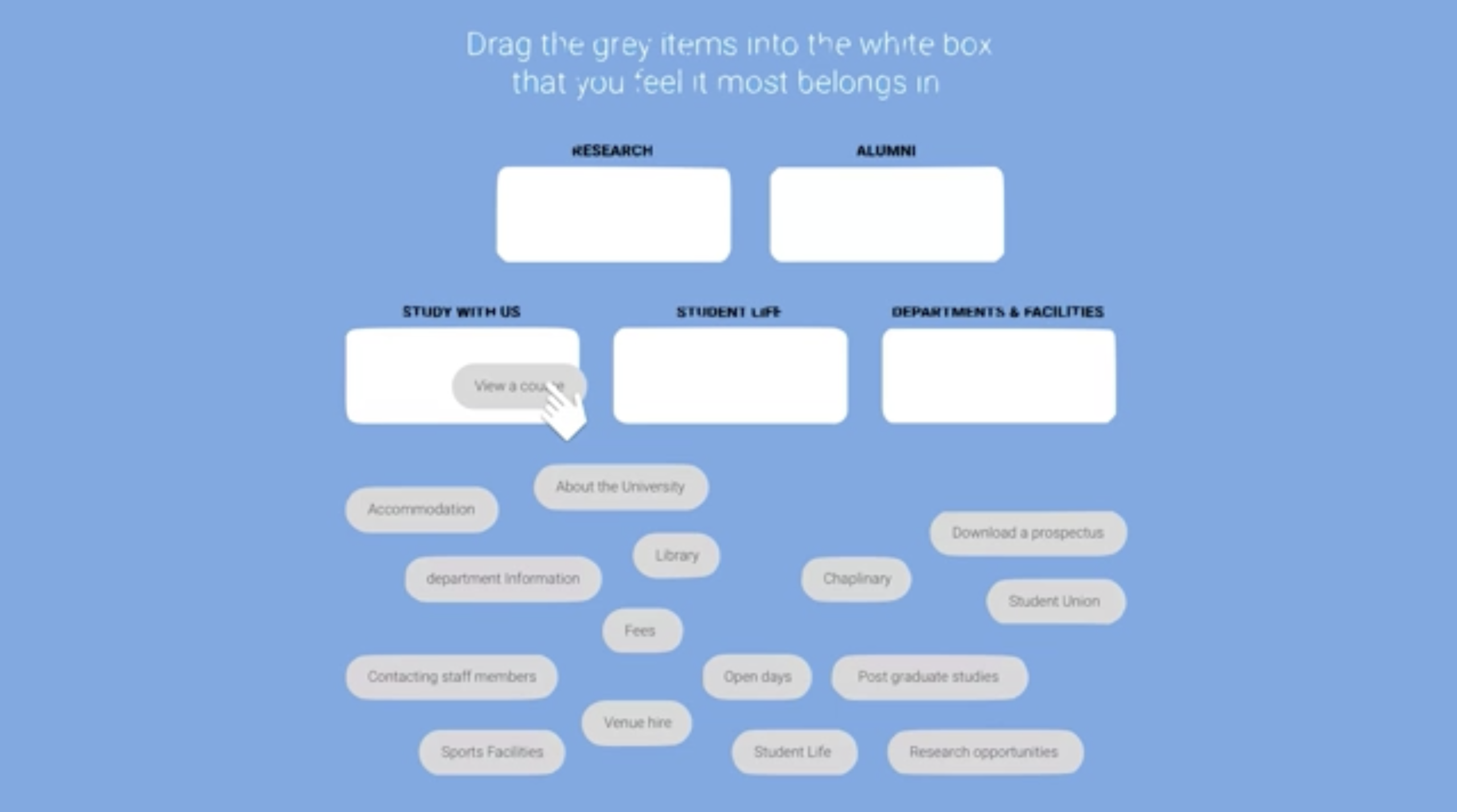
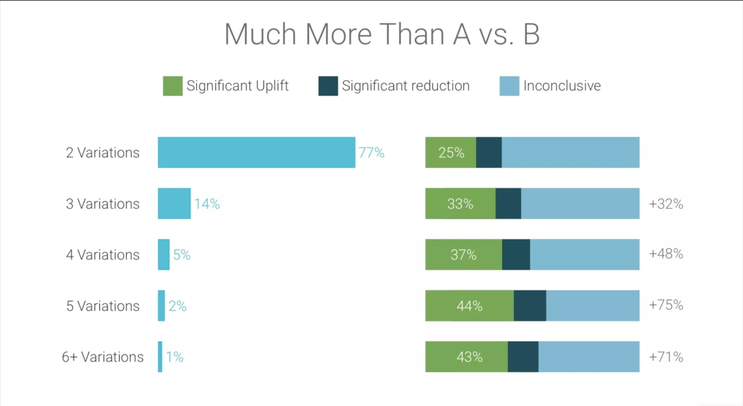
- Introduce different variants so you know which variant to roll out to everybody
- Google Optimize
- Decide how to measure success
- Microconversions are essential
- increases traffic
F. Create compelling calls to action
1. Pick your moment to ask users to act
- Call to action button psychology
- Make use of cookies - Powerful tool for remembering essential information when user visit the site,
- Could use wide variety of information of user behaviour such as but not limited to:
- How many times the users visited the site?
- Which pages they viewed?
- How long they spent on the page?
- Details they might have shared
It helps picking the right moment to display appropriate CTA
- Example: if a user returned to the site for the 2nd time, a call to action can be provided for the product they spen the most time. Looking out on their previous visit
- Example: A user has donated once in a charity site, you may want to encourage them a regular donation the next time they visit the site.
Track what users are reading
- Example: When users are hesitating to add an item to the cart, a pop up of discount code may be the nudge they need
- Example: if user is spending time on reading the blog post, it might be the perfect moment to ask the user to sign up in the newsletter
Consider the Referral source
- Example: a user arrived in your website from a review site, user might be down to purchase process
Factor in Date and Time
- Seasonal:
- Example: Showing CTA for Christmas
- Daily (Time of Day):
- Example: Showing meals on a food delivery app at different times of the day (ex. Breakfast, lunch, dinner)
- Example: Flight booking site might not business booking flights during the days and holiday flights during evening
Note: That’s not to say people do not book during that time of the day but you might find it favoring business bookings in business hours increases conversion.
Take Into Account The Device
- Users tend to avoid Data entry on phones.
- Solution might be to provide a customized CTA that reminds people to complete the form later by asking their email address.
Track previous CTA
- Avoid showing CTA to users who have already completed.
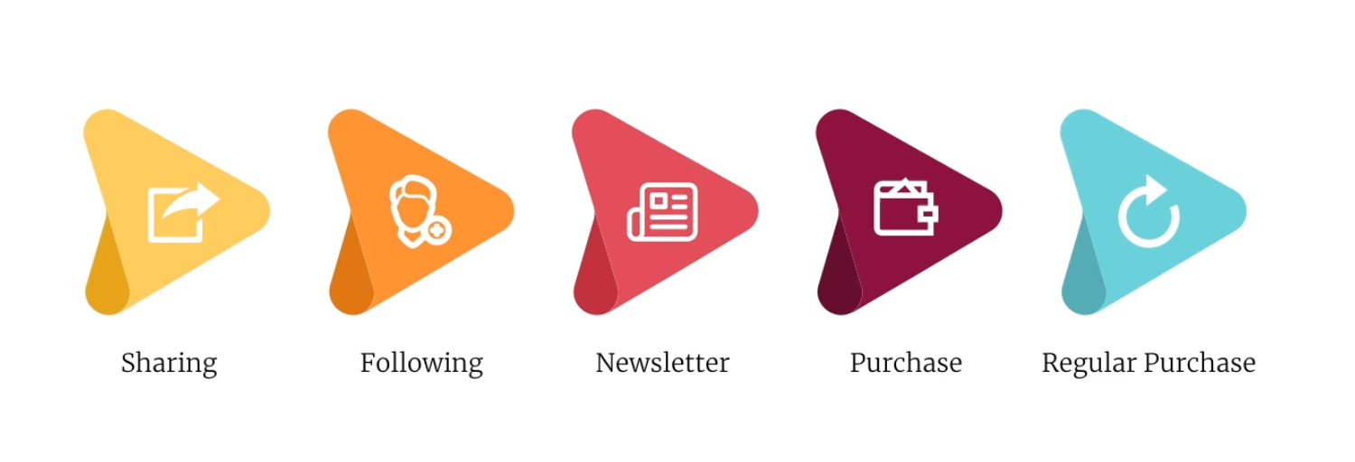
- From least demanding CTA to most demanding. The idea of this is to move the users from simple CTA all the way to demanding ones.
2. Design for Maximum Visibility
Optimise Positioning
- How users scan a page (left to right then top to bottom) - knowing this may help where CTA could be effectively positioned on the page which is on the left side rather than the right side of the page even if it is positioned lower on the page.
Use Imagery with Care
- Associate your image to your CTA that users will tend to focus on CTA instead of the image.
- If there is a disconnect in your CTA and image, users may tend to skip CTA focusing more on the image.

It is also necessary to Consider the Content of the image
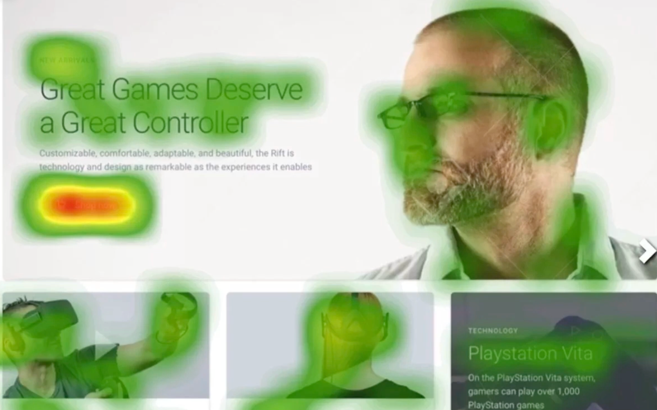
- Visual cues will tend to draw people or users attention to or away from the CTA
- For example the image contains a person, We will tend to follow the eyeline of the person
Maximize Negative Space
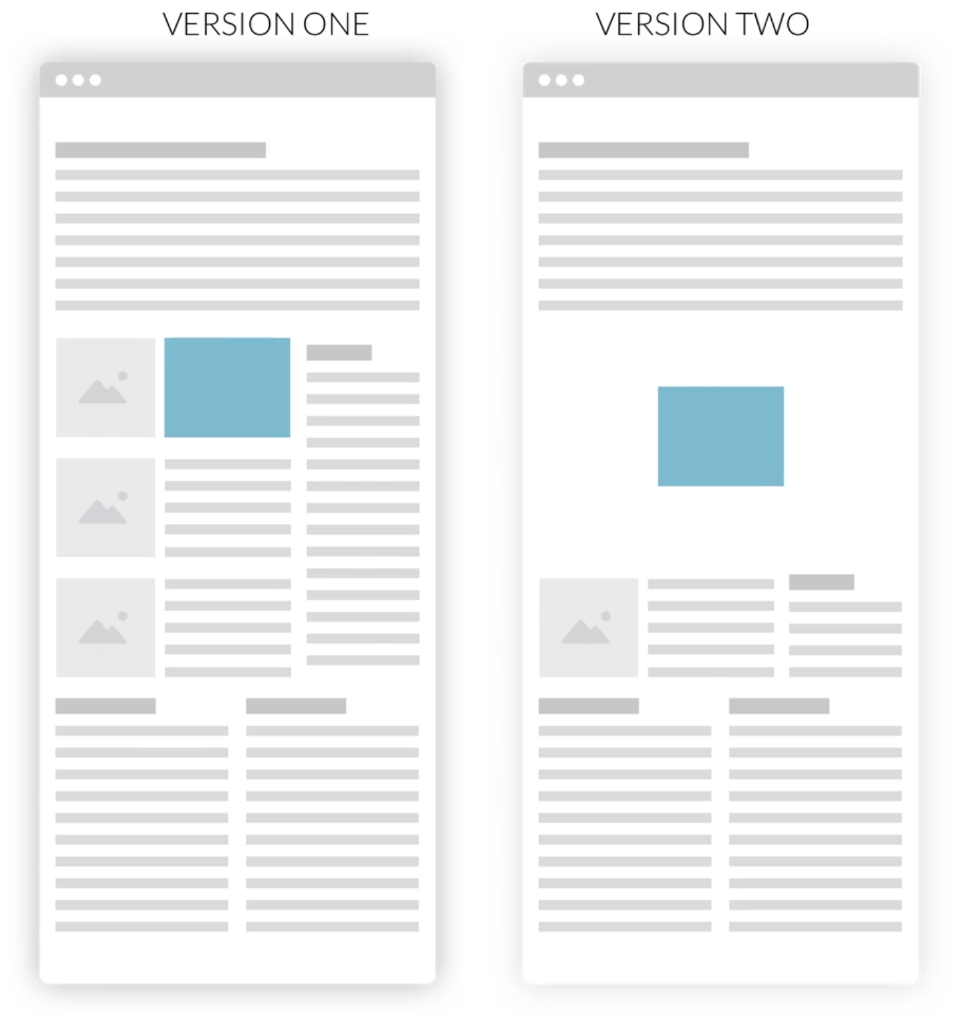
- As users have an attention span of 8 seconds, more elements makes user to get distracted and not focus on the CTA.
- Should reduce number of screen elements
- Maximize the amount of space surrounding the CTA, it leads users to nothing else to latch on to and so attention is drawn to CTA.
Contrast with Color
- Create CTA with contrasting color from other elements to help CTA stand out and it will have more visual impact.
Apply Subtle use of animation
Movement draws attention.
- Avoid Looping animations that can cause distractions to users preventing them to focus on your message.
3. Writing compelling CTA
Put credibility before hype
- It comes with a cost if the headlines are unable to deliver on their claims (Example: clickbait)
Balance Benefits with Features
Be Concise, But Favor Clarity
- People tend to scan copy the key phrases that answer their questions.
- The copy should be as long as they need to be, make use of the following:
- Headlines
- Subheadings
- Lists
- Pull out quotes
- And other typographic aids
This can help break up large block of texts and allow users to identify the parts of copy that might be relevant to them.
Focus on Objection Handling
- addressing any questions or concerns that user might have
Associate objection handling with CTA
- Dont go make people searching for it.
Use Emotion to Encourage Action
- use of “Click now” or “Act Today” it creates a little sense of urgency without spraying manipulative techniques
- Make use of emotional phrases (ex. Challenging, delighting)
Think about structure
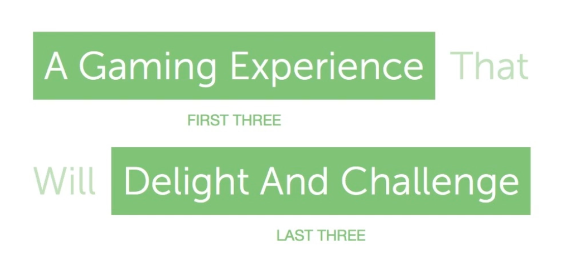
- Users will only take the beginning and the end of the headline.
- Make headlines short as possible
4. Consider the post-click experience
Provide Positive Feedback
- Thanking users after finishing a CTA for example, a user finished a checkout process.
- It helps acknowledging users
- It reassures the user that they made a good decision, reinforcing that they’ve done the right thing
Provide a safety net
- Be able to know that users can unsubscribe easily from newsletter
- Be able to contact you in case they get in trouble (ex. Financial sites, trouble with checkout process)
- Live chat: Reassures users and guide them to trickier aspects of the site (avoid using live chat if it is unmanned)
Remove Distractions
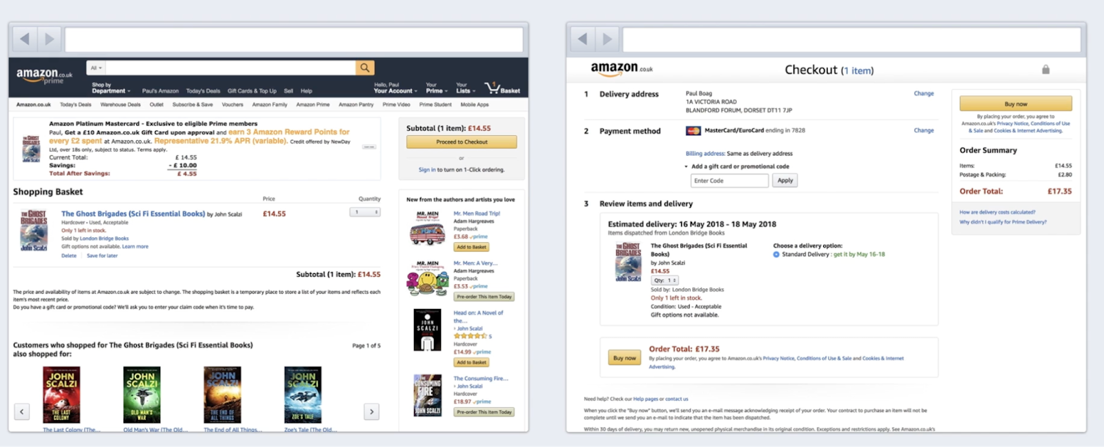
- It is essential to let users focus entirely on the completing the process as distractions may tend users to abandon the process when introduced to many distractions such as upselling additional items and adding CTA that makes users to signup to newsletter and such.
Maintain Momentum
- Users are more likely to complete a conversion process if they feel a sense of momentum
- If they think they are making a positive progress towards the end goal, it invites them to be reassured in every step of the way. Don’t wait the user to submit the form before you validate it.
- Speed up the process by filling in the data you can.
Optimise you Form Design
- Defaults - If more users buy on a specific country make the country default in the dropdown list.
- Forgiving - reducing to a minimum that a user needs to enter data Be flexible and accommodate any formatting and then reformat to have a clean database. Do not be strict on format ex. Rejecting after not following a specific format ex. entering a telephone number or zipcode.
- Avoid using multiple columns
- Don’t forget to distinguish between optional and required fields
- Validate your forms by placing any error messages next to the field
- Explain what the problem is and how to fix it
Conclusion
- Hiring a proper QA and UX Researcher is essential and not an option. It's really important to conduct surveys, thorough testing with our customers if we want to improve our services.
- Testing is just as important as designing our products.