DC2 - Dec 08, 2023
Creative Web Design
By Olga Shevchenko

A. GOALS - SMART
SMART. Definitions: what an achievable goal is; how to set goals correctly; what goals are for.
1. S-pecific [SIMPLE, SENSIBLE, SIGNIFICANT]
- When drafting your goal, try answering the following questions:
- What do I want to accomplish?
- Why is this goal important?
- Who is involved?
- Where is it located?
- Which resources or limits are involved?
- When discussing sales and earnings, it's essential to express the value either numerically or through some tangible outcome.
2. M-easurable [MEANINGFUL, MOTIVATING]
- It's important to have measurable goals, so that you can track your progress and stay motivated.
- HOW much?
- HOW many?
- HOW will I know when it is accomplished?
- Your goal also needs to be realistic and attainable to be successful.
- "I want to be rich" is not a goal but more like a desire. To make this a goal try saying "I need to increase my earnings by 30k in 6 months".
3. A-chievable
- Assess your capabilities and set a goal that you can achieve at the end.
- How can I accomplish this goal?
- How realistic is the goal, based on other constraints, such as financial factors.
4. R-ealistic [RELEVANT]
- Your goal should not affect your health, work, or relationships with loved ones. It should be sustainable and not harm you or others.
- Does this seem worthwhile?
- Is this the right time?
- Does this match our other efforts/ needs?
- Am I the right person to reach this goal?
- Is it applicable in the current socio-economic environment?
5. Time-bound
- Every goal needs a target date, so that you have a deadline to focus on and something to work toward.
- When?
- What can I do six months from now?
- What can I do six weeks from now?
- What can I do today?
- This will help you know if you can manage your time well.
Creating a goal and analyzing the results will help you understand if you are achieving goals easily or if you need to do something else for it. As soon as you fulfill your first goal, then all subsequent ones will appear. You will be able to set new, more ambitious goals for yourself and trust me, you will know how they are achieved.
B. Visual Bank
How to stay focused on the positive things and where to look for inspiration.
1. Where do I look for inspiration?
- You should look for inspiration everywhere.
- Ask yourself - what do I have to do to become an amazing designer in a year? It's obvious - you have to work.
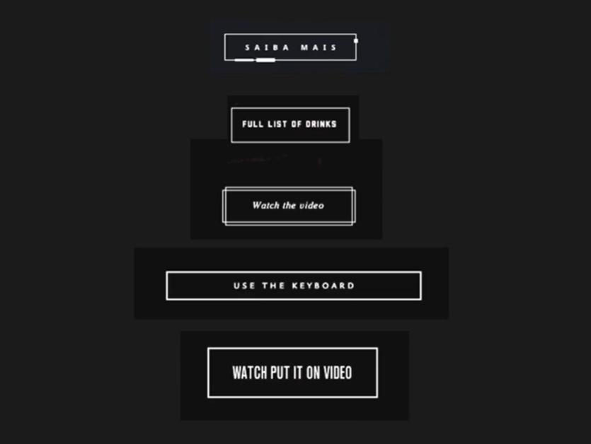
- Start with simple stuff — draw lots of variation of one element (eg. button)
- Think outside the box
2. Stealing isn't (always) plagiarism
- Plagiarism is finding some works and saying you made it. Stealing however is taking someone's idea and adapt it to your project. Feel free to steal ideas. After all, there are so many people in the world that you might just have the same idea as sorneone else.
3. Steps
- Copy
- When you find something you like, copy it. If you like a button — try to recreate it.
- This will give you a certain understanding of how some things work.
- Save the things you steal
- Sometimes you steal an idea, you like it a lot, but you don't know where you could use it yet.
- Read a lot
- Whatever you read, reading activates your imagination in a unique way.
- Look around
- This will help you understand what feels good for you as a creator and you will have some stuff to add to your visual bank.
- Ask "Why?"
- Ask the developer why certain objects are arranged in a certain way. Ask The designer was used some particular shapes etcetera.
- When time comes, you will already know some insights that you only got because you're brave enough to ask questions.
"How I make my own creative projects?"
I steal a lot. I based my own designs on the scenes that I like about other websites. Here is a technique that I want to share: let's imagine you're making a website and there are several objects from your visual bank that you want to use. Try to combine them. Your button inspiration might come from one website. Your font idea could be from another one and so on...
Sometimes combining several objects won' t work, that is almost. But sometimes it will, and trust me, it will be awesome.
C. Basics of composition
Knowing the basics of composition will help you make your works visually appealing and interesting.
1. Composition
- Composition is the way in which design elements are put together or aligned and arranged to create a balance and visually appealing webpage.
- A good composition creates an easy way for readers to navigate your ebsite while strengthening the main message that you want to communicate to them.
- Symmetry - Basic point of composition
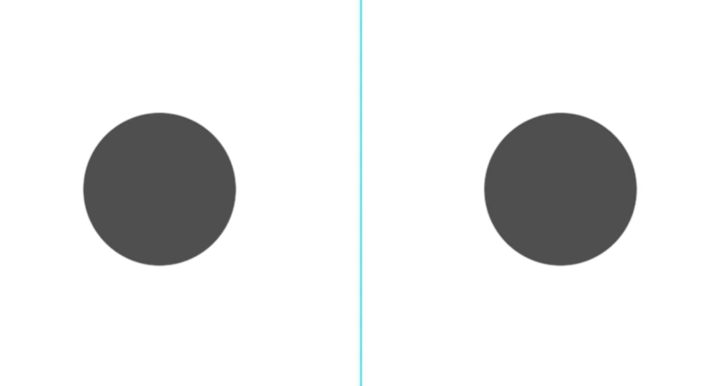
- This happens once the composition of design is distributed evenly around a central point or access. This symmetry can be horizontal, vertical or radial in its form.
- Types of symmetry - Reflective, Rotational, Translational symmetry
2. Basic elements of composition
- Contrast, color and mass
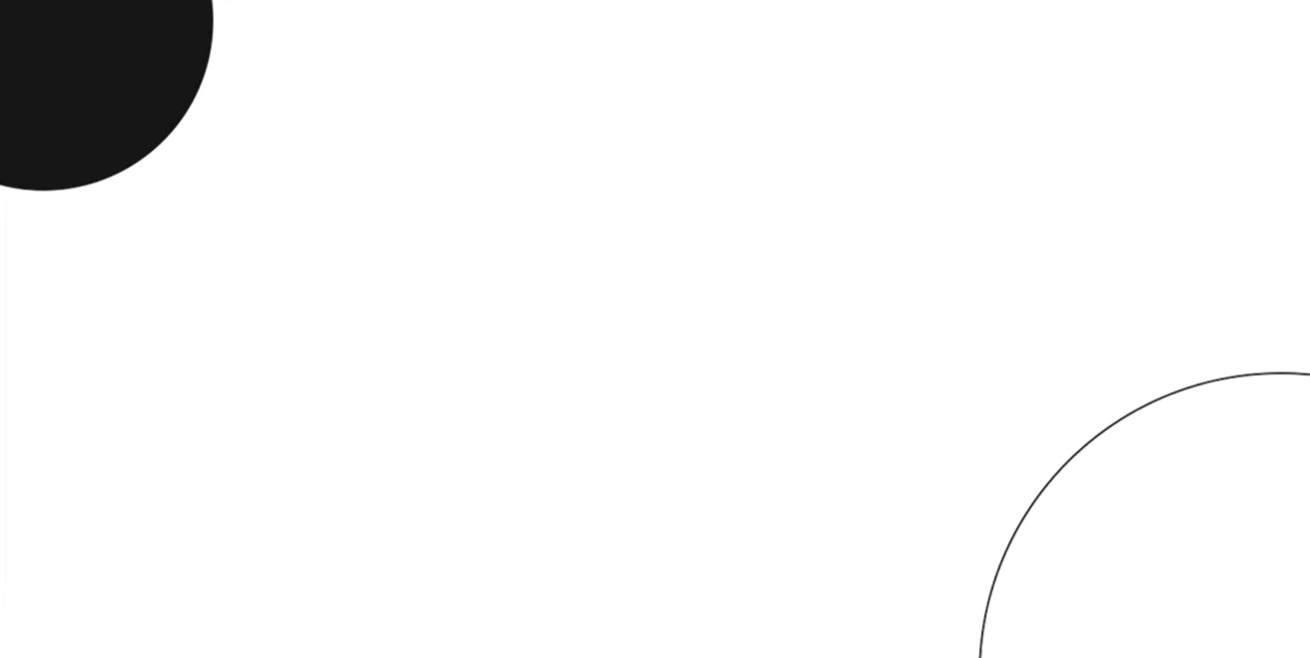
- One of the first laws is that the best place on the sheet in terms of a composition is the upper left corner.
- And it's also influenced by the habit of reading from left to write for most languages except for Arabic.
- It's always important that the entire composition on the sheet is the balance in relation to the size and masses of the objects we are using.
- Characters
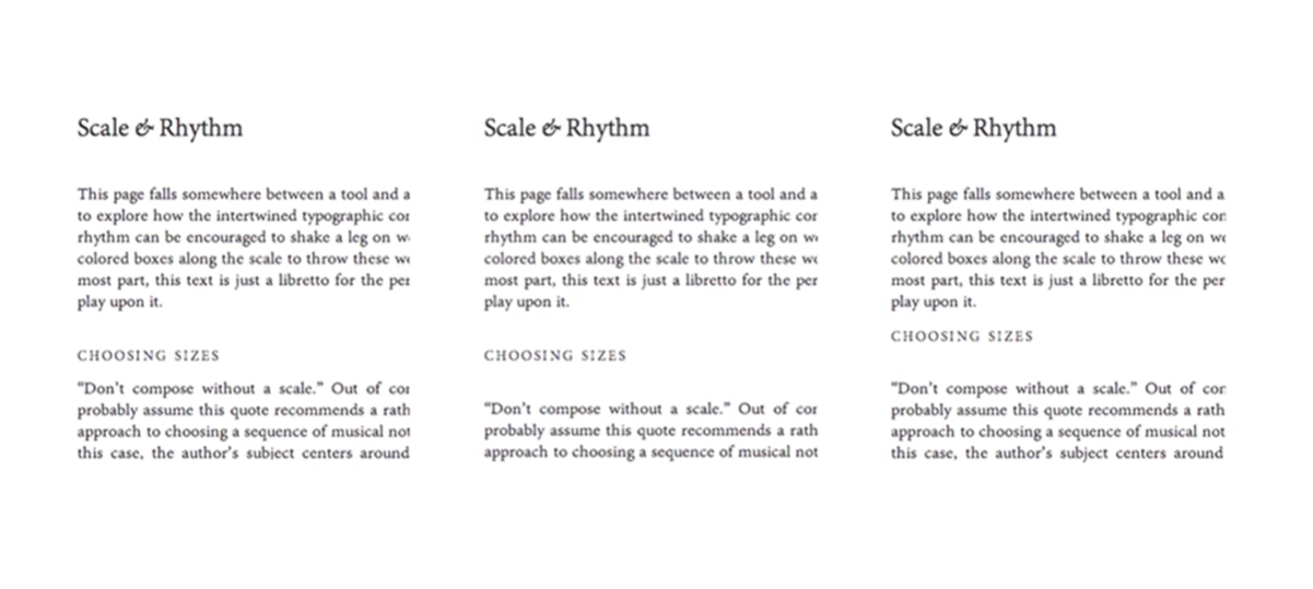
- This really helps us a lot in web design. When we work with big amounts of content to make sure we place information in the best way in order for the reader to understand the main points.
- Optical characteristics
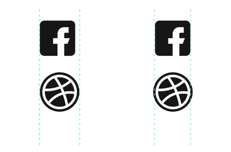
- Each element has their own optical characteristics.
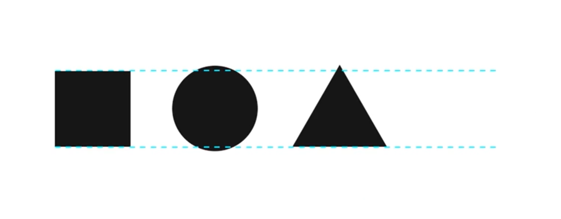
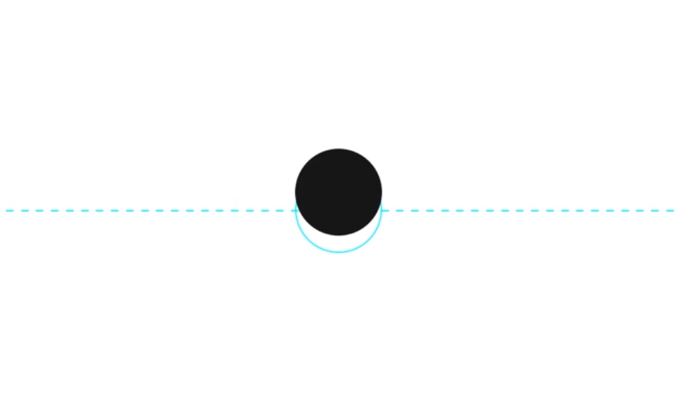
- Center of the sheet rule
- When we look at our screen, we draw a horizontal line exactly in the center of it. Then if we place a circle in the center, it will seem to us that it is slightly below the center. In order for it to appear in the center of the shape, it actually needs to be slightly higher.
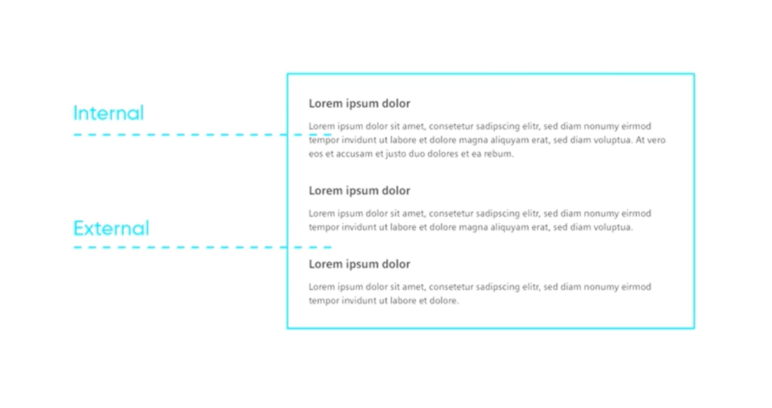
- Internal and external
- The main rule is that the internal distance of the elernent must be shorter than the external one.
- Helps organize text or element layouts, avoiding crowded designs; utilizes Proximity, a Gestalt Principle, for element grouping.
- Rhymes and rhythms
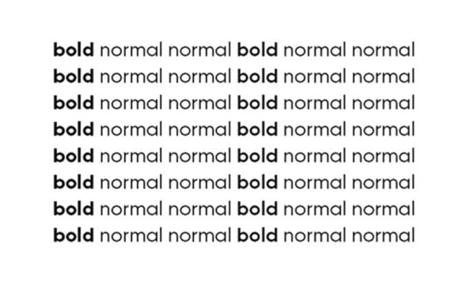
- This may simply mean being able to perceive a repetitive pattern that captures users’ attention easily.
- Incomplete object rule
- This is when the viewer is able to perceive elements as a whole even there are gaps in between each element. We usually use it in creating a logo like letter logos which can create new perspective. Example: here (S and 2 hands).
- Common background rule
- Elements are perceived separately but can perceived as one when using similar background. This is used commonly in elements like icons, providing similar background colors can help users view that each element are related to each other. For example the icons on the menu are perceived as a group of social media platforms.
- Connection rule
- Being able to perceive a connection between each elements with the use of a single is commonly shown on layouts like Procedure or steps layout here and Order/Progress step layout here .
- Fitt’s law It predicts the time on how the user can easily navigate from one element to another. It can be in relation to ergonomic of the user. Example: here
- Creating buttons that are commonly visited by most users are tend to be positioned depending on the user’s comfort.
- Hick’s Law
- Giving more choices for the users to choose from may take them a while to decide. In relation to this, the average human attention span time is only 8.25 seconds which will not help the website have its users finish what they want to accomplish. Though some elements are many which is mainly seen on e-commerce websites like shoppee, lazada and amazon. Even though there are a lot of products to choose from, there is a way on how a user can last more than its attention span time and this is when elements layed out like card view.
- Simplification law
- If you put together a number of complicated abstract shapes and combine them, you will create an object that your user will perceive as one instead of of breaking it down to components. So if you want your user to see the components as separate units, simplify the layout, making it more obvious where everything can be found.
- Utmost position principle
- This rule teaches us that the human brain remembers the first and the last unit of information that it's given best. The same goals the very top of the page, it should make clear what your brand is exactly because this is what will catch the eye of the user. The top of the page is also where you should place the main message of the website explaining its purpose etc. Don't forget to add relevant visuals too.
- Highlight rule
- The object that looks different from a lot of similar ones gets memorized the fastest. If it contains certain highlights, make sure they are surrounded by some simpler objects, otherwise they won't be highlighted anymore.
Working with composition is always an important part of the process. You need to learn how to work with composition so that it conveys the emotion of your site, not just a beautiful part of the interface, but your reliable foundation.
By trying different approaches to composition, you will learn how to assemble the future look of the site in your head. Place elements on the screen so that nothing "sticks out" anywhere. This is similar to the "visual bank" above, but more subtle in some way.
All in all, composition is indeed a profound basic science that requires a lot of practice.
D. Typography
Construction of letters. How typography works on the web. Using typography when working with content on the site. What to consider in typography when designing.
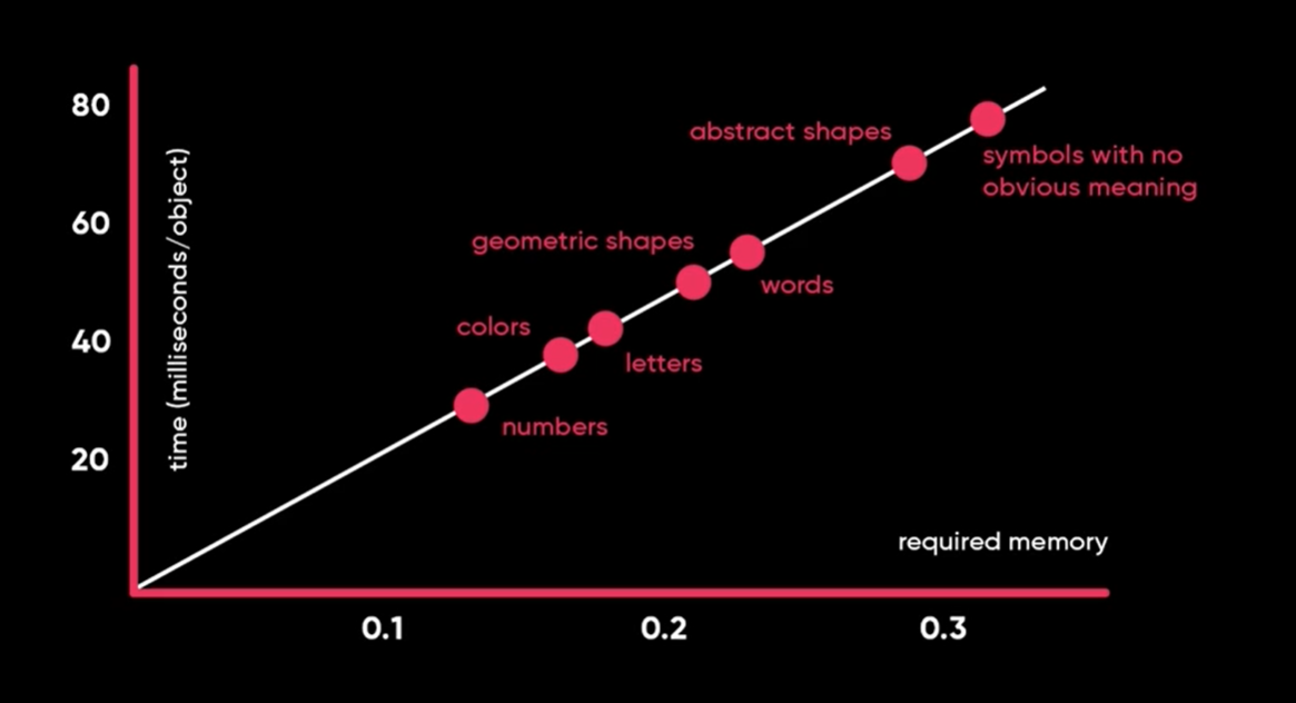
1. 7+-2
- Human memory is designed to memorize an average of 7 objects in one go.
- When there are 10+ objects, it makes it difficult for the brain.
2. Contrast of sizes
- If we have 2 objects, we want to make sure they are of two very different sizes to create the contrast.
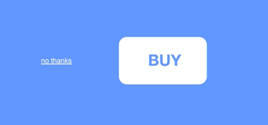
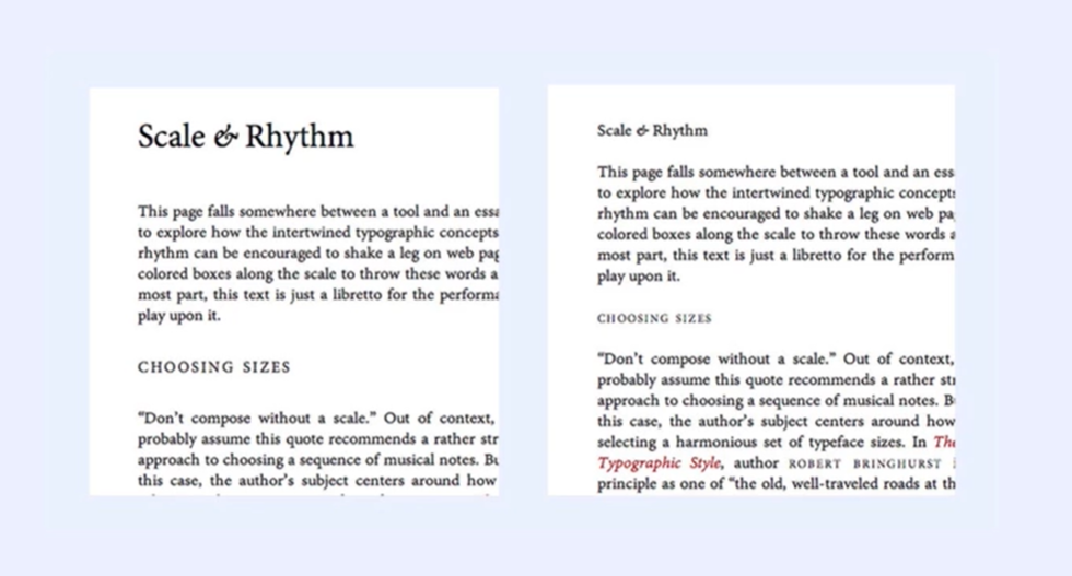
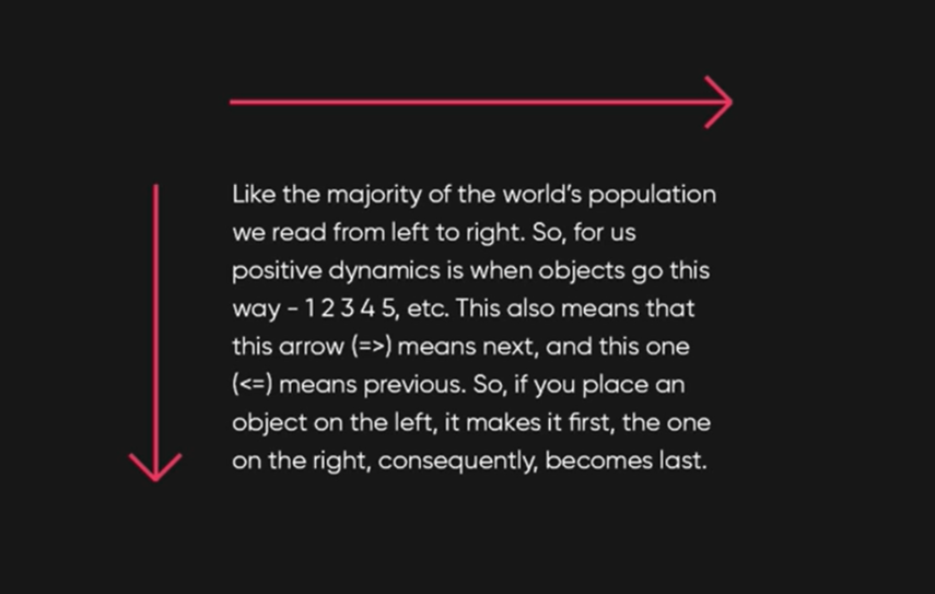
3. Positive dynamics
- Pay attention to what is the most important in your block. It's also a bad idea to use small pictures with big titles.
- Keep in mind that visuals are more memorable than text because colors are easier to remember than numbers.
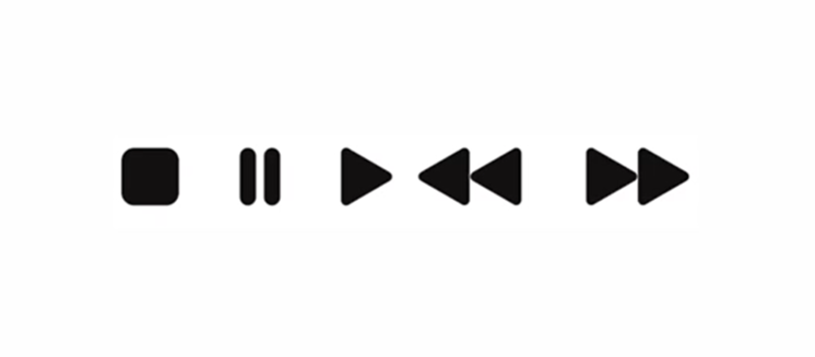
4. Pictograms
- Unknown pictograms require introduction.
- If you're developing a website or if it's supposed to work long term, then at some point you can remove your explanation. However, if it's a corporate or a promo website, it won't work this way.
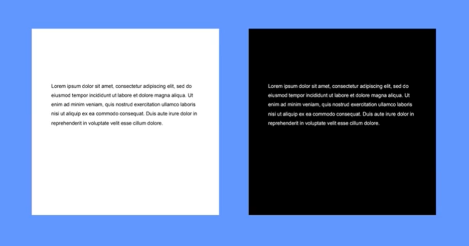
5. Contrast of the background
- Even though black letters on a white background are easy to read, white letters on a black background aren't and here's why: black background conceals the outline of letters, making them look way slimmer.
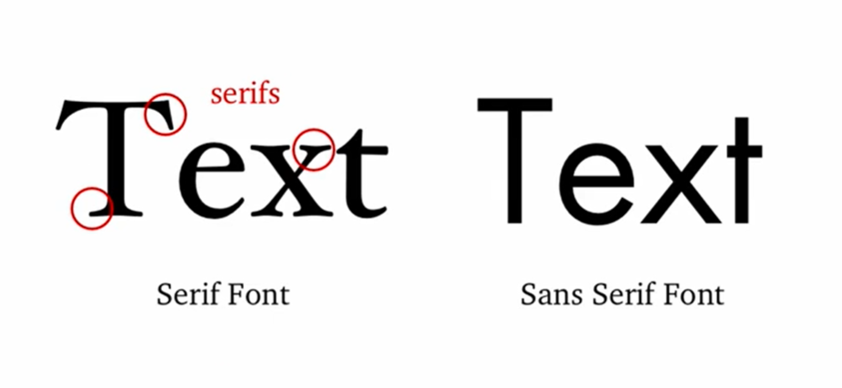
6. Serif
- There used to be common beliefs that serif is easier to read. It has to do with the fact that in 18 to 20 centuries people would read newspapers and books and the fonts were similar. So everyone gets used to serif nowadays. However, people have switched to gadgets it and got used to sans-serif. In fact, serif has become harder for us to read. So if you're using it on your website, it's best if you use it in a highlight rather than apply it to the entire text.
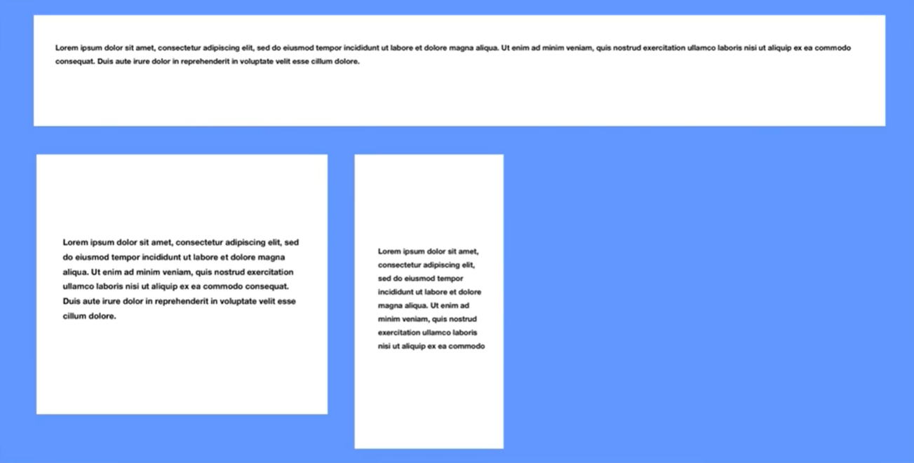
7. Length of the lines
- Average length of a line should be 50-60 digits if our font size is 12-14. This will let users read through the lines without getting tired as they will not tilt their heads from left to right.
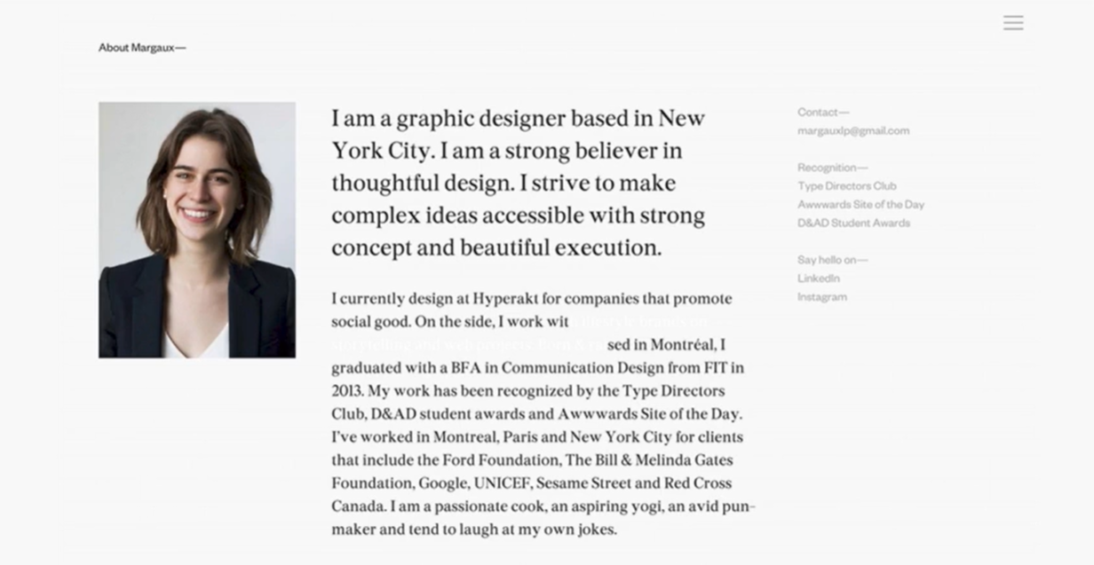
8. Line spacing
- Line spacing should have enough space. If your font size is 14, line height should be 14 / 2 + font size (14) = 21
9. Formalization of the text
- To make sure your text will be read, you have to make sure it has a certain structure: a heading, subheadings and paragraphs. So on every website there are h0, h1, h2, h3...
- h1 is normally the heading
- h0 is a word or a short sentence that's eye-catching and attracts attention
- h2-h3 are subheadings, and
- h4 is the main body with a big text
- If you stick to this system, it will become way easier for you and your users to navigate through websites.
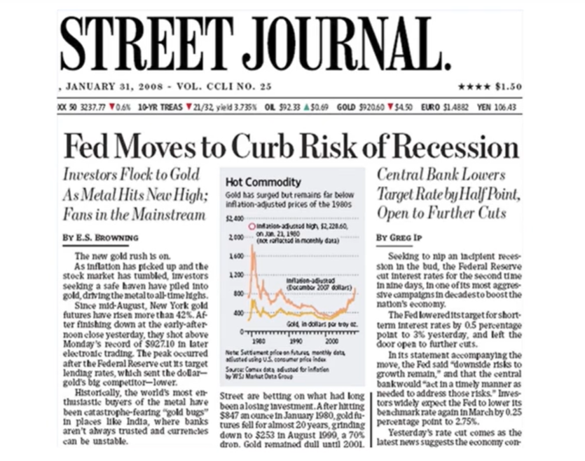
The brain is used to:
a heading where the first line is longer
or heavier than the second
The brain is not used to:
a heading where
the first line is shorter or lighter than the second
Logical placement:
Typography
as a science
Illogical placement:
Typography as a
science
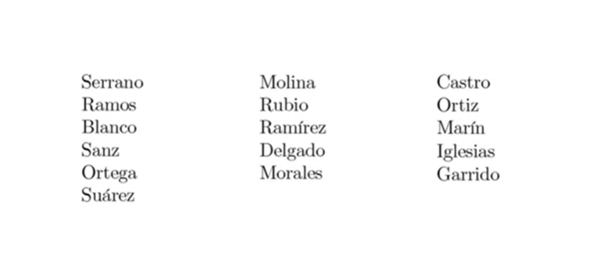
10. Text layout
- To make sure that any text will fit into the problems that you created, try putting the smallest and the biggest text in it. You have to make sure that post work well.
Sometimes the text becomes the base for your site. Sometimes there is a lot of it. And sometimes it needs to be emphasized on. These are the moments where your typography skills are revealed. And if there are mistakes, then there is an opportunity to correct them.
E. Creative thinking
Various tools for boosting creativity. Brainstorming methods. Walt Disney technique and complex associations.
Do not purchase stock photos! You don't always need to buy $ 50 pictures to make a good website. Sometimes a bit of creative thinking is enough. And don't use generic photos for certain topics (eg. handshake for trust, scale for law)

1. Brainstorm
- Sit down, take a sheet of paper and a pencil and for the next 10 minutes do nothing else than 10 minutes write down everything that comes to your mind. Your brain will actually start generating creative options.
2. Creative techniques
- Top 100 list — which is when you write down the top 100 things you like or the top 100 options for how a button could look to find the best design for your website. The 1st 30 points will again be easy. But when you run out of ideas on the tip of your tongue, that's when your brain really starts working.
3. Mind mapping
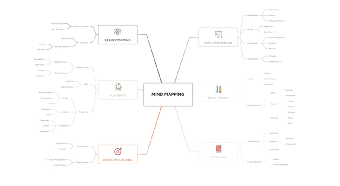
- By grouping the information you receive from the client (eg. colors and style can be under branding, phone and email can be under contact...). This will help structurize the information in your head.
4. Connecting 2 dots
- We take 2 things that seem to have nothing in common and try to connect them.
5. Abbreviation, Chair, and Other tools
6. Disney's solution
- 3 groups of creators based on personality
- Dreamers were the people who had to create without thinking that something could be impossible or non-existent.
- Realists were people, who really knew how much everything would cost, what was possible and what wasn't.
- Critic judges the execution of the idea. They knew what the risks were and how they could affect the project.
- Once the judges are done looking for flaws, the updated version gets passed on to the creators again.
- Only when the judges find no flaws and finally have nothing to say, the idea is perfected.

Sometimes our head is overflowing with ideas, and sometimes we can't get anything out of it. Therefore, we practice different approaches in our search of ideas. Yes, sometimes they can be quite strange, abstract and incomprehensible. But they help you think differently and not be afraid to come up with bold ideas.
f. Custom grids
What grids are for and how to build them. Creative grids and how to adapt them.
1. Grids do not exist
- To have a creative grid, you need to create it.
- But nowadays, technology is so advanced that there is no need to use premade grids - mainly because they limit us.
2. Adapting
- It's not enough to only design a desktop version. We will also need one for phones. And even though a lot of front-enders know how to adapt a desktop version for phones, we should do it ourselves because often the elements are so complex and untypical, that the frontender might not arrange them in the way you would.
3. Responsive web design
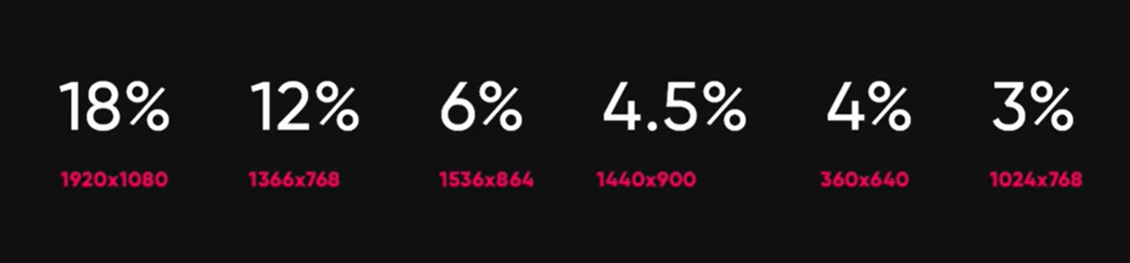
- A browser version, for example, has to be adapted for phones, laptops, tablets and H D —screens.
- For bigger screens you have to use bigger text and pictures - the bigger the screen, the bigger the visuals.
4. Ears
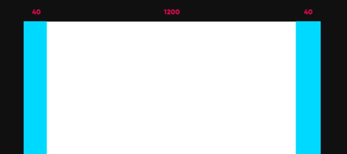
- If your screens width is 1280, you need to leave small gaps on each side to give your website some space. We call these gaps ears. They are normally around 40 pixels wide for this particular format. So you're left with 1200 pixels of space for the design itself.
- Another great thing about a 1280p screen is that it's exactly 1.5 times smaller than a 1920. Which means that to adapt your design, you simply need to make your visuals 1.5 times bigger. However, keep in mind that it won't work for all elements of your website.
5. Creating custom grids
- Start with the layout for the desktop version 1st. Why? Because a phone version is way simpler and it's always easier to simplify it out than to add new details. The only exception is when the client needs the phone version more than the desktop one, in this case you start with the important one.
6. Points to consider
- Photos and videos - When you are adding blocks meant for pictures or videos, keep in mind that the classical proportion of an image or a video is 3x4 or 16x9. So make sure your blogs are the same proportion, especially if they are supposed to be filled by the client later.
- Toolbars - A lot of people forget about the fact that toolbars take some space on the screen, too.
- Compression - A website has to be reachable in under 3 seconds - anything above that is too much and could potentially annoy the customer. Make sure to compress the images before uploading them.
- Check - Once your website is done, before sending the product to the client, check if it works on different devices.
Sometimes it happens that you draw once and draw other sites based on that one. Over time, you get used to it and it is already difficult to change it up for something new.
You will get used to using different grids in your designs. You will use different approaches. And you will no longer be captivated by the comfort of one grid.
G. Animating interfaces
Types of animation. Microinteractions. How animation helps UX and simplifies delivering content.
1. Some types of animation
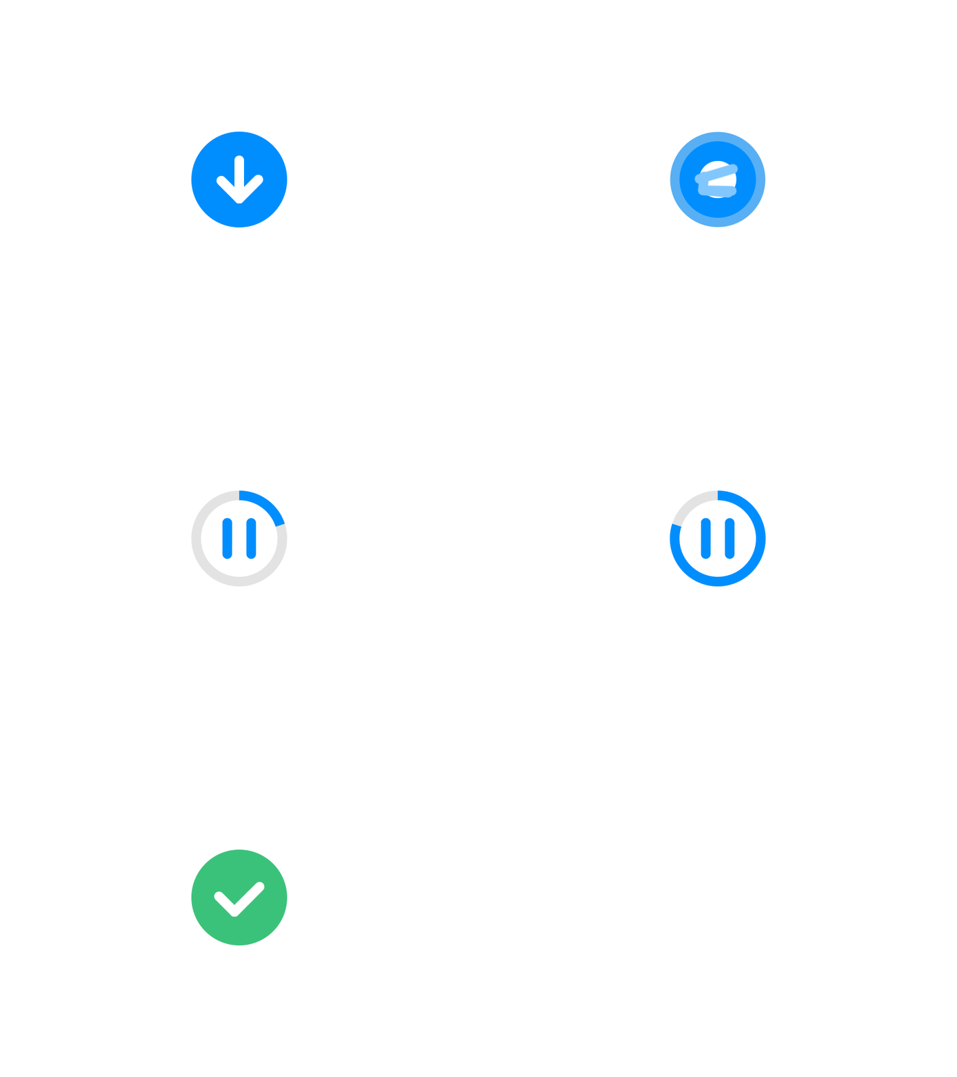
- Preloader
- This gives you an emotion similar to the one you have in the theater before the show stars.
- Preloaders are there while the entire website is loading, so the users get a certain distraction while waiting.
- Keep in mind that too many preloaders are annoying. So it's best if you only use one for the main page.
- Hover
- Hover helps us see which buttons are clickable, which elements carry a certain function and which don't.
- Hovers work differently for phones, because there is no cursor and some things just wouldn't work the way they would for a computer.
- To attract attention
- The biggest and most noticeable that's meant to be seen first. We can control the order of the objects being noticed.
- Navigation
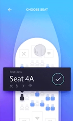
- This is a kind of animation that essentially helps the users navigate through the website.
- If you choose to hide the menu and make the users look for it, make sure the elements inside it make clear what they are.
- Value change
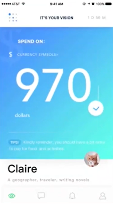
- This is the kind of animation that we use for all sorts of numbers.
- Gamification
- Most modern phones have a gyroscope - we see it when we tilt our phones and something happens on the screen.
- Keep in mind that computers do not have gyroscopes so you would have to attempt the gamification for them separately.
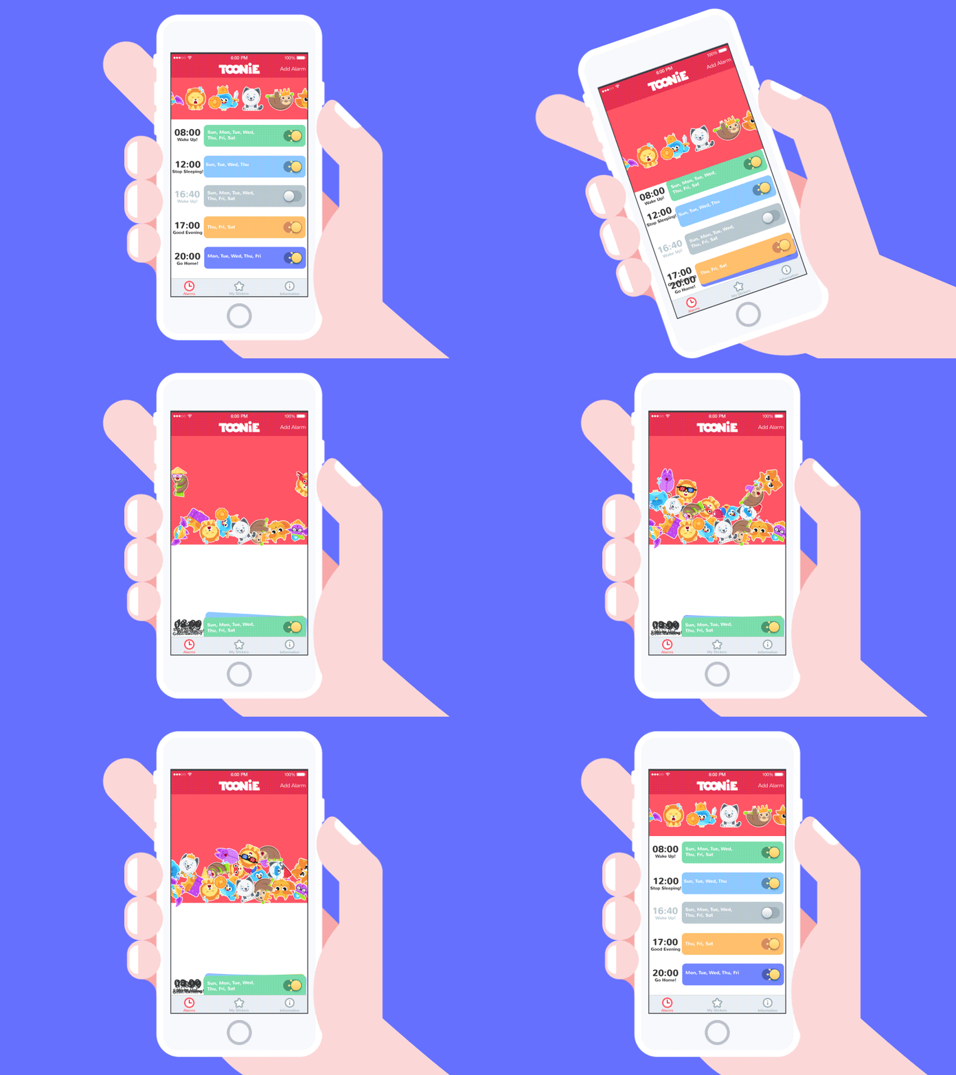
- Mouse interactions
- This is when the background changes as we move the cursor.
- Page motion
- Animation after animation after animation (eg. preloader then part of the page shows one by one and so on..)
2. Why microinteractions rock?
- improve website navigation
- make it easier for users to interact with your website
- provide instant and relevant feedback about a completed action to a user give tips to your users
- communicate information about certain elements, like whether or not it's interactive
- make the user experience much more rewarding
- encourage sharing, liking, and commenting on your content
- direct users' attention
- and finally, they just make your site more emotional
3. So how do we satisfy frontend?
- Don't compress it - whether you work with photoshop, sketch or figma - just send the actual file. That makes a lot of processes easier for developer.
- Unusual fonts. Sometimes developers can find them on google fonts or some similar tool. But sometimes your fonts are truly unconventional so make sure to provide them too.
- All of the icons have to be sent in their .svg format. Otherwise they will be compressed and ugly.
- Don't forget about hover maps. Don't be lazy, draw a separate layout where you indicate all states of every animated object and the link to the source where you found a cool animation too.
- If you can do motion design, send a video of the animation you want instead of a long text message with a description.
4. Resources
- Canvas is basically as a background interacting with your cursor.
- List of libraries with effects and code for canvas that you can use for your designs:
- Ready Mag - works perfectly for resentation websites landing pages and promo websites.
- Tilda - helps you with corporate websites, online stores, etc which means you can create your own animation.
- WebFlow - allows you to make an animation and use it for their website you're working on. But it requires basics of coding.
Your works will be filled with life! It will be much more interesting for you to draw the interface of your sites, because you will take into account the animation and the time of its appearance. It's like discovering a new dimension - a lot of new opportunities appear for you.
Conclusion
-
Plagiarism is unethical; however, borrowing ideas responsibly is encouraged. Explore various references for inspiration, providing a broad range of choices for your creative endeavors.
-
Seek inspiration from diverse sources – it's all around you. Explore intriguing works, draw inspiration from them, and practice by emulating and creating your versions.
-
When crafting your design, give thoughtful attention to the following techniques: composition and typography.
-
Cultivate creative thinking by engaging in brainstorming sessions and employing various creative techniques.
-
Finally, incorporating animations into interfaces enhances the visual appeal of your design, capturing attention more effectively.