CS - MAR 22, 2024
CONVERSION OPTIMIZATION:
Svensk Husdröm, Norins Ost, Durewall Institutet
TODO
- Pick 1 page on each site that is suitable for optimization. You can still choose the homepage if you think that needs the optimization most.
- Analyze the page.
- Make up 1-3 changes that could increase the conversion rate.
- Write a short motivaton on why you think the changes could improve the site (eg. changing color on this button creates a highet contrast which calls on the users attention, and that could lead to more clicks).
IMPORTANT!
This time, look in the CRO ticket of each customer to see what conversion goals we are working towards and take that in consideration as you make up the suggestions.
Remember the following
- The product and target audience
- Social proofing
- Offers and benefits
- Content flow
- What the site's about?
- How it can help me?
- How does it deliver that help?
- How do I get that help?
- Call-to-action (CTA) buttons
- Color contrast
- evaluating the effectiveness of the color palette
- Typography
- readability of text
- Graphics
- minimize texts if necessary
- flow diagram, video references
- Initial impressions upon viewing the page
- in the first 5 seconds that you opened the page, what comes to your mind? what does it make you feel?
- Optimize media files for faster loading of pages
- Clearer images
- Use real life photos instead of stock photos if possible
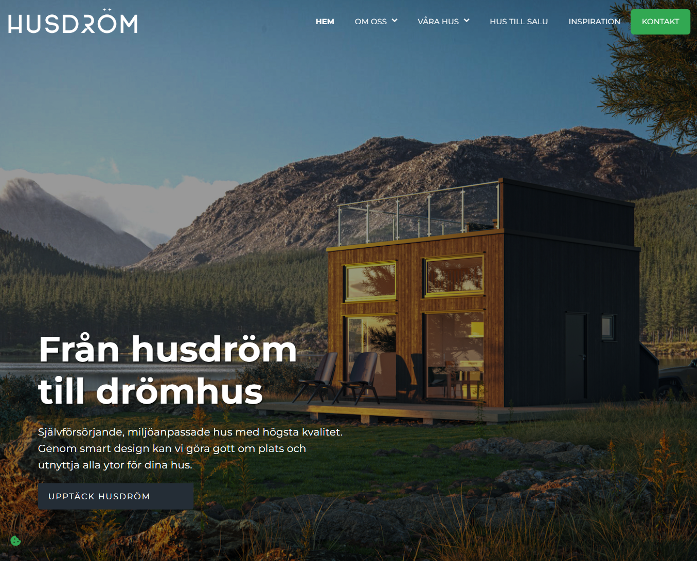
A. Svensk Husdröm AB
Self-sufficient, environmentally friendly houses with the highest quality
The website shows potential but could use some enhancements, particularly in conveying the dreamlike aspect as implied by the tagline "From house dream to dream house."
- HERO Section
- Consider using a carousel slider or video background for more dynamic visual impact.
- Adjust the color of the call-to-action (CTA) buttons for better contrast and make it consistent across the site.
- HOW WE BUILD Section (New)
- Introduce a progress flow showcasing the house-building process to engage and intrigue visitors. This can be a progress flow with icons,images, or video.
- VAD VILL DU BYGGA Section
- Remove faded overlays on cards to make the house images stand out.
- Add interactive features like zooming or image-changes on hover to maintain visitor interest.
- Include clear CTA buttons for easier navigation.
- SOCIAL PROOFING Section (New)
- Incorporate testimonials immediately after this section to build credibility.
- OM OSS Section
- Enhance the layout by either using the video as a full-screen background or change the video to a slider if in case they chose to use the video in their hero section.
- NEWS Section
- Clarify this section by adding a heading text.
- Consider using card layouts with images for a more visually appealing presentation.
- REFERENSER Section (Move upward)
- Showcase the references by changing the slick gallery right a clean section with header, short text, and direct button link.
- KONTAKT Section
- The section looks dry right now. Revamp this section by adding a form and adding a map for better visual.
- FOOTER Section
- Adjust the background of footer buttons to ensure contrast with the banner background.
In addition to the suggestions mentioned earlier, here are some additional optional recommendations:
- This is optional but would be a great addition: upon entering the site, have a background music such as chirping of birds or breeze of air to evoke feelings such as "THIS IS THE DREAM!"
- Ensure consistent use of text tags, such as H-tags for headers and p-tags for body text.
- "Pågående projekt" section under About page isn't uniform. Change the section to regular width and add actual projects under.
- Opt for cards instead of static images for the Social Media section in the About page.
- Streamline contact forms by positioning them on the right side with accompanying text on the left.
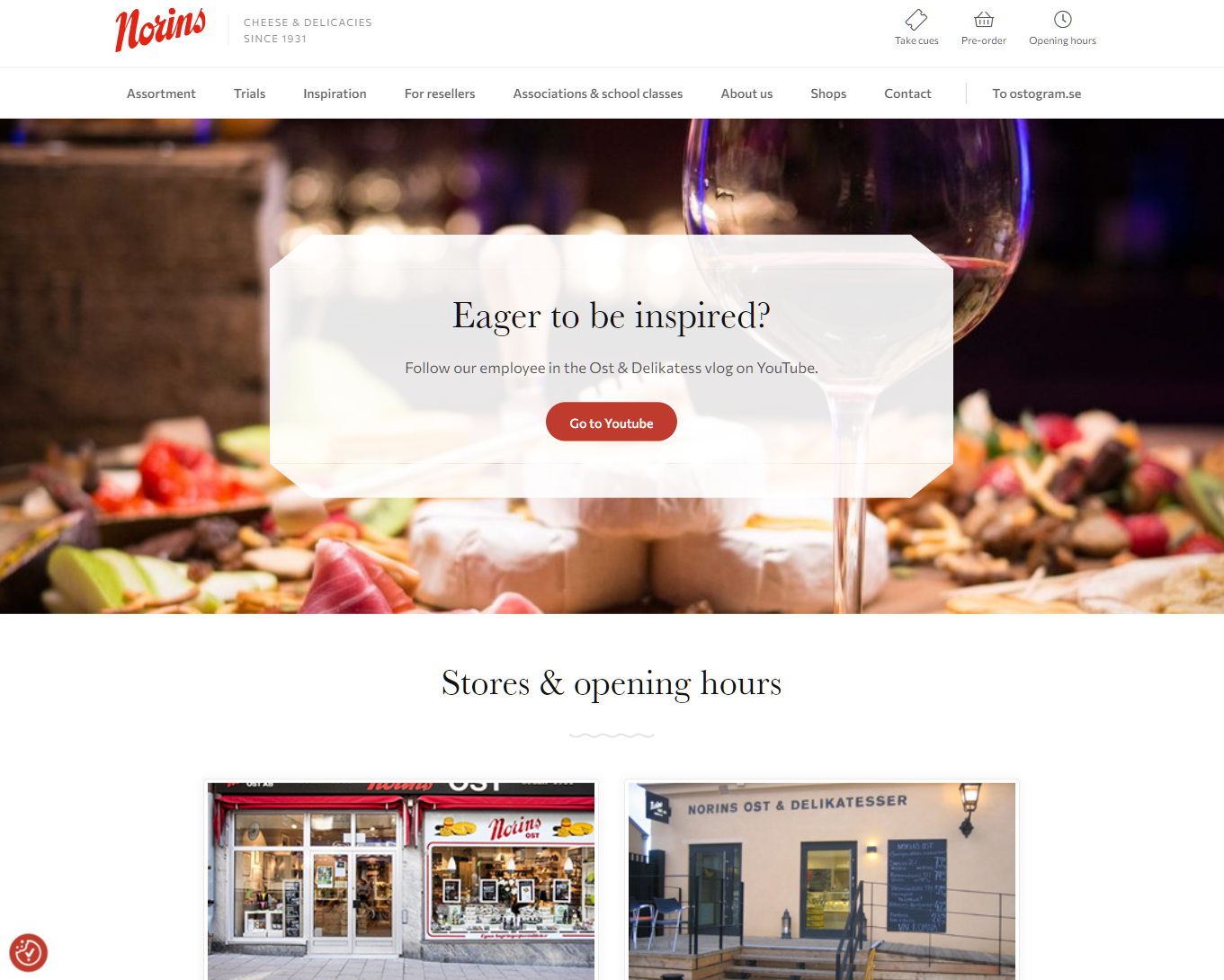
B. Norins Ost Aktiebolag
CHEESE & DELICACIES SINCE 1931
We've decided to optimize the homepage, and here are our suggested improvements
- HERO
- Introductory text should lean towards their products and accomodating customers with their needs rather than promoting their youtube channel.
- Change the hero background to slider or video for added interactiveness and redirect the button to the "Sortiment" page so products will be prioritized.
- SORTIMENT, PROVNINGAR (New sections)
- Add sections that showcase the "Sortiment" and the "Provningar".
- For the "Sortiment", cards of latest products or best sellers can be added.
- For the "Provningar", use a simple banner with a background image of people at a cheese tasting with a faded gradient overlay and some text on the right side.
- SOCIAL PROOFING (New section)
- If available, incorporate social proofing into the third section to instill trust among viewers.
- FOOTER
- Also add contact information here and make it clickable so customers can easily contact them.
In addition to the suggestions mentioned earlier, here are some additional optional recommendations:
- Their logo is pretty and exudes this retro vibes. Try incorporating assets based on their logo and color.
- Change the color of buttons to match the logo color.
- Switch the "Go back to top" button in the footer to a floating button on the bottom right of the page that appears when you scroll past 800px from the top.
- If possible, have them a photography session so they can use fresher photos. Refer to this sample: https://www.murrayscheese.com/
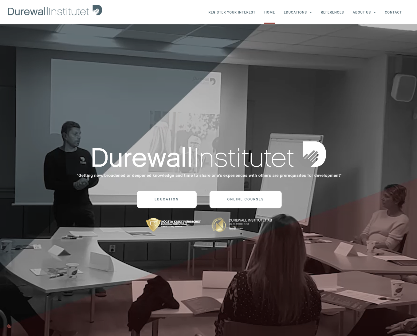
C. Durewall Institutet AB
a well-established national knowledge and training center FOR movement knowledge, handling and self-protection
- HERO
- Since people are visual learners, focus more on visuals as the page currently contains a lot of text, making it a bit dull.
- Switch the overlay to become interactive on hover instead of the static overlay currently in use.
- ABOUT US (New section)
- It's essential to clearly communicate the business's services. Consider adding a quick 'About Us' section that explains the business niche, its target audience, and the benefits for customers.
- REQUEST FORM Section
- This section can be converted into a floating pop-up to make it more accessible throughout the website.
- MOST BOOKED COURSES
- This section needs a better layout as it's the main part of the homepage.
- Consider making it full-width and updating the card designs. Ensure the images on the cards effectively represent each course title.
- Additionally, maintain consistency in text sizes and change the overlay to interactive as well.
- SOCIAL PROOFING
- While social proofing is available, it should be optimized for better visual appeal, as it appears cluttered at the moment.
- Consider placing it immediately after the hero section to quickly establish the company's reputation, as consumers often rely on other consumers' reviews.
- OUR COURSES MAKE A DIFFERENCE
- Place this section just before the footer and align it to the left. Instead of a solid color, use a background image.
- Red boxes
- Consider removing this section since the most booked courses are already highlighted at the top.
- If this section is necessary, redesign it to match the layout of the Most Booked Courses section above, including section headings, card images, descriptions, and CTAs.
- FOOTER
- Redesign the footer to better accommodate the usual footer content and use full-width to prevent text wrapping. Consider adding seals here instead of in the hero section.
In addition to the suggestions mentioned earlier, here are some additional optional recommendations:
- Ensure consistency with button designs.
- Change the navbar layout to accommodate the numerous subpages. Highlight the 'INTEREST' button by placing it on the far right and changing its background color.
- Add a partners section on the homepage to build the company's reputation.
- Simplify the hover effect of buttons to avoid affecting other elements when hovered over.