DC3 - Jan 12, 2024
Psychology in Web Design:
How to Create a Hero Section That Converts
By Rinaldo Ugrina

A. HEADING psychology
Processing fluency
- The purpose of your hero section is simple: to get our website visitors understand that you can solve their problems. If you can get an immediate virtual head nod when they land on your home page, you'll have a much higher chance of getting your visitors to take the next step.
- When your writing is unnecessarily complex, readers perceive you to be less intelligent.
Boost the clarity by doing the following methods:
1. Use positive frames
2. Convey intangible concepts
3. Transform generic claims
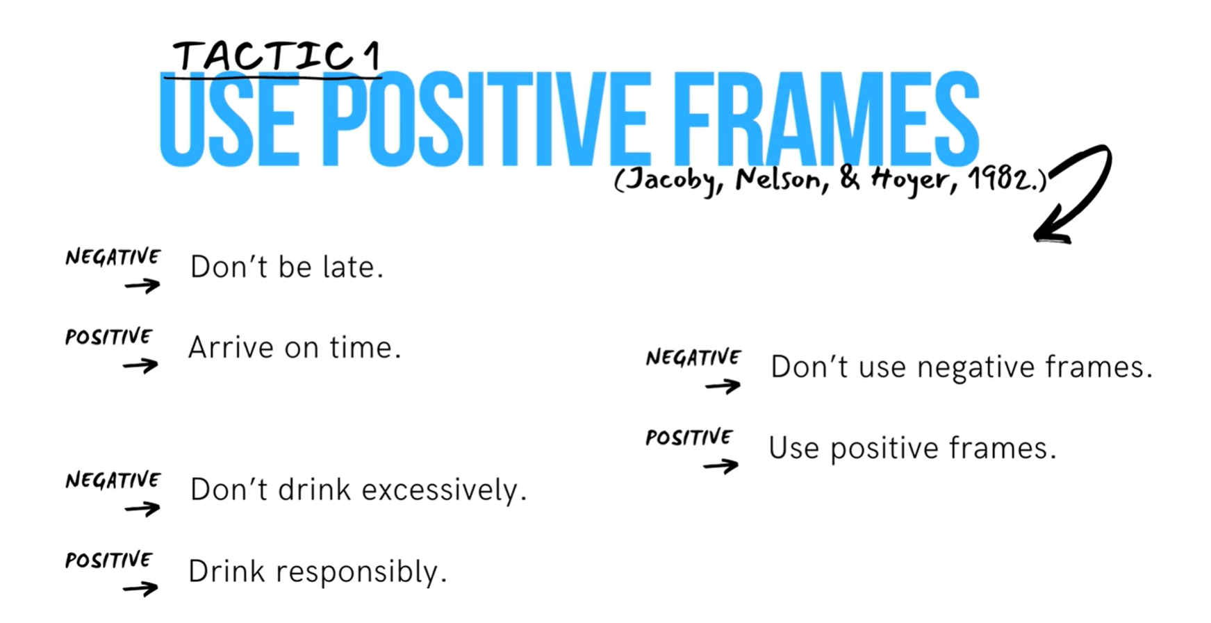
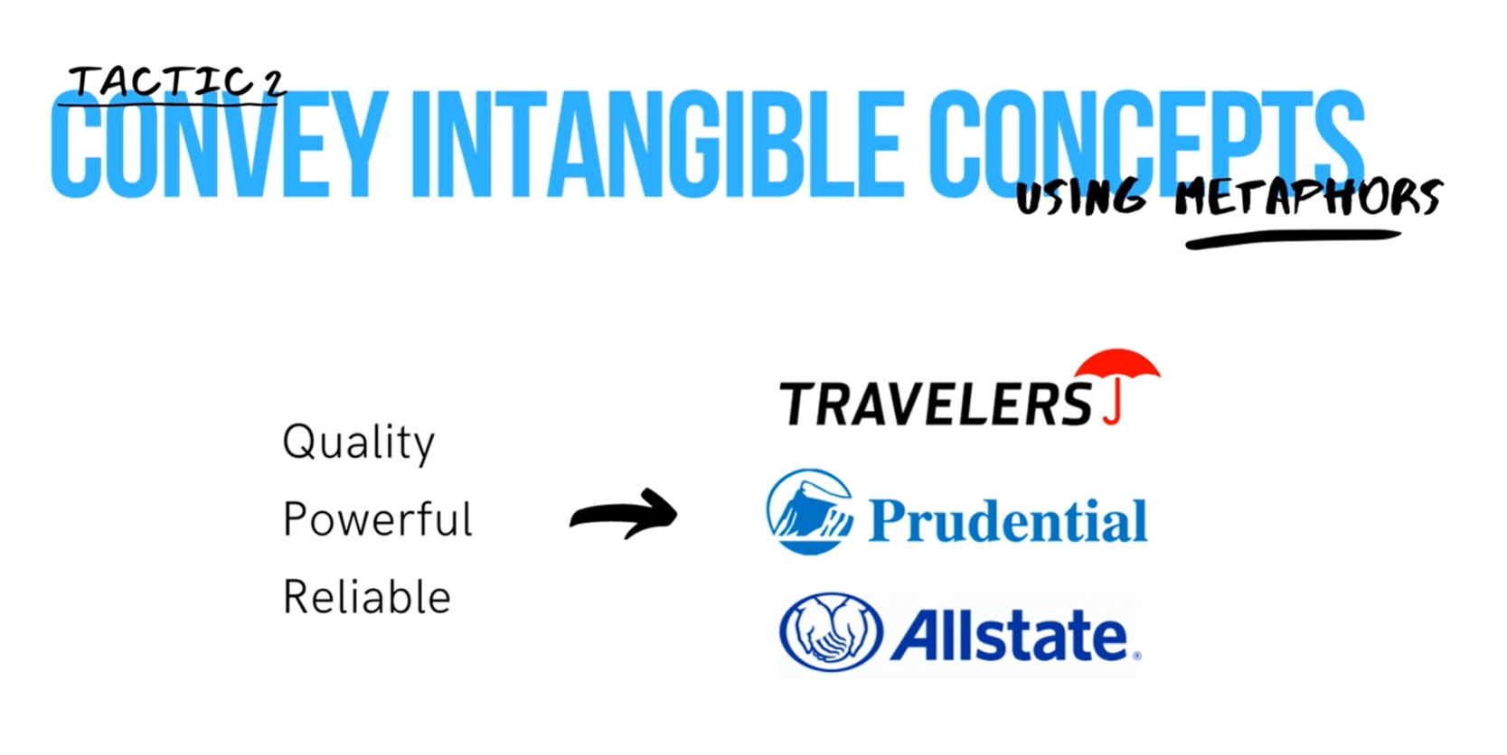
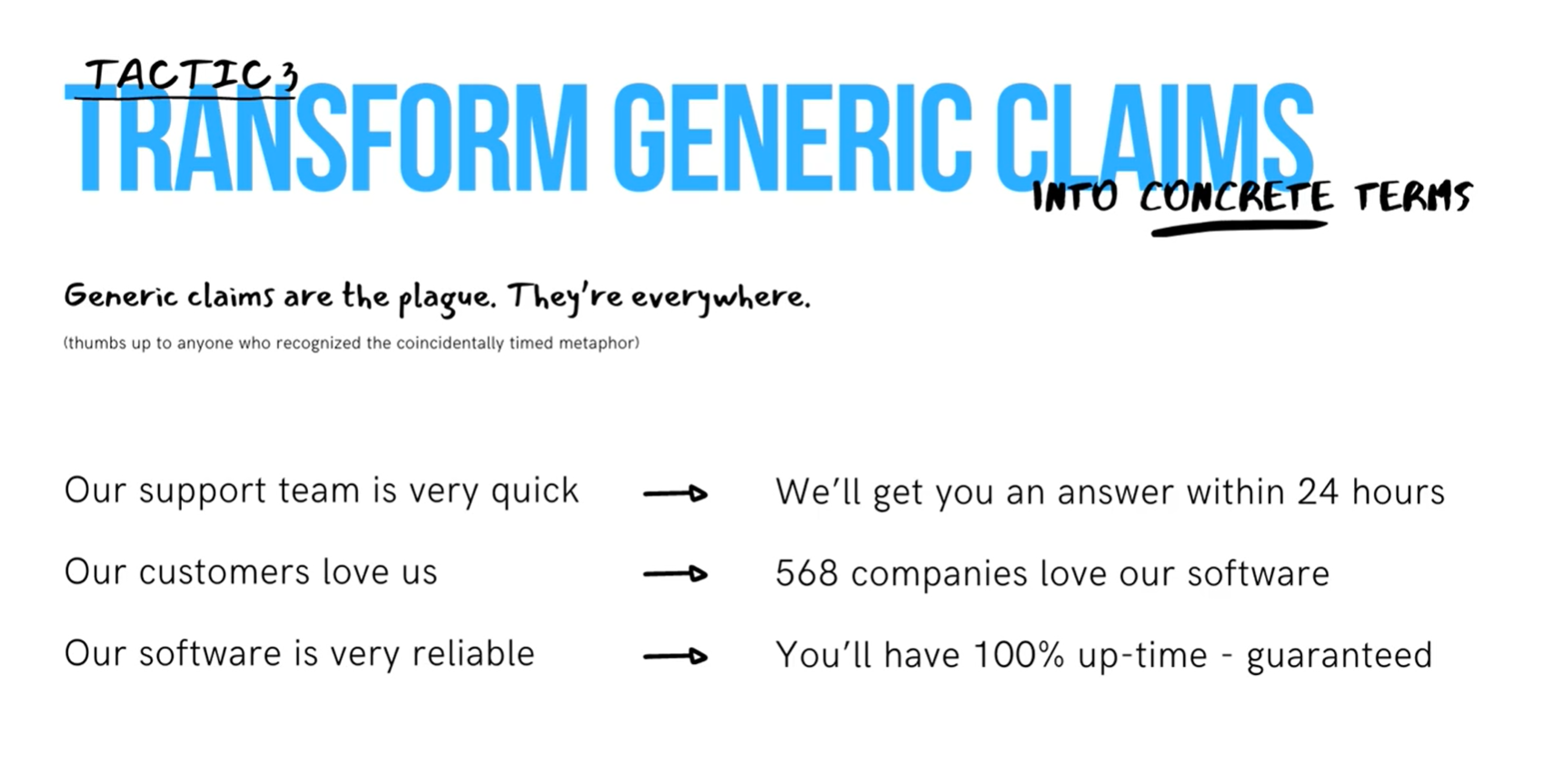
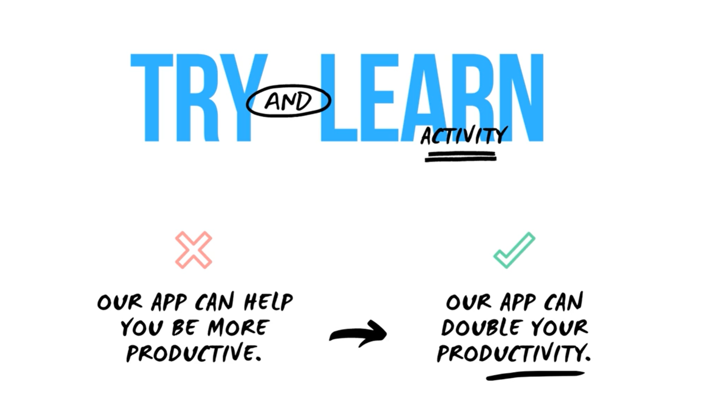
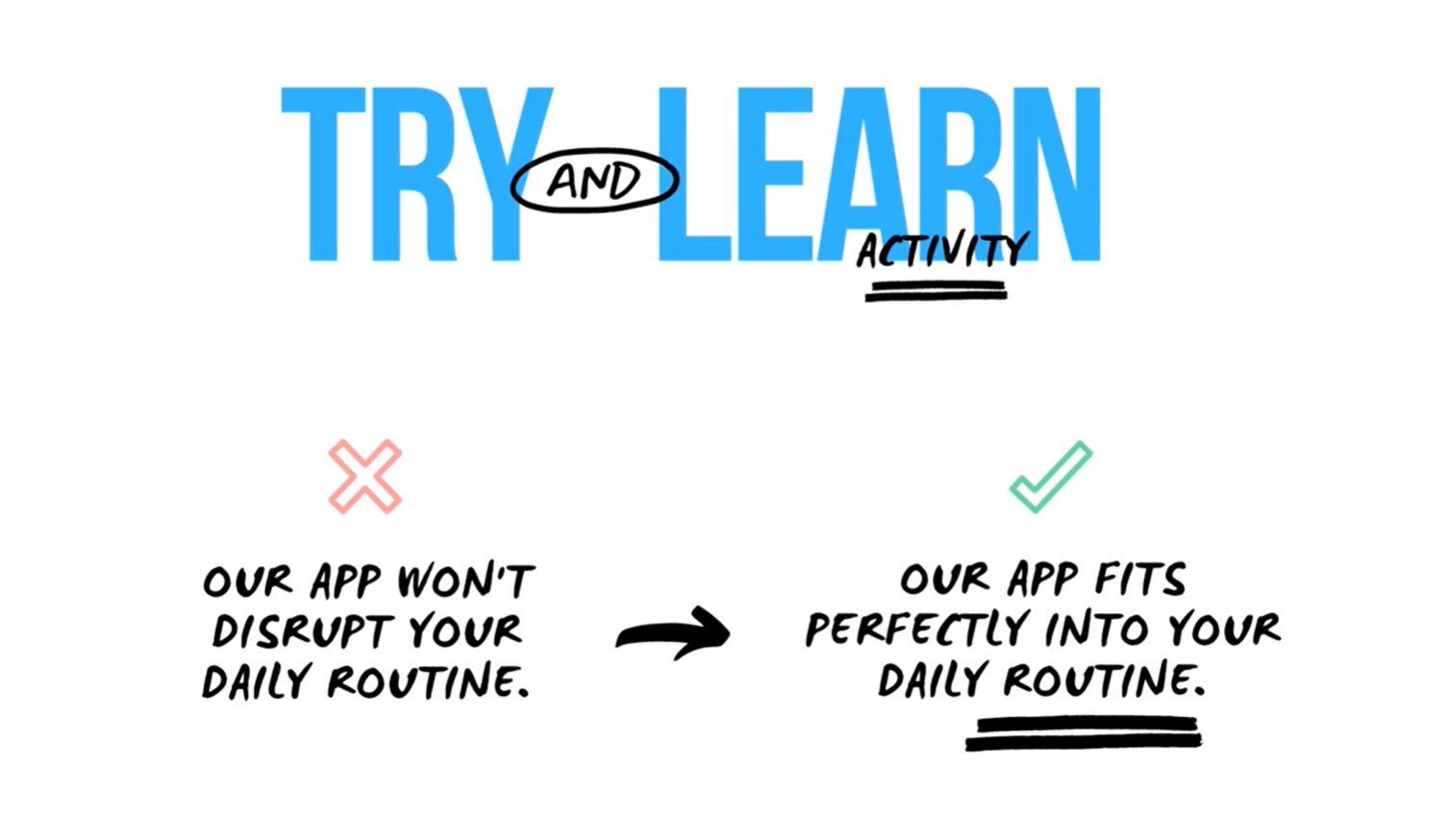
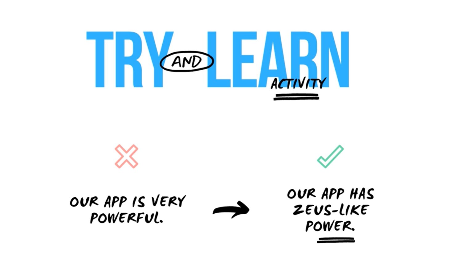
4. Trigger a positive emotion
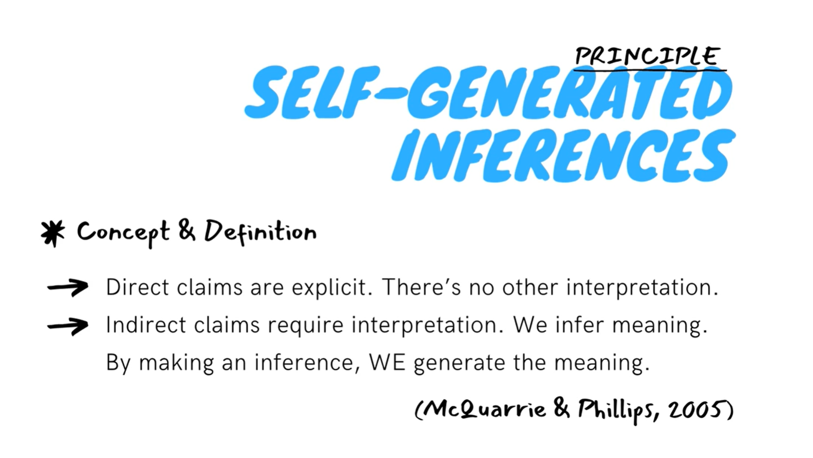
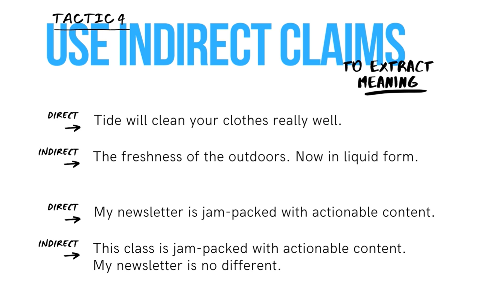
- Use indirect claims to extract conclusions
- Why do you rarely see direct claims online such as "Tide will clean your clothes really well"? Because direct claims are less persuasive.
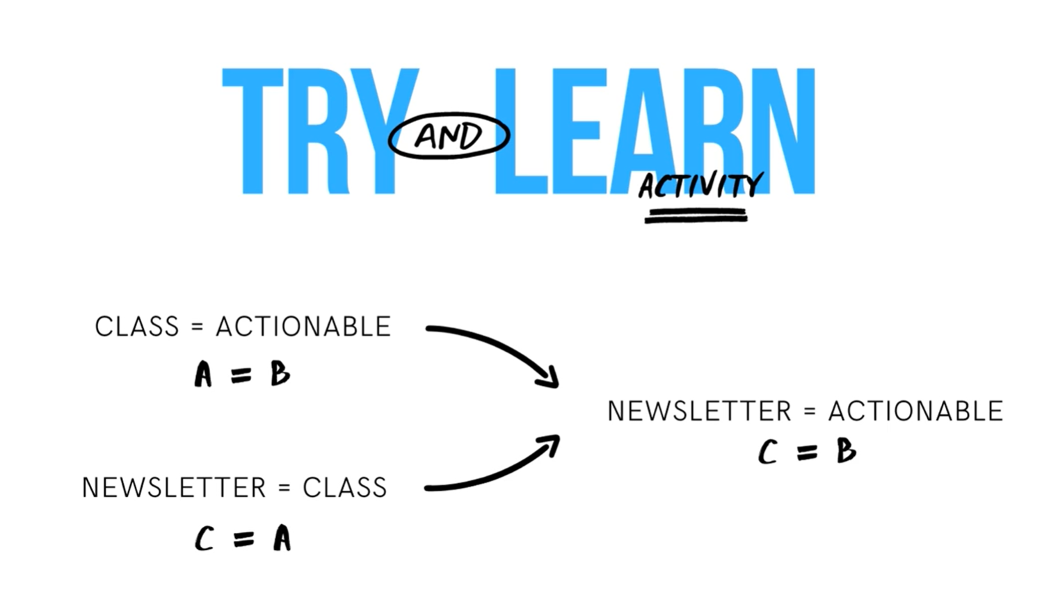
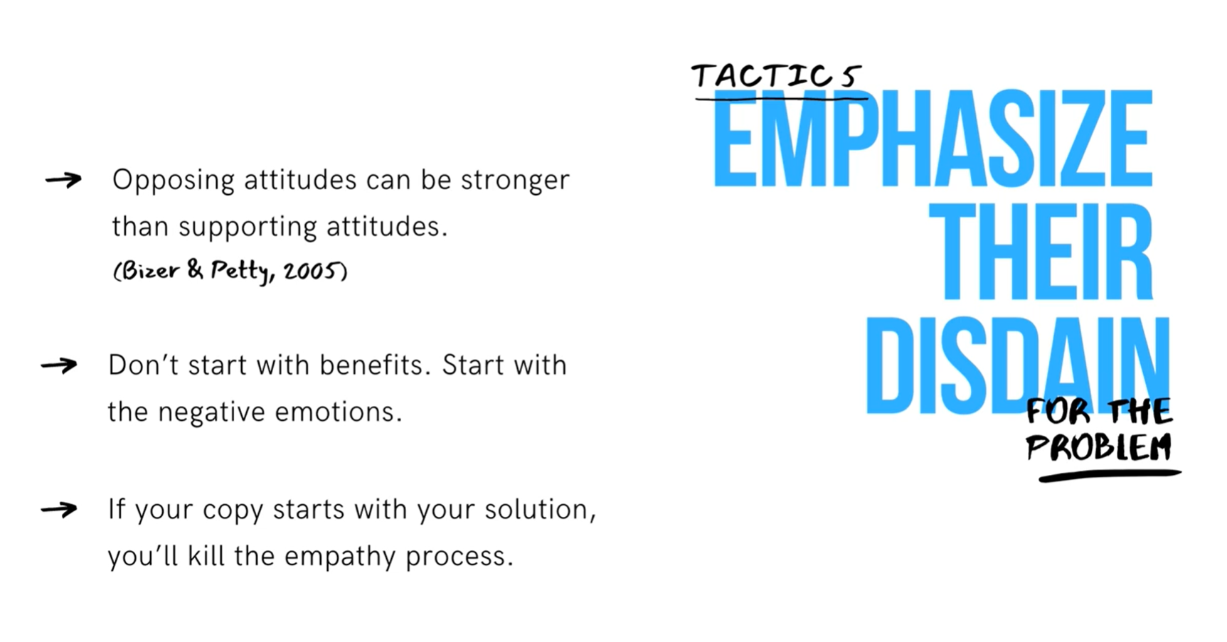
Agitate the problem — Your solution should always relieve some type of pain that the reader is experiencing. If you want readers to appreciate your solution, you need to remind him of the pain so poke the bone and show that it hurts before revealing your solution. Agitate the underlying problem. Why is it important? Why is it problematic? How is the negatively affecting your visitors? Then reveal your solution. We're biologically structured to avoid pain, so if you can trigger that feeling of pain, your readers will be more likely to pursue your solution. Here are some techniques to do that.
5. Emphasize their disdain
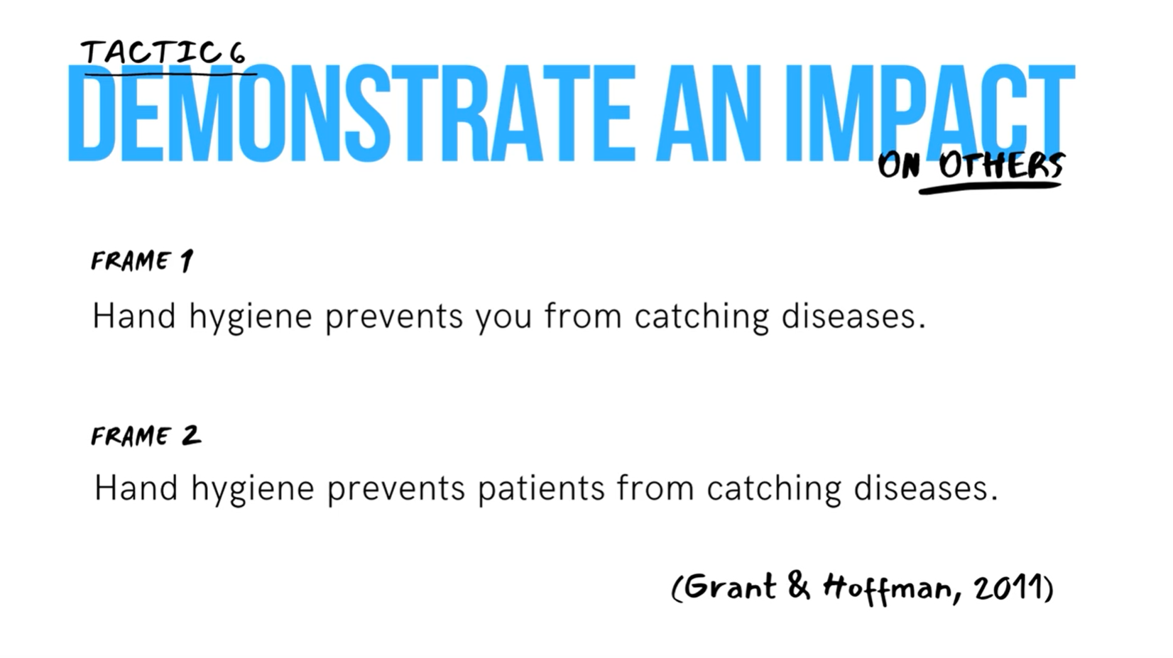
6. Demonstrate an impact on others
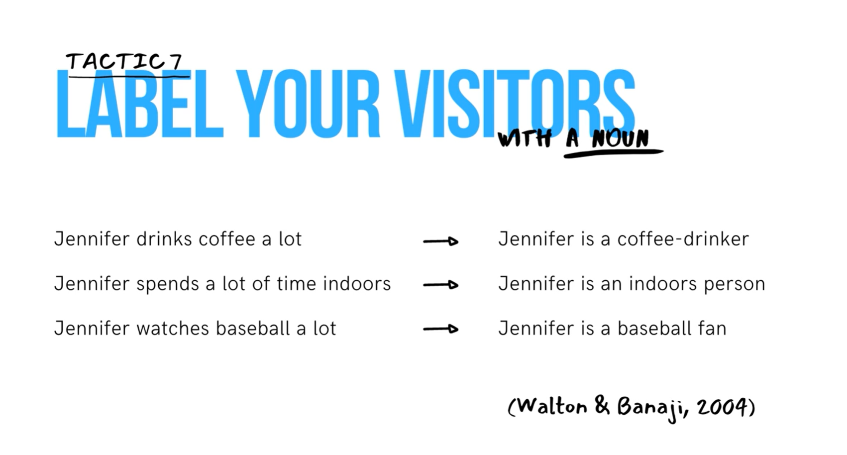
7. Label your visitors with a noun
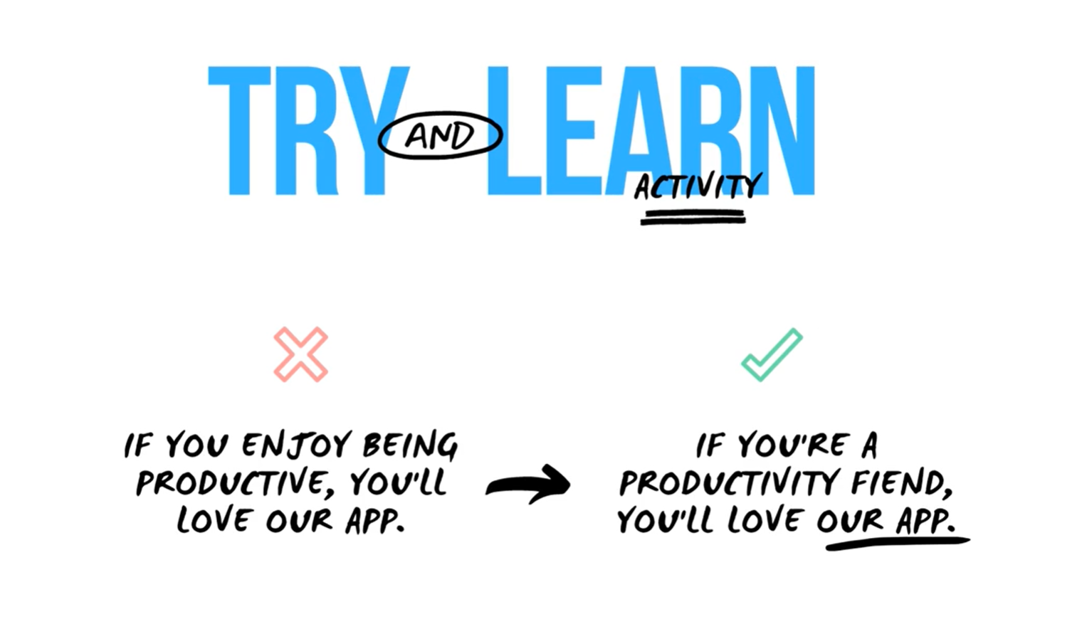
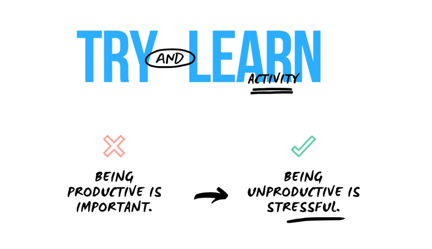
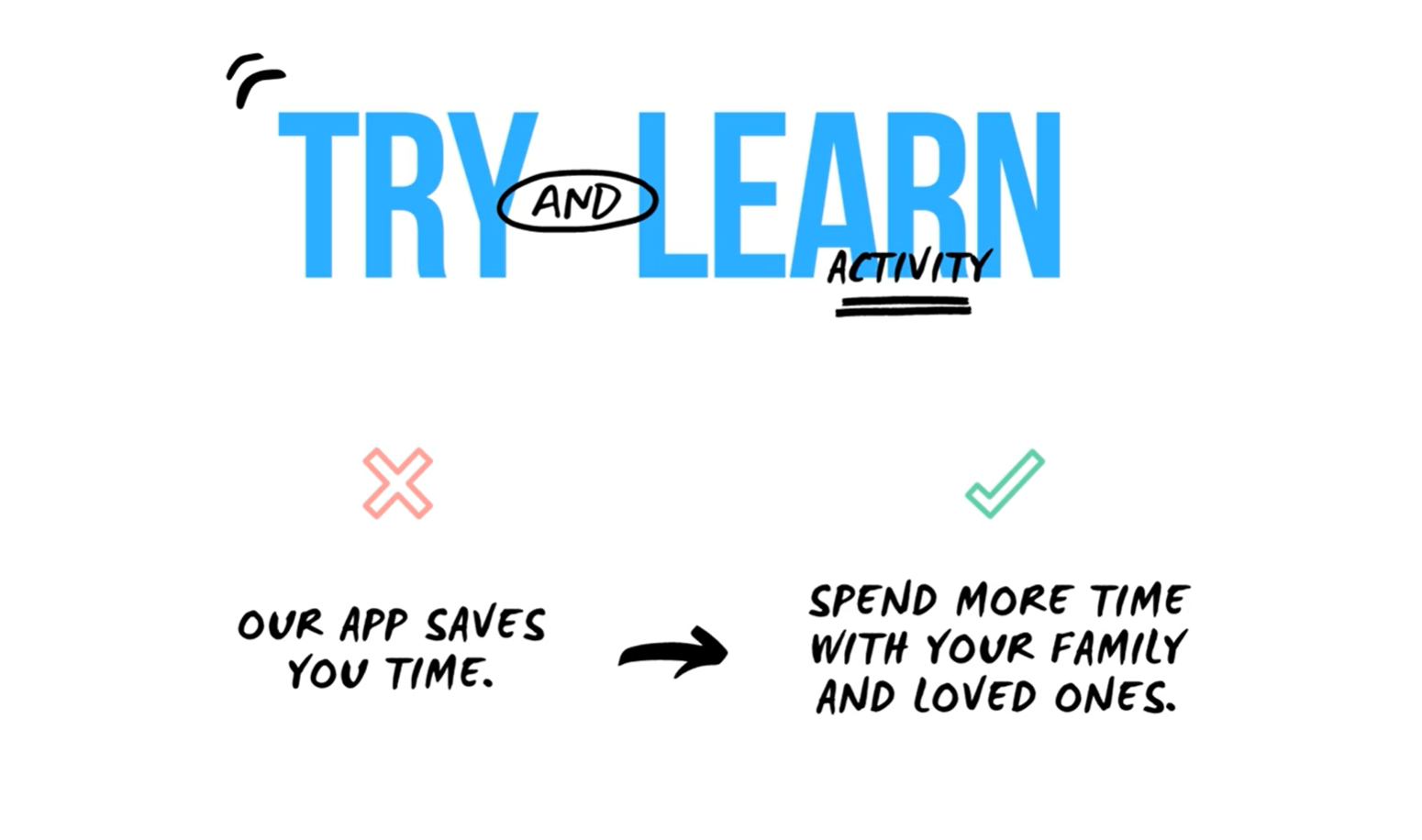
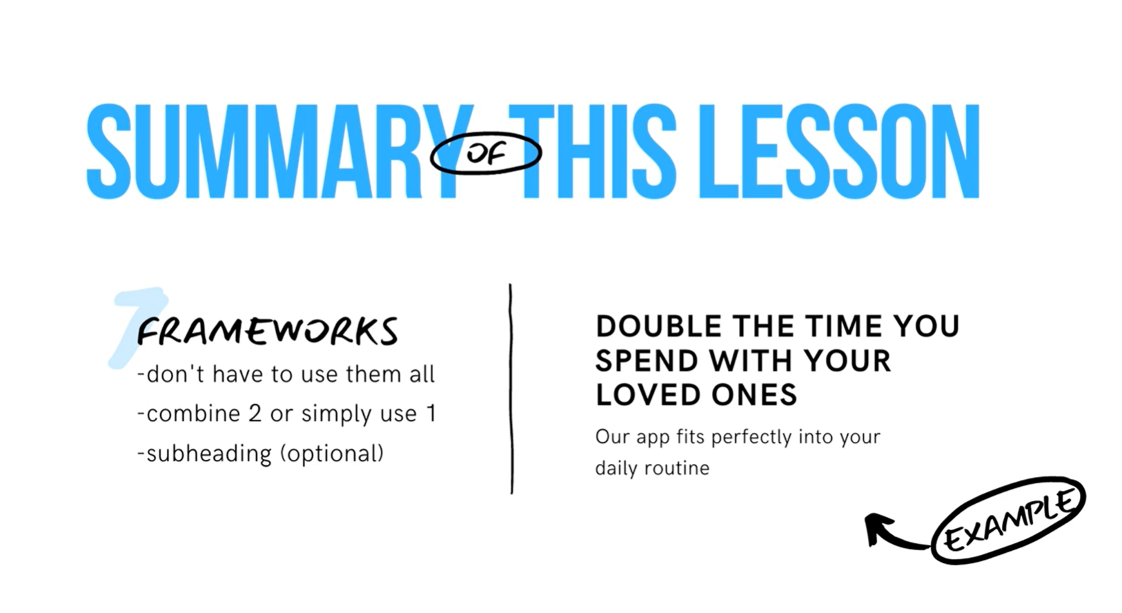
You don't have to use all of them for your heading. You can combine a couple of them or just simply use one. Also, if you think your message will be clearer, you can have a subheading to you main heading and have a secondary message that way.
B. CTA Button Psychology
CTA buttons guide users towards your goal. It is the part of the hero section that the user needs to click in order to take the action you want him to take.
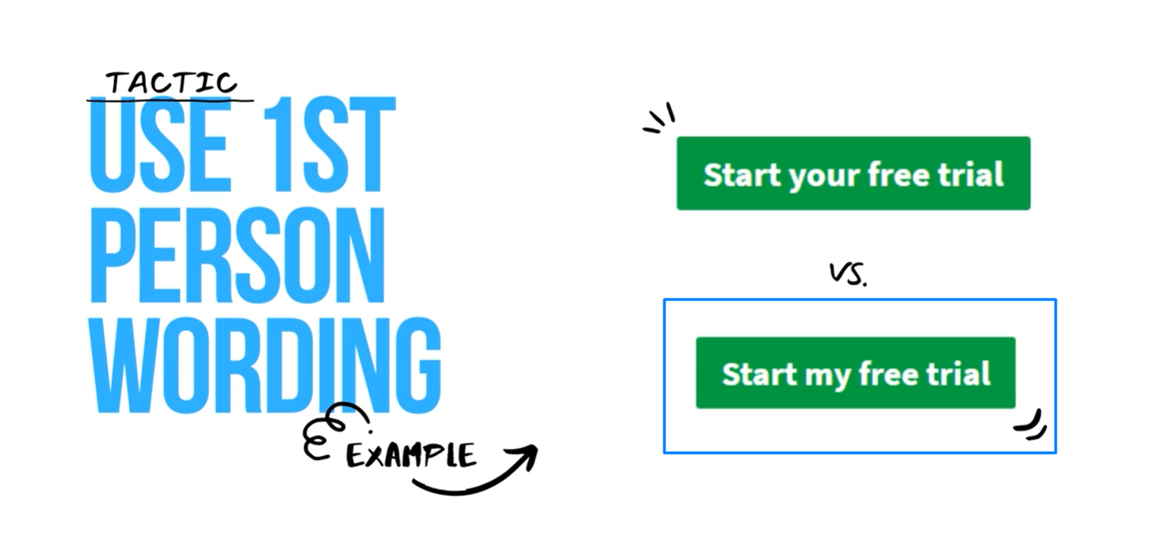
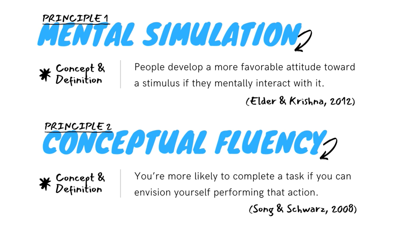
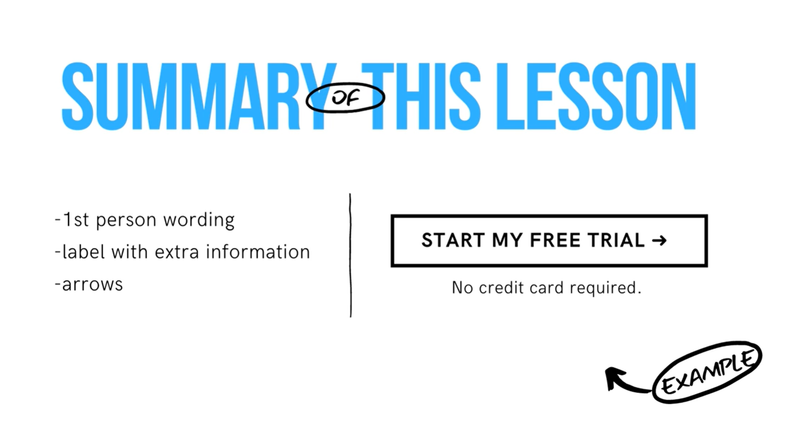
1. Use 1st person wording
- There's a lot of block posts and conversion optimization case that is online that claim to have increased conversions by using first person in CTA.
2. Short button text
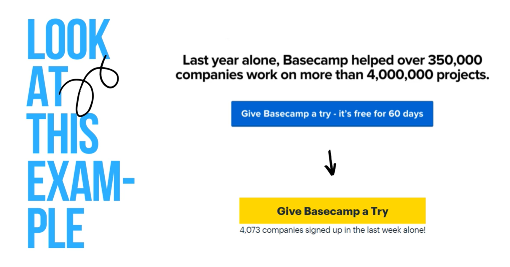
However, button text shouldn't go on and on and on. It should be specific, action oriented button text. It would be tempting to stretch the text but it's a bad move. Ideally, you'd want to keep the text 2-5 words only.
3. Arrows
Additionally, your CTA is a button so make it look like one — add an arrow. This will help you clearly distinguish that there is a next step when you click that. Using an arrow also conveys a sense of moving forward and progression.
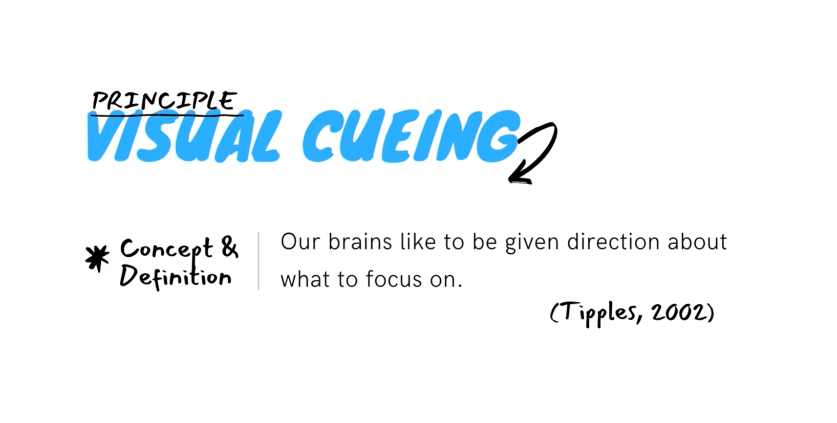
The principle that lies behind this behavior is called visual cueing.
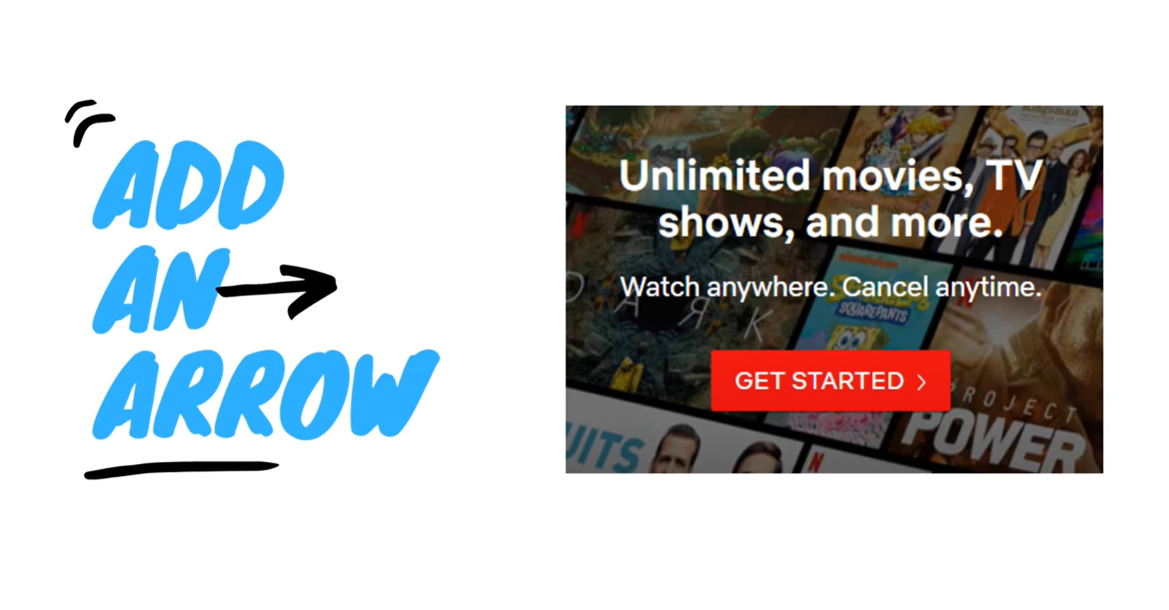
CTA buttons done right can dramatically increased conversions on your website.
So in this lesson, we covered first person wording, adding extra information in the label under the button and using arrows in the button.
C. Hero image psychology
A hero image is the first main photo or graphic that you see at the top of a website. The goal of the hero image is to immediately draw visitors in and show them what your site and you content are all about.
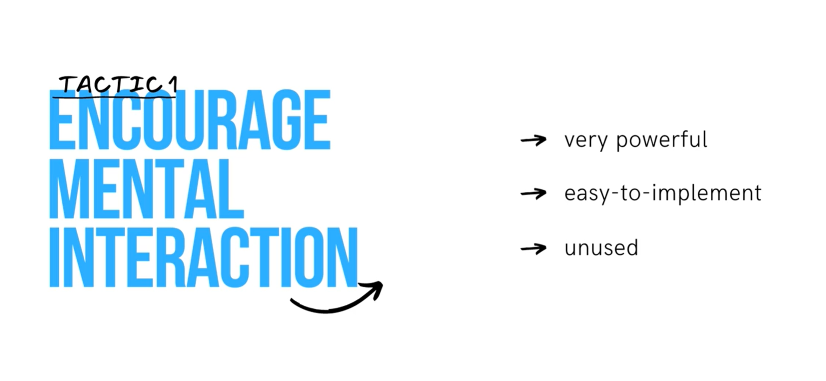
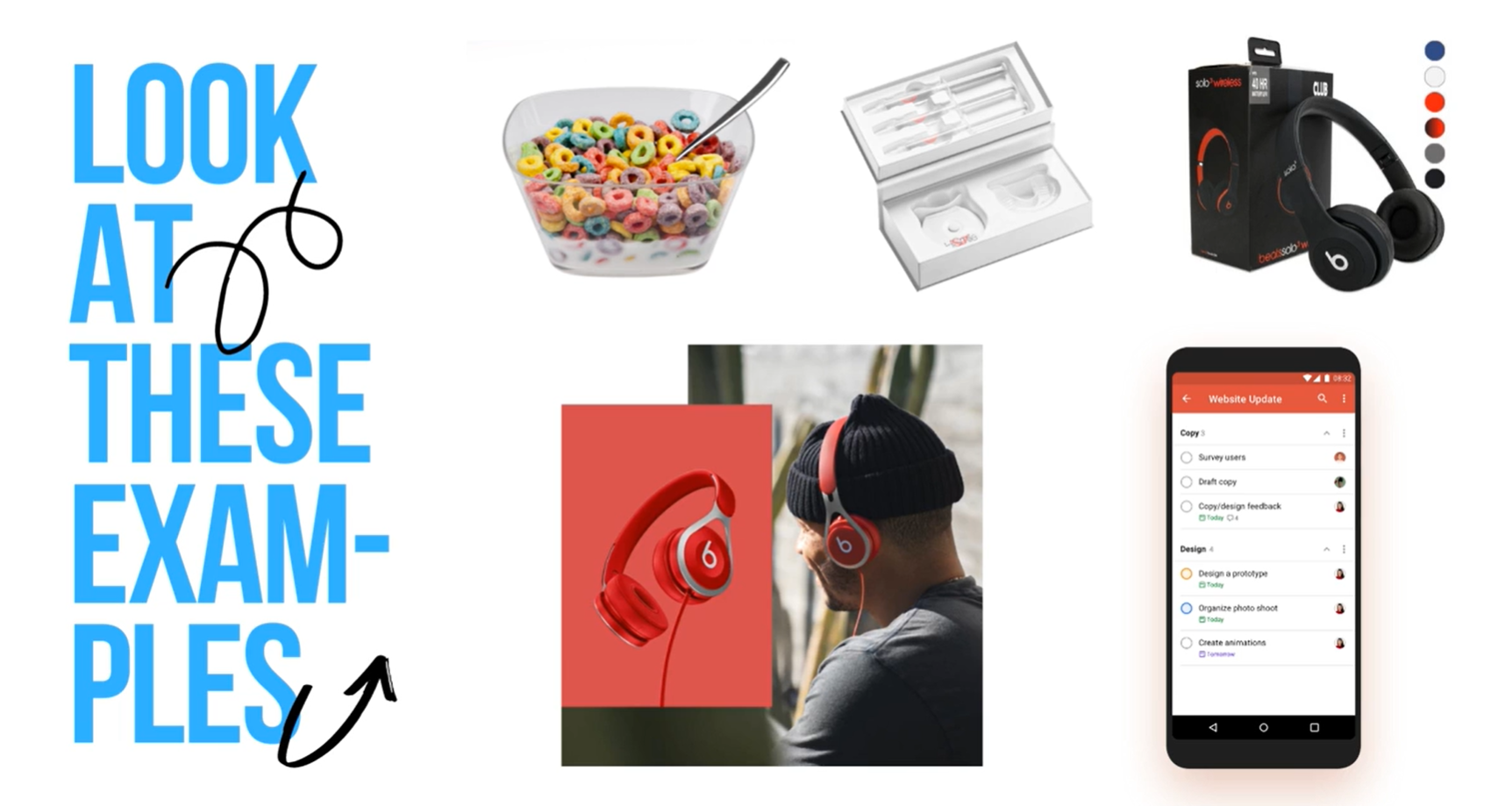
1. Encourage mental interaction
- When businesses create product images, they often depict the product without much thought.
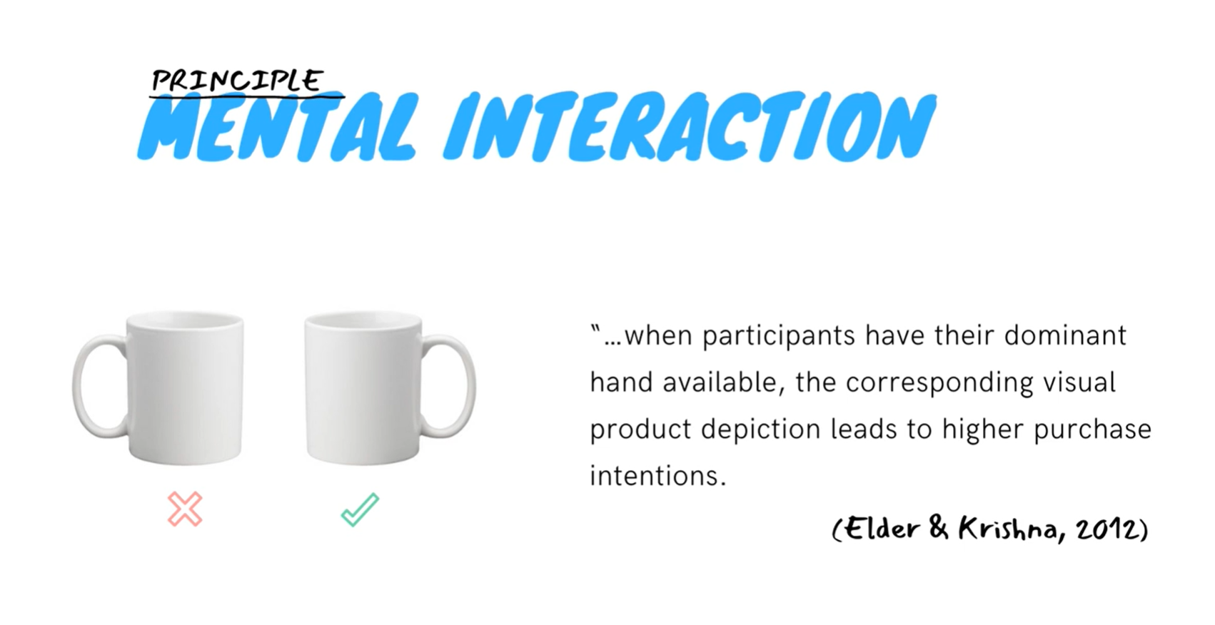
- When participants envision themselves interacting with a product, they become more likely to purchase it.
- More examples:
- Orient asymmetrical products toward the right — toward the dominant hand of most people.
- Place instruments or utensils on the right
- Orient product openings toward the viewer.
- Remove products from their packaging.
- Post a video or a graphic of the person actually using the described product.
- Post a screenshot of your app. If you're selling software, post the screenshot.
- Research suggests that visual representation of products encourages mental interaction and results in heightened buying intentions. Visitors can visualize themselves using their product. They will feel more inclined to buy it because it's easy for them to imagine the product as part of their life.
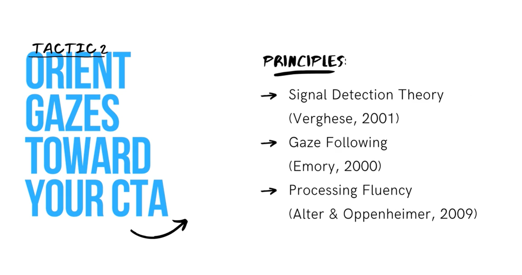
2. Orient gazes towards your CTA
- We possess an evolutionary trait to follow people's gazes.
- If your hero section contains pictures of people, orient them toward your CTA to attract more attention to that area.
- You should avoid orienting people in the pictures toward the viewer because those front facing images will attract attention toward the person instead of the important parts of your hero section or page.
- By positioning people in photos toward your CTA, your website visitors will be naturally drawn towards those areas and they will have a stronger desire to convert.
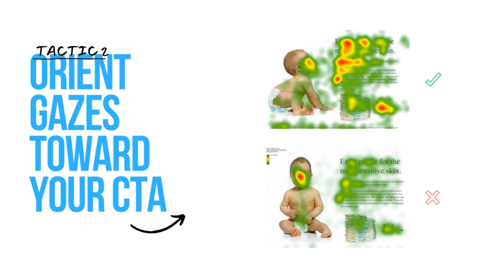
Encourage mental interaction by orienting your products especially the model's gaze if you're using people in your imagery.
D. Layout PSYCHOLOGY
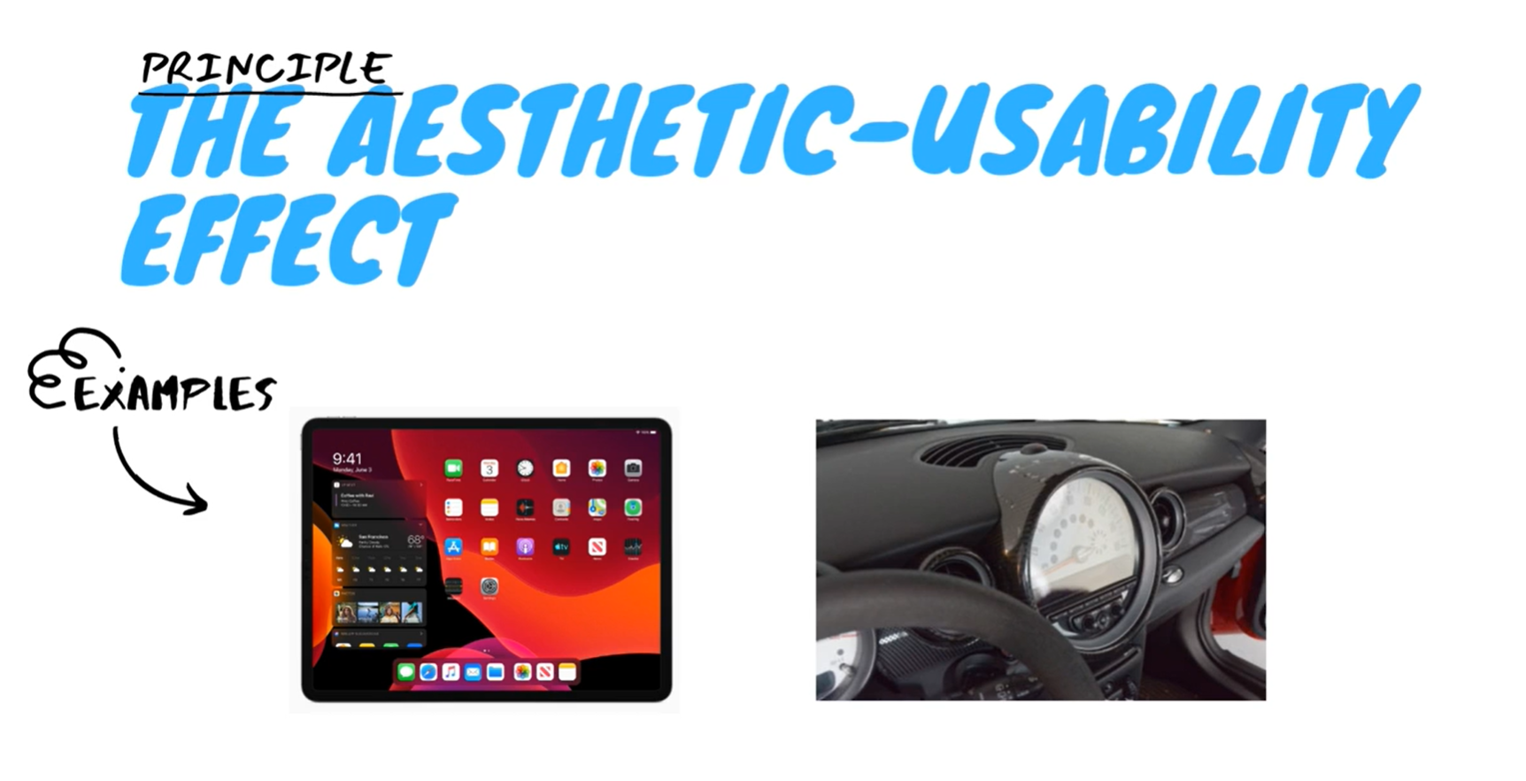
1. The aesthetic-usability effect
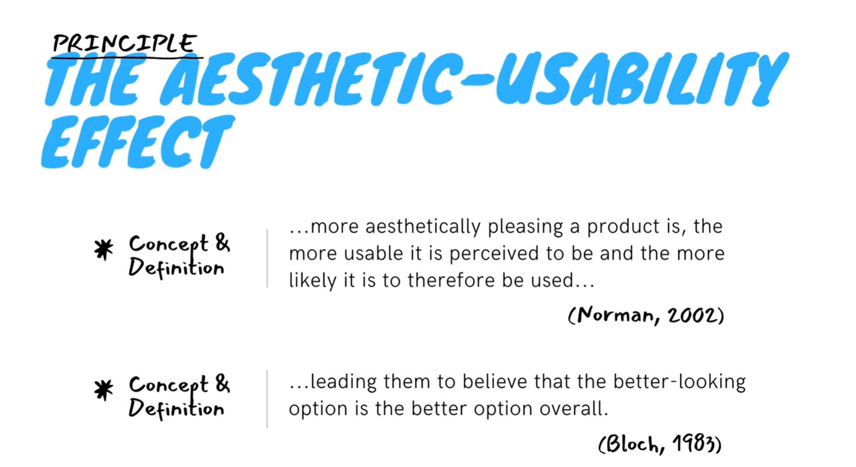
- The more aesthetically pleasing a product is, the more usable it is perceived to be, the more likely it is to therefore be used regardless of functionality.
- According to Bloch, visual appearance is the first thing a potential buyer notices about a product, and they're more sympathetic to faults or failures if a design is aesthetically pleasing, leading them to believe that the better looking caution is the better option.
- Despite potential usability issues in Apple products and peculiar features in Cooper cars, users often overlook these concerns due to the products' appealing aesthetics.
- This principle has numerous applications in web design. When a customer visits your website, they're likely to prefer the websites they enjoy looking at and feel good about using, even if they don't perform the tasks as effectively as they did on the website they perceived to be uglier.
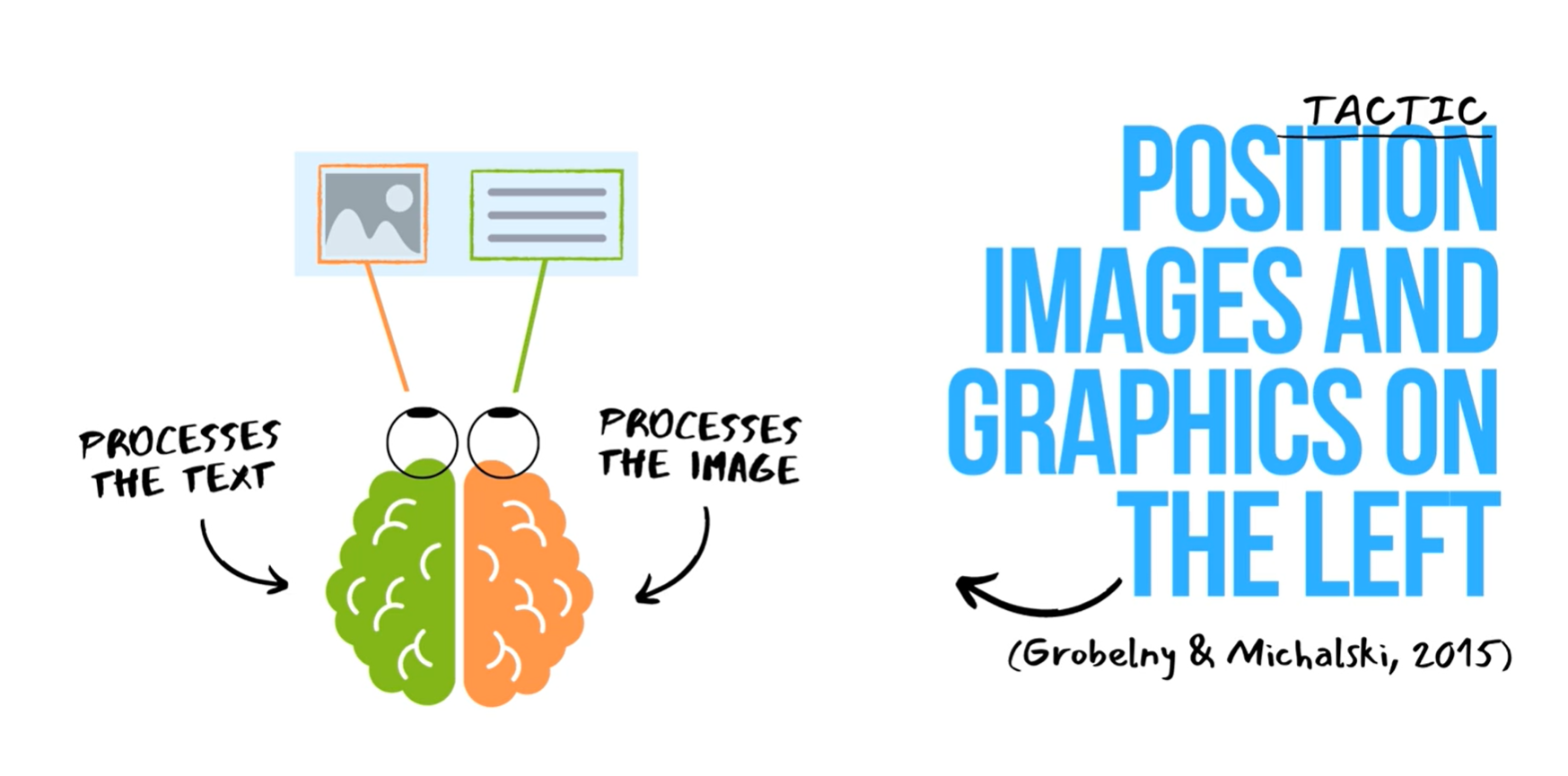
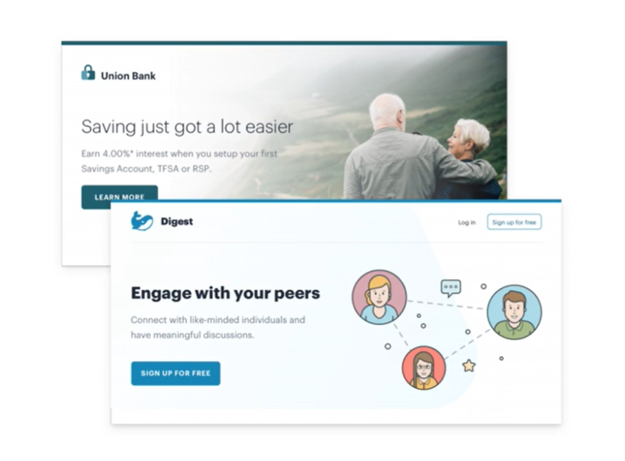
2. Position graphics on the left
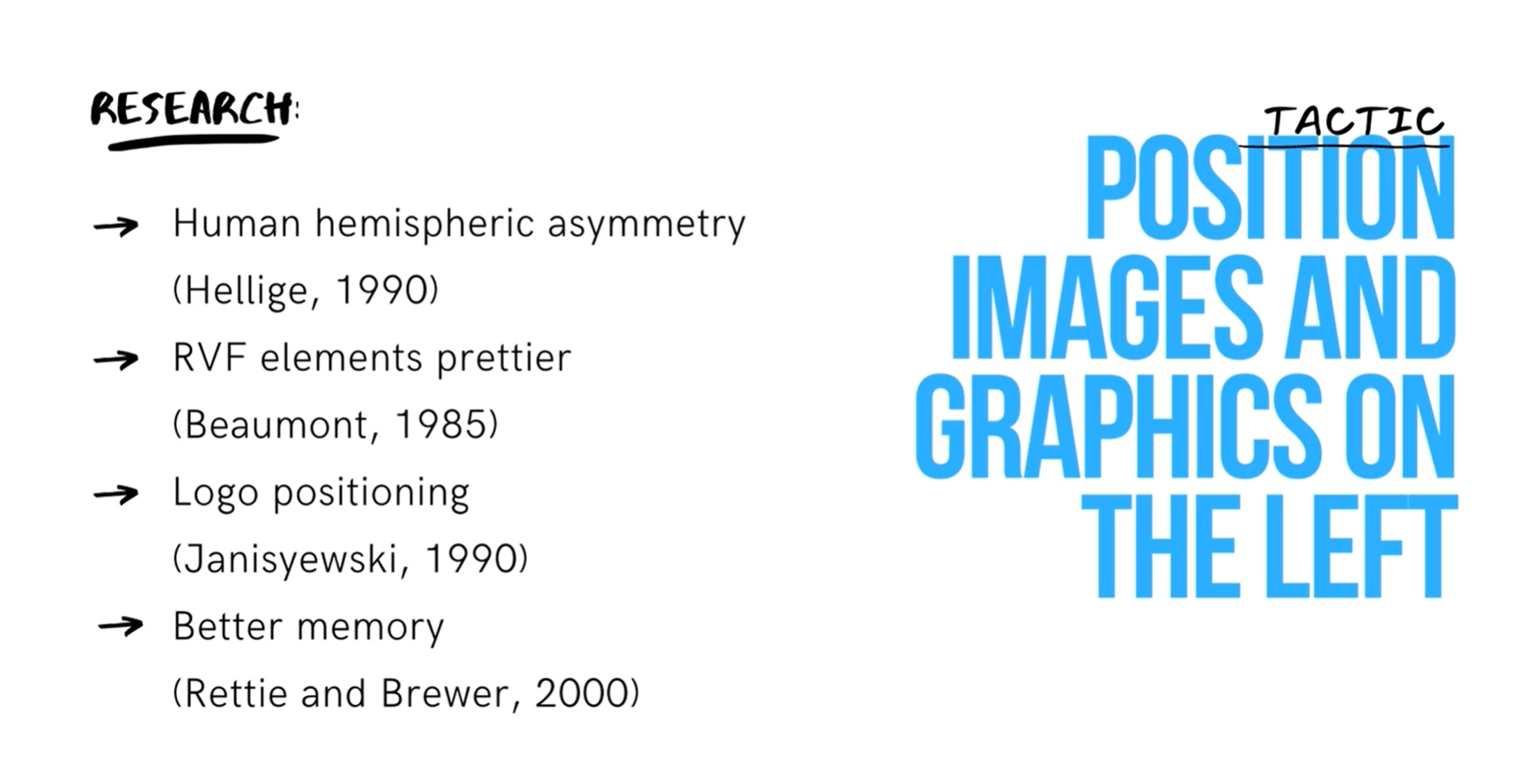
- Research participants described the appearance of an important element as more beautiful if it was in the right visual field. (Beaumont, 1985)
- Research participants also rated products and logos better, depending on their positioning. (Janisyewski, 1990)
- Participants remembered the elements better if they were positioned following the suggestions of Hemispheric brain of symmetry rules. (Rettie and Brewer, 2000)
- Some researchers have obtained different results, because it seems that the results may depend on the dimensions of the images and text and even some cultural factors. For example, they found that some of the Asian countries these rules were not applicable.
E. design
1. Layout: Start with too much white-space
- One of the easiest ways to clean up a design is to simply give every element a little more room to breathe. White space should be removed, not added.
- A better approach is to start by giving something way too much white space then remove it until you're happy with the result.
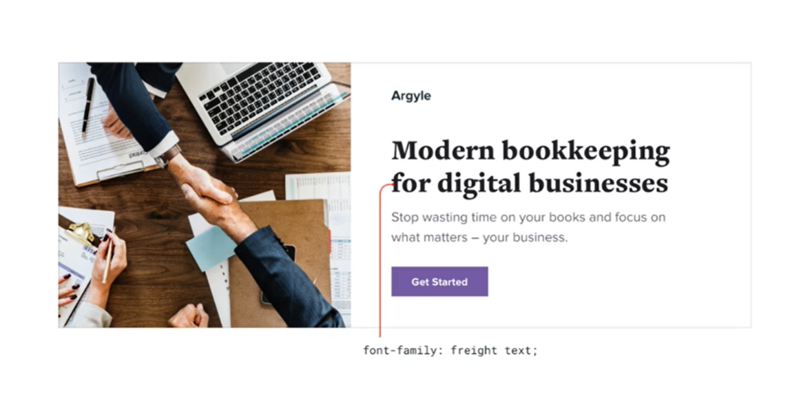
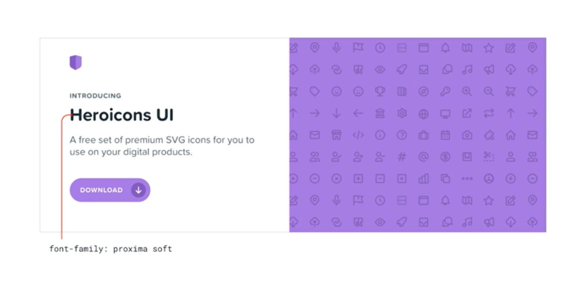
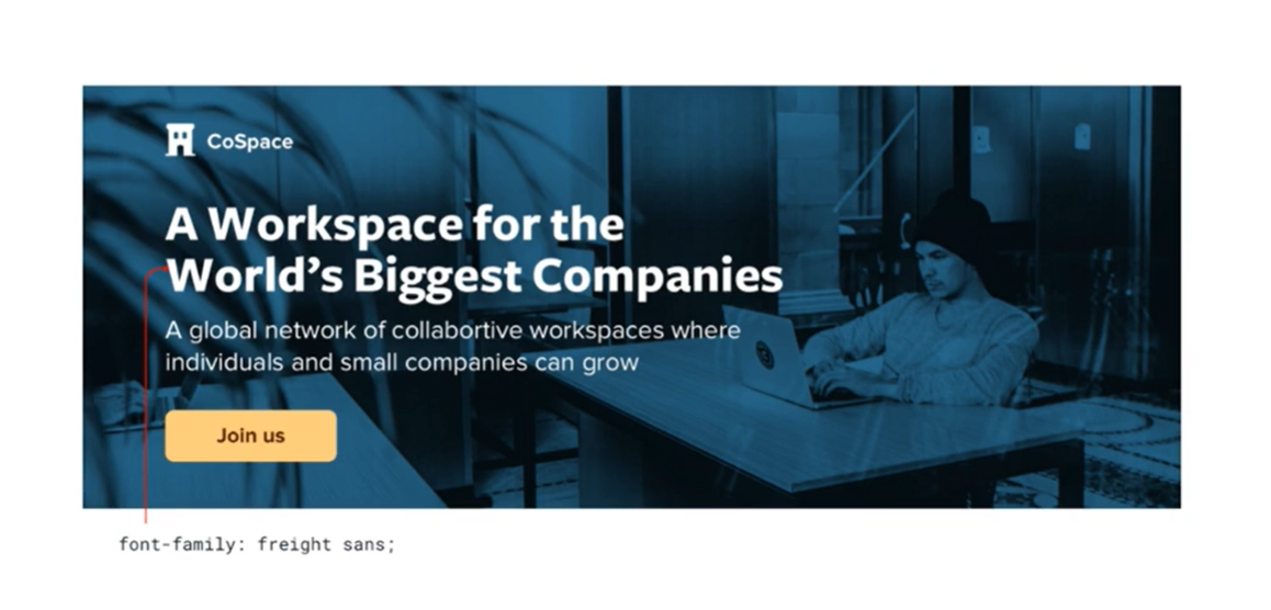
2. Heading: Use good fonts
- Tips:
- Ignore typefaces with less than five weights. Typefaces that come in a lot of different weights tend to be crafted with more care and attention to detail than typefaces than with fewer weights, or
- Trust the wisdom of the crowd. If a font it's popular then it's probably a good font.
- Font choice: Every design or font has some sort of personality.
- Banking site might try to communicate secure and professional, while the trending new startup might have a designer fields fun and playful on the surface.
- If you want an elegant or classic look, you might want to incorporate a serif typeface in your design.
- For a playful look, you could use a rounded sans-serif
- If you're going for a plainer look or want to rely on other elements to provide the personality, a neutral sans-serif works great.
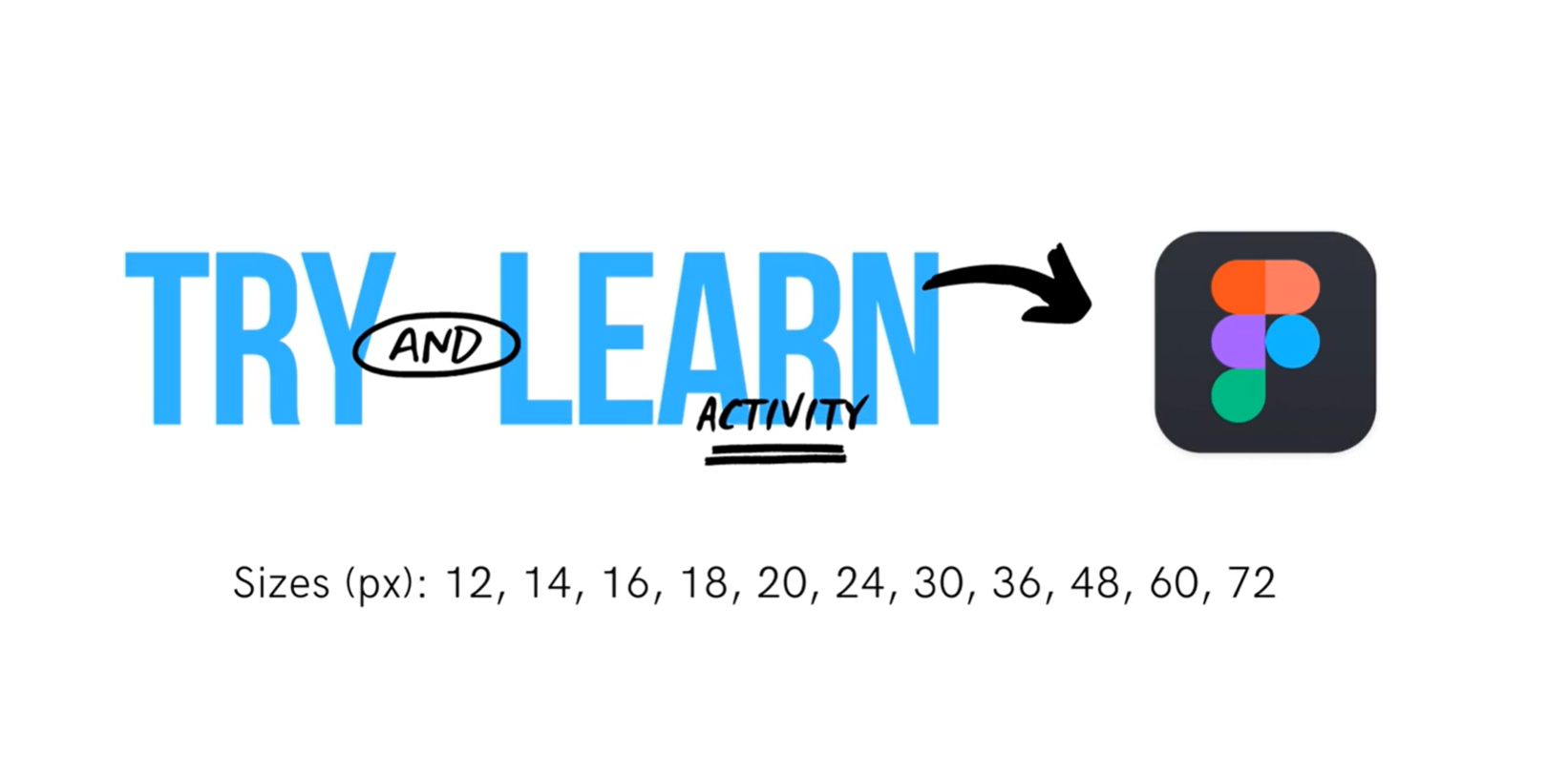
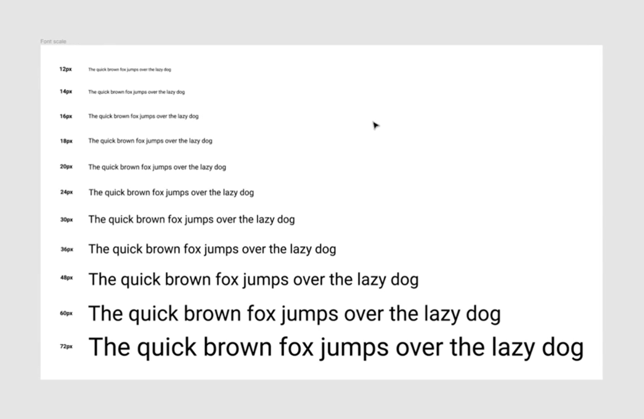
- Establish a type scale: Choosing font sizes without a system is a bad idea for two reasons:
- It leads to annoying inconsistencies in your designs
- It slows down your workflow
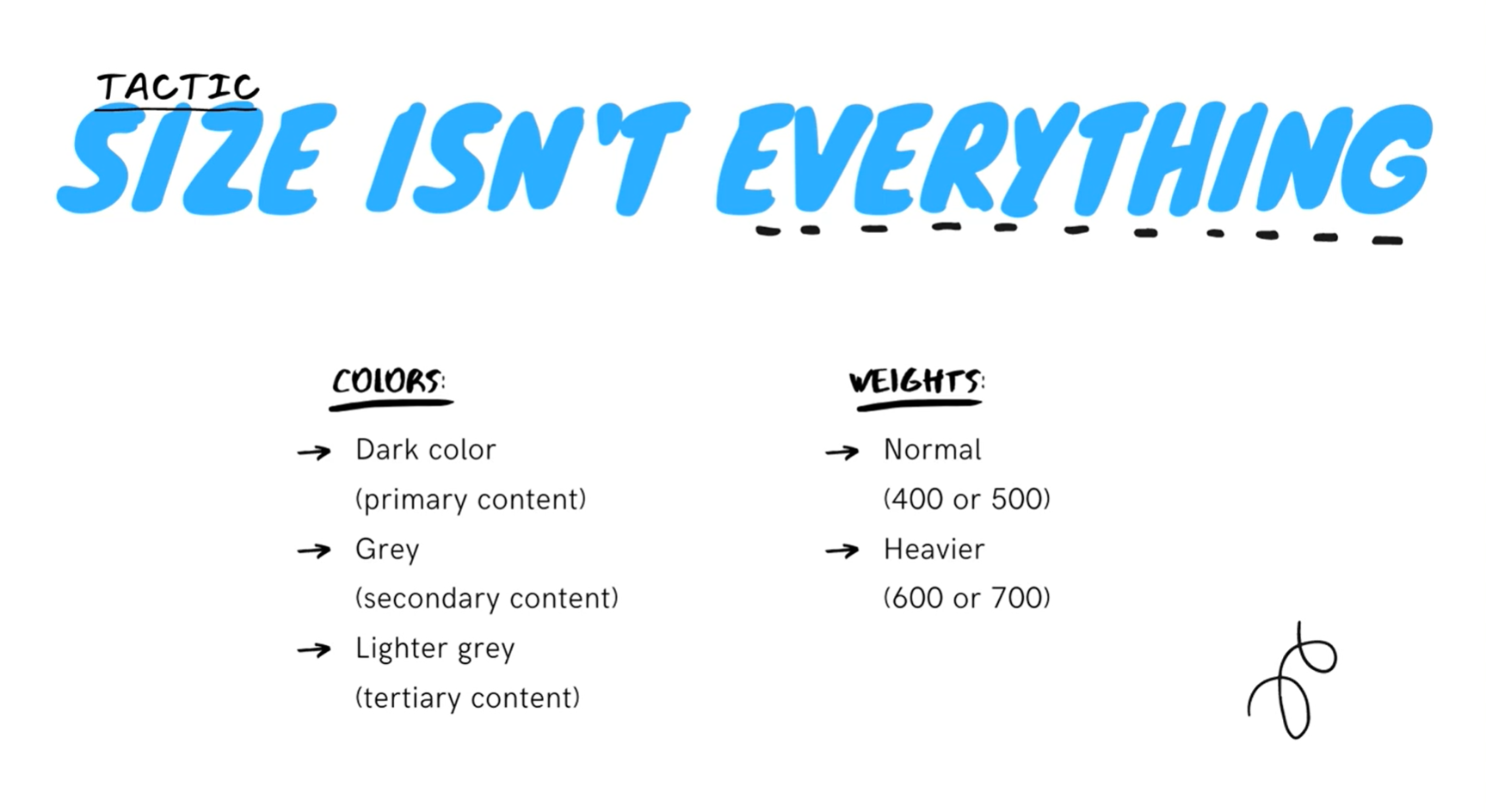
- Size isn't everything
- Try and stick to 2-3 colors.
- A normal font weight 400 or 500 depending on the font for most text and heavier font weight 600 or 700 for text or if you want to emphasize. Stay away from font weights under 400 for user interface because they work for a large headings but they are too hard to read at smaller sizes.
3. CTA Button
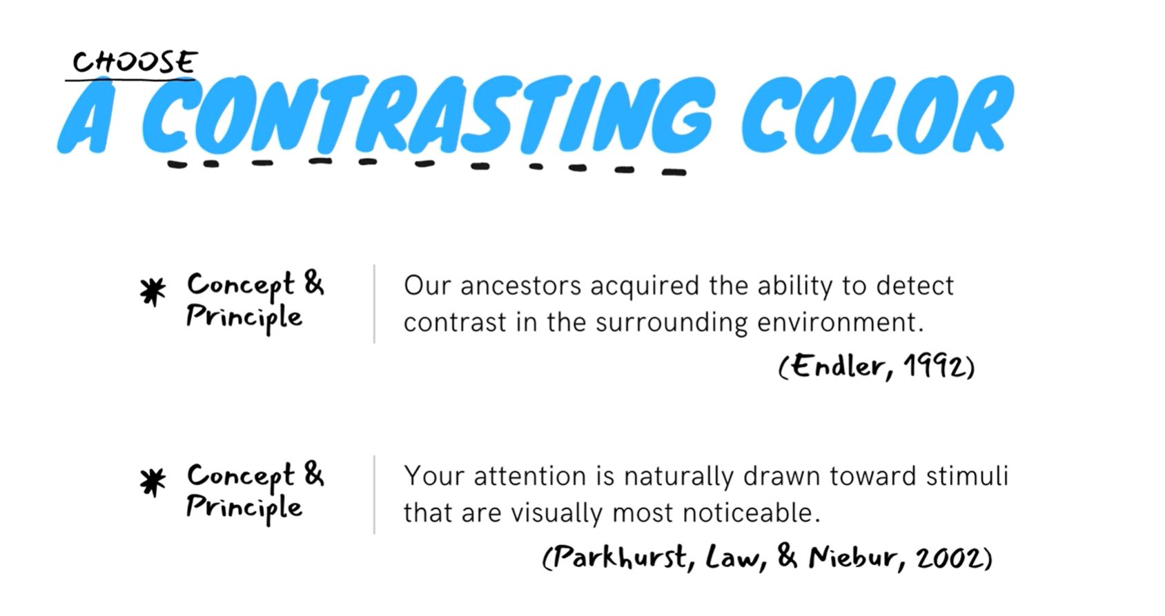
- Chhose a contrasting color
- Blue is is safe and familiar. Gold might say expensive and sophisticated. Pink is a bit more fun, but not so serious.
- But whatever color you choose, make sure you choose a contrast in button color
- Contrasting button colors increases processing fluency. Due to the contrast, the act of clicking your button will enter visitors minds more easily. That ease will then generate a pleasant sensation in their brain.
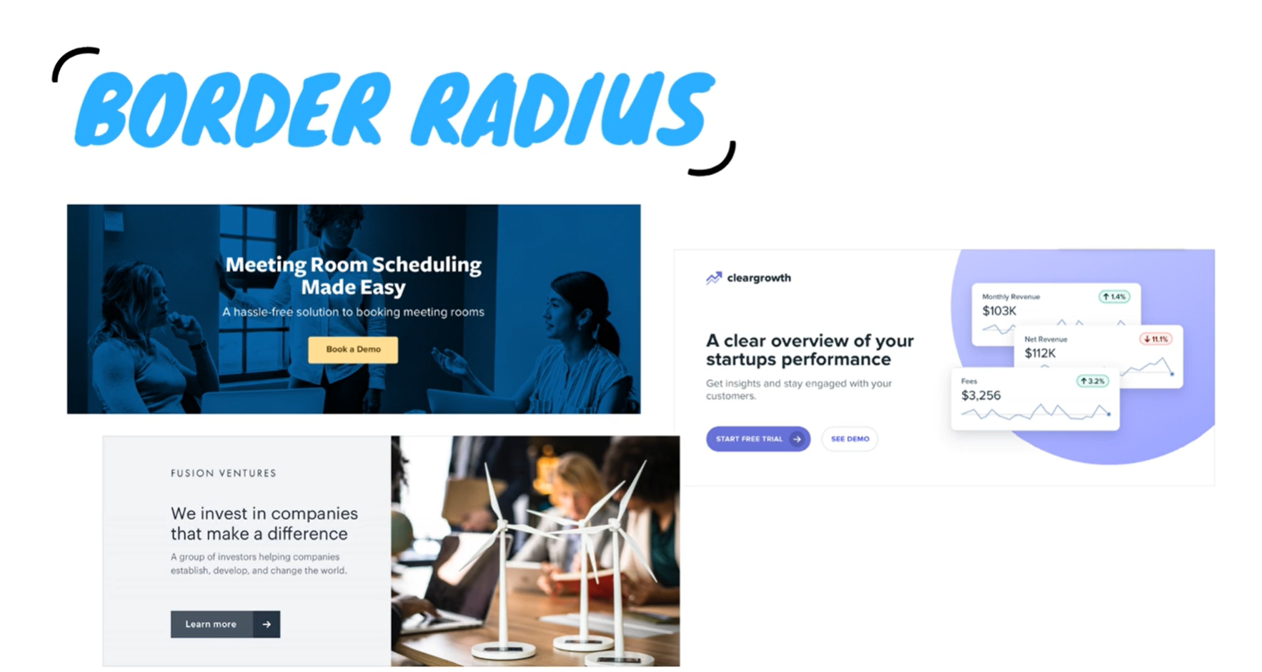
- Border radius
- If and how much you around the corners in your design can have a big impact on the overall feel.
- A small border radius is pretty neutral, large is playful. Whatever you choose, it's important to stay consistent. Mixing square corners with rounded corners in the same interface almost always looks worse than sticking with one or the other.
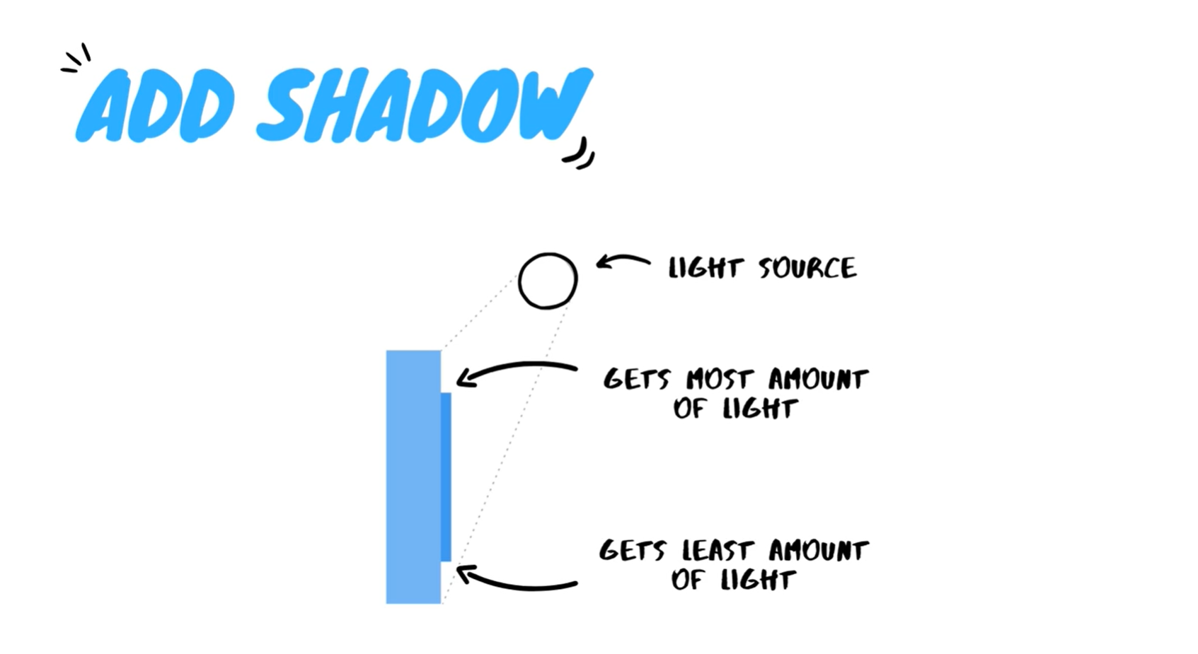
- Add shadow
- We want to create an illusion that the button is raised off of the page, so it will be easier for the visitor to notice it and click on it.
4. Hero image
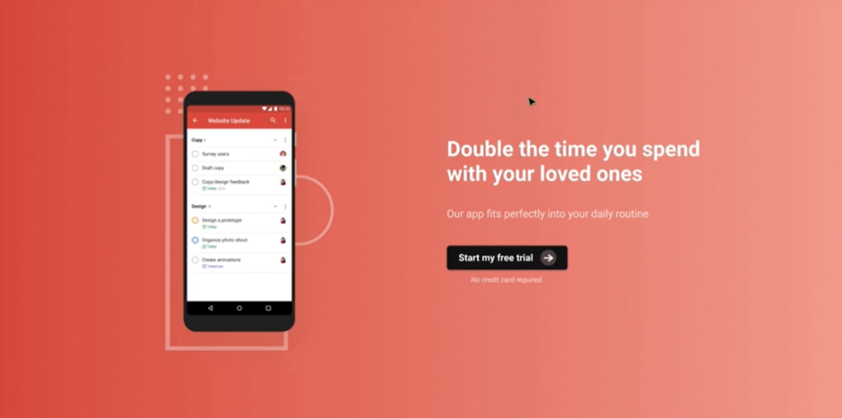
- Solid or gradient background color
- Image background
- If background is too bright, add overlay so content can be emphasized.
- Illustration or shapes under the main image
Tactics I shared with you in this course are already grounded in concrete psychological research. Will they work every time? Well, not necessarily. But...
They are not some random split tests and ideas that we pulled from thin air. More often than not, they should provide a positive boost. With an analytical approach in mind and the conversion tactics we just learned about you should be able to scale your website growth more efficiently.
Conclusion
- While these practices are supported by research and have been employed for an extended period, the final appearance of a website still relies on the designer. This consideration encompasses the client's requirements and the inherent nature of the website.
- It would be valuable if our content writers were familiar with proper copywriting techniques. Currently, no one in the production team creates content for the client unless we are fluent in Swedish, in which case a basic understanding is adequate.
- Several times, the aesthetic-usability effect has proven true for us, particularly with our previous websites where certain features were included solely for aesthetic purposes (hahah!). Clients tend to be more forgiving and are inclined to stay on websites that are visually appealing and engaging. However, this course has been instrumental in fostering a synergy between UI and UX, enabling us to create pages that not only captivate users but also effectively convert them into customers.
- This has also made us reevaluate our templates especially the buttons that we use on our websites.