CS - MAY 31, 2024
CONVERSION OPTIMIZATION:
Örebro Bilringar, Previda, Spol- och industriservice
TODO
- Pick 1 page on each site that is suitable for optimization. You can still choose the homepage if you think that needs the optimization most.
- Analyze the page.
- Make up 1-3 changes that could increase the conversion rate.
- Write a short motivaton on why you think the changes could improve the site (eg. changing color on this button creates a highet contrast which calls on the users attention, and that could lead to more clicks).
IMPORTANT!
This time, look in the CRO ticket of each customer to see what conversion goals we are working towards and take that in consideration as you make up the suggestions.
Remember the following
- The product and target audience
- Social proofing
- Offers and benefits
- Content flow
- What the site's about?
- How it can help me?
- How does it deliver that help?
- How do I get that help?
- Call-to-action (CTA) buttons
- Color contrast
- evaluating the effectiveness of the color palette
- Typography
- readability of text
- Graphics
- minimize texts if necessary
- flow diagram, video references
- Initial impressions upon viewing the page
- in the first 5 seconds that you opened the page, what comes to your mind? what does it make you feel?
- Optimize media files for faster loading of pages
- Clearer images
- Use real life photos instead of stock photos if possible
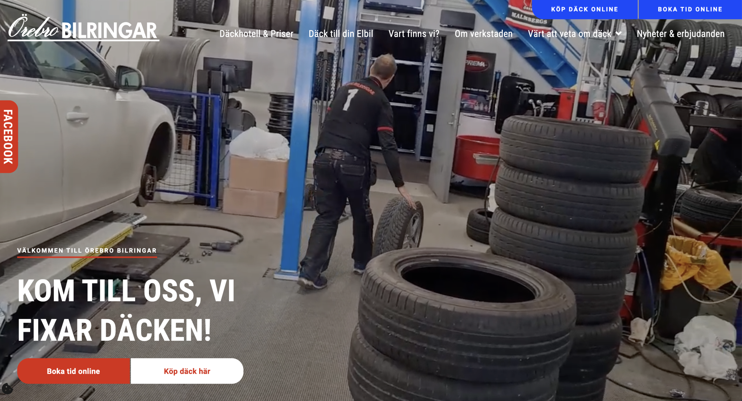
A. Örebro Bilringar AB
Örebro Bilringar has helped people drive safely on the road since the 1960s
The homepage looks good as of now, so we chose "Värt att veta om däck" for this session.
- Change the layout of the tire fact links. Currently, the design looks like a list only and not buttons. Remove the underline and make the whole grey box clickable.
- Additionally, we recommend changing the static image to a carousel to make the page more dynamic.
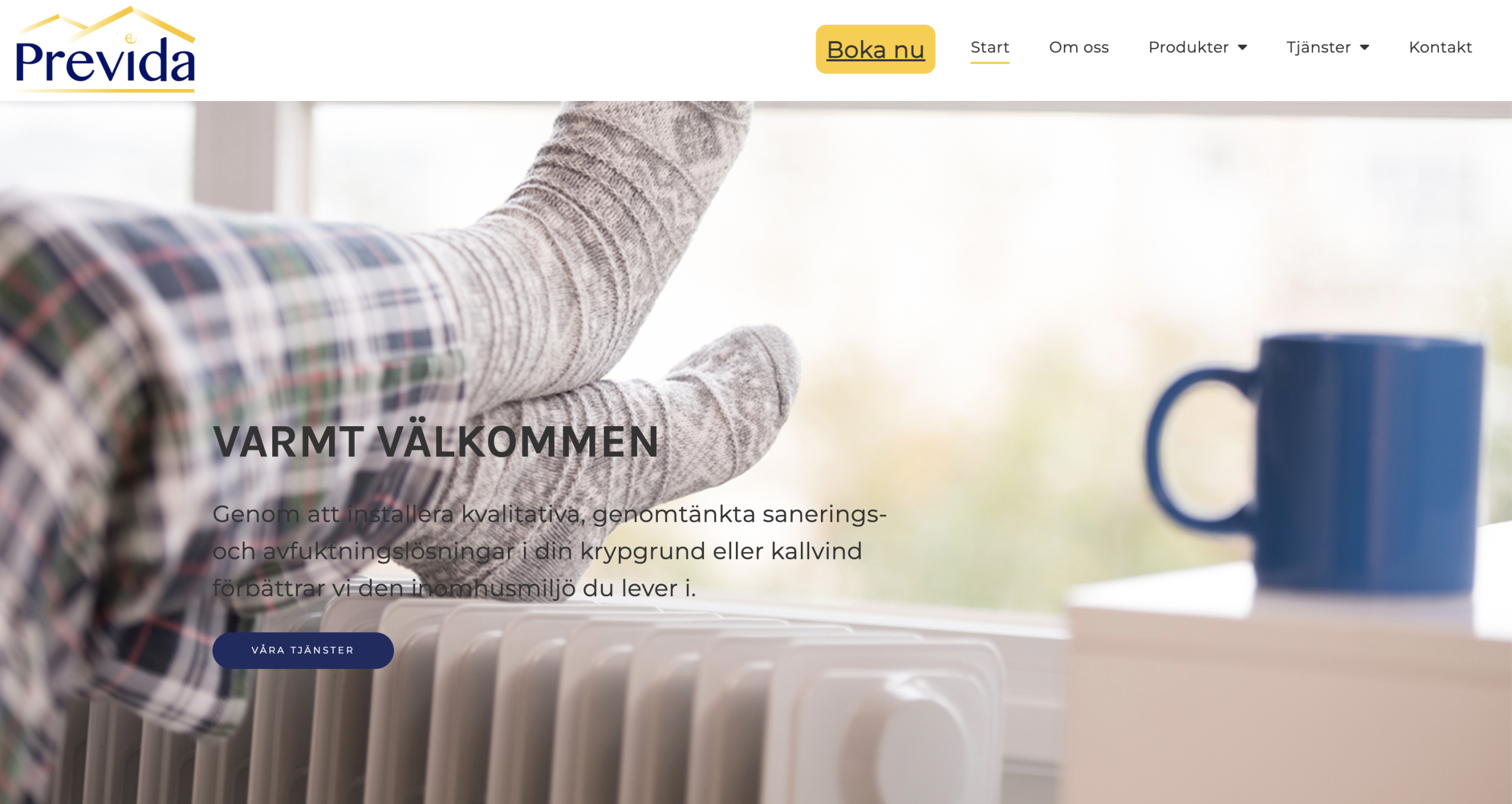
B. Previda AB
quality, well-thought-out cleaning and dehumidification solutions
We've decided to optimize the homepage, and here are our suggested improvements
- Change the hero's background position to emphasize the humidifier instead of the feet, or replace the image with one that better showcases the service itself. Also, add an overlay filter to make the text more readable.
- Adjust the layout of each service card by adding padding and aligning the buttons at the bottom of each card to make them uniform.
- Move the "Do you need help with cleaning or dehumidification solutions" section to create a separate CTA banner. Add a short text, button, and image as well.
- In the section with icons, replace the static icons with 3D versions to make it more lively. Add links under the text for the phone number, address, email, and Facebook page.
- On the contact form, switch the positions of the columns so the image (car) points towards the form.
- In the navbar, remove the underline from the Book Now button for a cleaner look.
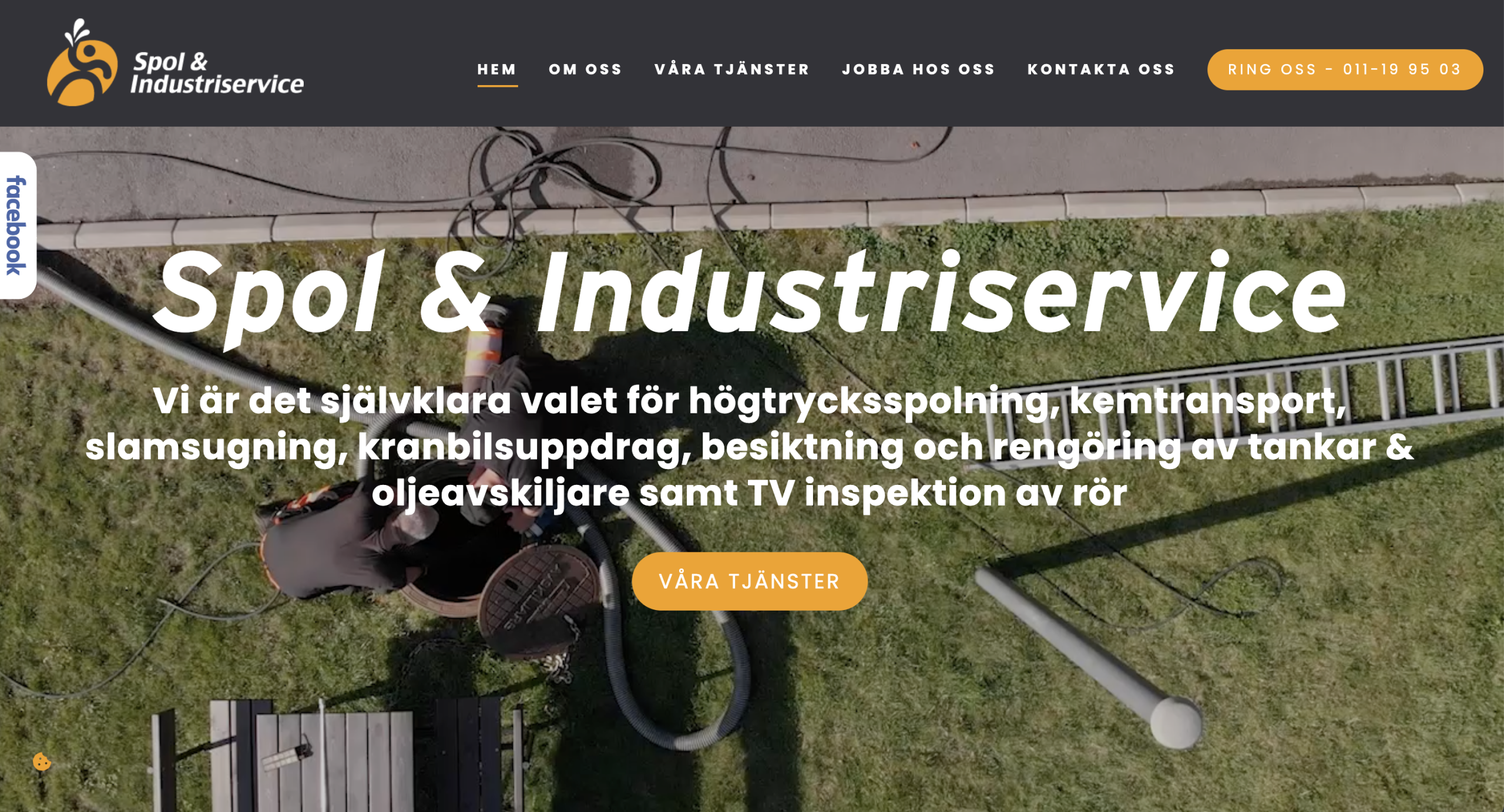
C. Spol & Industriservice
high-pressure flushing, chemical transport, sludge suction, crane truck assignments, inspection and cleaning of tanks & oil separators
We identified several pages that need enhancements for better delivery. Here are the specific pages and recommendations:
-
SERVICES page
-
The header image looks awkward. Either remove it or move the page header text into that section.
-
Change the layout of the cards to smaller ones and display four in a row to reduce scrolling.
-
Adjust the tags on each service card: use <h3> for the title followed by <p> for the description.
-
-
WORK WITH US page
-
The form is too stretched out. Place text in the left column and the form in the right column.
-
The text at the bottom about available positions is contradictory. The header says "We're looking", but the text below says "We are not looking".
-
Fix the layout by either putting the header on the left and the body on the right, or add a background image and align all text to the left.
-
-
HOME page
-
Change the layout of the service cards. Use an <h3> tag for the title, followed by the description, then a button redirecting to the page. Currently, the buttons are confusing as they look like static headers on a yellow background but function as buttons."
-
Improve the "Get a free estimate" section by either centering all elements in one column, or keep the existing design but add padding, a proper title, and fix alignments.
-
-
GENERAL
-
Add padding-inline to the main containers. The pages, especially the service cards, feel a bit cramped.
-
The footer contact icons do not match the information. Use a telephone icon for the phone number, an envelope for email, and a map marker for the address.
-