CS - MAR 8, 2024
CONVERSION OPTIMIZATION:
Deluxia, Tenders, Marcuskraftan
TODO
- Pick 1 page on each site that is suitable for optimization. You can still choose the homepage if you think that needs the optimization most.
- Analyze the page.
- Make up 1-3 changes that could increase the conversion rate.
- Write a short motivaton on why you think the changes could improve the site (eg. changing color on this button creates a highet contrast which calls on the users attention, and that could lead to more clicks).
Remember the following
- The product and target audience
- Social proofing
- Offers and benefits
- Content flow
- What the site's about?
- How it can help me?
- How does it deliver that help?
- How do I get that help?
- Call-to-action (CTA) buttons
- Color contrast
- evaluating the effectiveness of the color palette
- Typography
- readability of text
- Graphics
- minimize texts if necessary
- flow diagram, video references
- Initial impressions upon viewing the page
- in the first 5 seconds that you opened the page, what comes to your mind? what does it make you feel?
- Optimize media files for faster loading of pages
- Clearer images
- Use real life photos instead of stock photos if possible
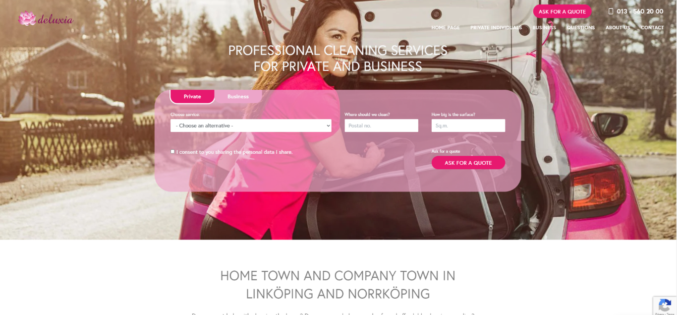
A. DeluXia
PROFESSIONAL CLEANING SERVICES FOR PRIVATE AND BUSINESS
The homepage currently lacks the deluxe appeal implied by the business name, giving off more of a ""girl-next-door"" vibe than a professional cleaning service. The design also feels outdated and may not effectively engage users or communicate the brand's identity to potential customers.
Following Jakob Nielsen's principle of usability, which emphasizes familiar design patterns for optimal user experience, could enhance the site's familiarity and usability.
We chose to study the homepage since we need to streamline it for quick decision-making by visitors within the first few seconds. The homepage should quickly communicate the service offered without overwhelming the visitors with too much information.
- The hero section has a quote form which is good but occupies too much space and the text is unreadable. It could be placed on the right side or in a pop-up to improve symmetry.
Changing the hero to a full-height section would also enhance the design. Additionally, there's no error message after submitting the form if the fields are still empty. - Social proofing is available but should be optimized. Consider placing it immediately after the hero section so customers can quickly get an idea about the company's reputation, as consumers often rely on other consumers' reviews.
- The location section resembles an earthquake map and can be redesigned for clarity. Consider converting this section to an About Us section that includes the location details but less text.
- The services section lacks information and clarity. Consider using cards instead of buttons, adding images, and providing short descriptions of each service.
- The work method section could be animated to add personality. Place the description text below the icons instead of using hover-reveal, which may not be immediately noticeable.
- The "Meet your expectations" section can be changed or removed. Aside from being text-heavy, the statement "100% customer satisfaction" lacks support, making it unrealistic.
This could also raise doubts among customers in the long run, especially if they check their social proofings on other platformns and find 1-star ratings with bad review. - The "You and the Staff Safety" section can be removed or placed on other pages as it may not be relevant in the homepage.
- Rework the text in the environmental work banner for clarity and impact.
- Add titles or headings to the logos section to identify their significance. Link each logo to its respective website if applicable and consider making them responsive, possibly using a rolling gallery format.
In addition to the suggestions mentioned earlier, here are some additional optional recommendations:
- Consider changing the navbar to a bg-primary with text-light, adding personality to the site.
- Tone down the strong shade of pink used throughout the site and introduce an accent color instead. This will create a more user-friendly color scheme, particularly considering their target demographic of customers in their 30s to 40s.
- Use clearer and higher-quality images throughout the website.
Also, check flashguyscleaning.com quotation form in their hero section. If we can replicate, this could be a great plugin to sell to cleaning company or other company with related services.
Over all, as a customer, the homepage is bit hard to identfity if this is the brand for my needs. At the first few seconds, customer should be able to decide to engage in the site or not so the homepage should just contain an intro to what they can offer. Users would prefer your site to work the same way as all other sites they already know.
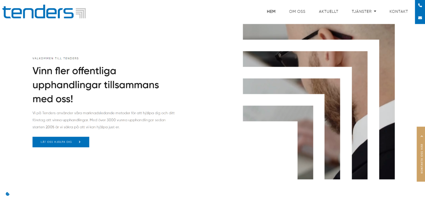
B. TENDERS
Tenders Sverige AB is a business legal consulting firm specialized in public affairs
We've decided to optimize the newspage, and here are our suggested improvements
- Reduce large white spaces, particularly before and after the "Här publiceras nyheter och aktuell..." heading. Utilize the space more effectively since news pages are primarily informational.
- Highlight the latest news item at the top of the page. Refer to the attached image on the right for an example.
- Make the news items more compact to accommodate potentially large number of items over time.
- Include descriptions for each news item to provide readers with a preview of the article without needing to visit the subpages.
- Enhance the readability of the icons in the "Share this post" section on each subpage by changing their color when hovered.
- Consider the readability of text colors, adjusting font size or color as necessary to ensure readability for the target audience.
We also discussed some improvements for the homepage:
- Incorporate more animation or movement into the homepage to align with the business's claim of using "market-leading methods." An interactive homepage would breathe life into the seriousness of their field and convey the message of "work with us, and we'll surely bring life to your business or needs.".
- Increase the font size of headings, as they may appear small against the backdrop of white spaces.
- Enhance the brown color to a more goldish hue. Utilizing a blue and gold palette can convey a sense of luxury and professionalism, aligning with the business's image.
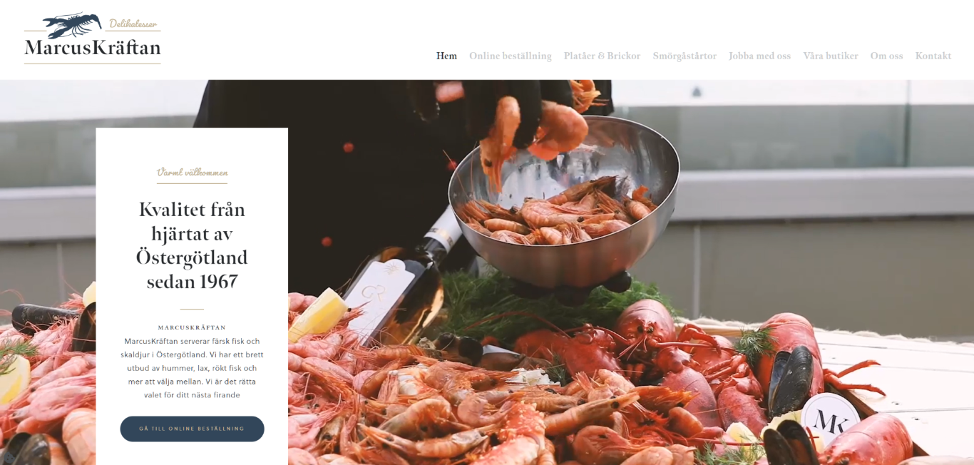
C. MarcusKräftan
MarcusKräftan serves fresh fish and seafood in Östergötland
In the marketing world, we're often drawn to goods advertised by attractive models because we're programmed to associate those products with attractiveness, believing they will make us look better too.
Similarly, on food websites, vibrant colors and appealing presentations can make us eager to try the dishes. Therefore, the homepage should sell the seafood fantasy to customers.
- Enhance the navbar visibility by either darkening the text color or introducing a blue background with white text. Also, emphasize the "Våra Butiker" button.
- The colors seem a bit bland. Most food websites, especially those for seafood, typically feature vibrant oranges and reds. Following Jakob's Law, using familiar colors can help build trust with customers. Try saturating the video in hero section and add more contrast. If possible, change the video with regular people eating rather than well-dressed people to make it give a vibe of being affordable and accessible to a wider audience.
- If available, incorporate social proofing into the third section to instill trust among viewers.
- Increase the font sizes of CTAs for improved visibility. Also, enhance clarity and urgency of the buttons by updating "Go to online webshop" to "Order now" for improved readability and precision.
- Make the rest of sections full-width to maximize the space.
- Enlarge the "Best selling" section, as it is the highlight of the page. Customers should be enticed by the images, so consider implementing a hover effect like this where the image zooms in upon hovering, emphasizing the appeal and encouraging purchases.
- Add hover animation to the info cards so customers remain engaged as they scroll. Additionally, ensure the CTAs stand out by making them contrast with the background.
- Enhance the gift card banner by smoothing the gradient overlay and selecting a background image featuring a person giving, receiving, or holding a gift card. This visual change will ensure that even users who scroll quickly without reading the text will notice MarcusKräftan's gift card offerings.
- If applicable, consider incorporating promotional banners, such as free delivery, to drive engagement and conversions.