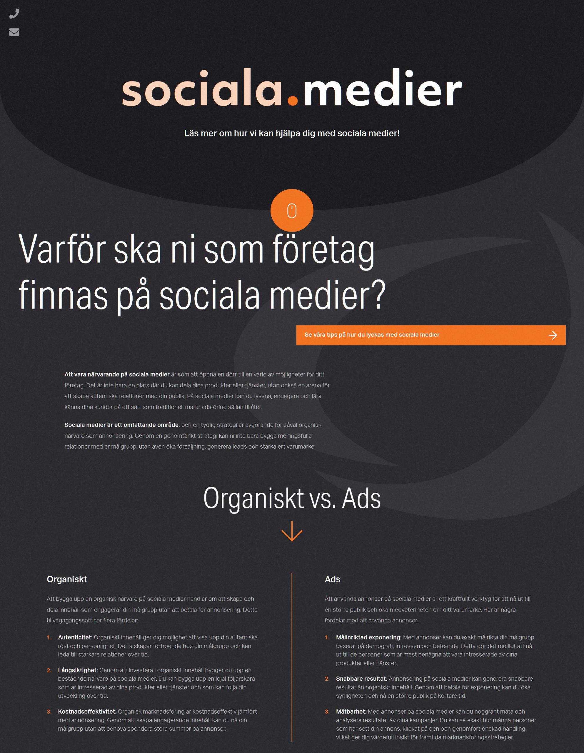
The current page has an excessive amount of text. Introducing more visual elements and graphics would be more effective in capturing attention.
Incorporate client testimonials immediately after the hero section, titled ""Why Choose Mediakonsulterna?"" Utilize top-tier references, including but no limited to:
video testimonials
existing clients committed for the next 6 months
account managers' interactions with clients
endorsements from celebrities, influencers, and high-profile clients.
Adjust the font size to accommodate the target audience, particularly those aged 30 and above, ensuring readability and accessibility.
Implement clear and prominent CTAs throughout each section to guide users towards desired actions.
Add progress flow diagrams that highlights potential outcomes under the "Why should you as a company be on social media?" section.
Since most of our comments are based on designer/employee POV, it would help to seek feedback from a diverse range of individuals to gather varied perspectives. Questions may include, but not limited to
evaluating the effectiveness of the color palette
readability of text
initial impressions upon viewing the page (in the first 5 seconds that you opened the page, what comes to your mind? what does it make you feel?)
Overall, prioritize visual elements, graphics, and real-life testimonials to enhance engagement, as text-heavy pages are often perceived as dull by most users.
A.
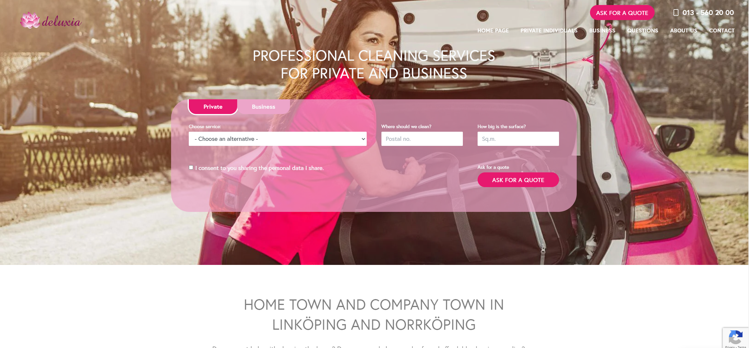
PROFESSIONAL CLEANING SERVICES FOR PRIVATE AND BUSINESS